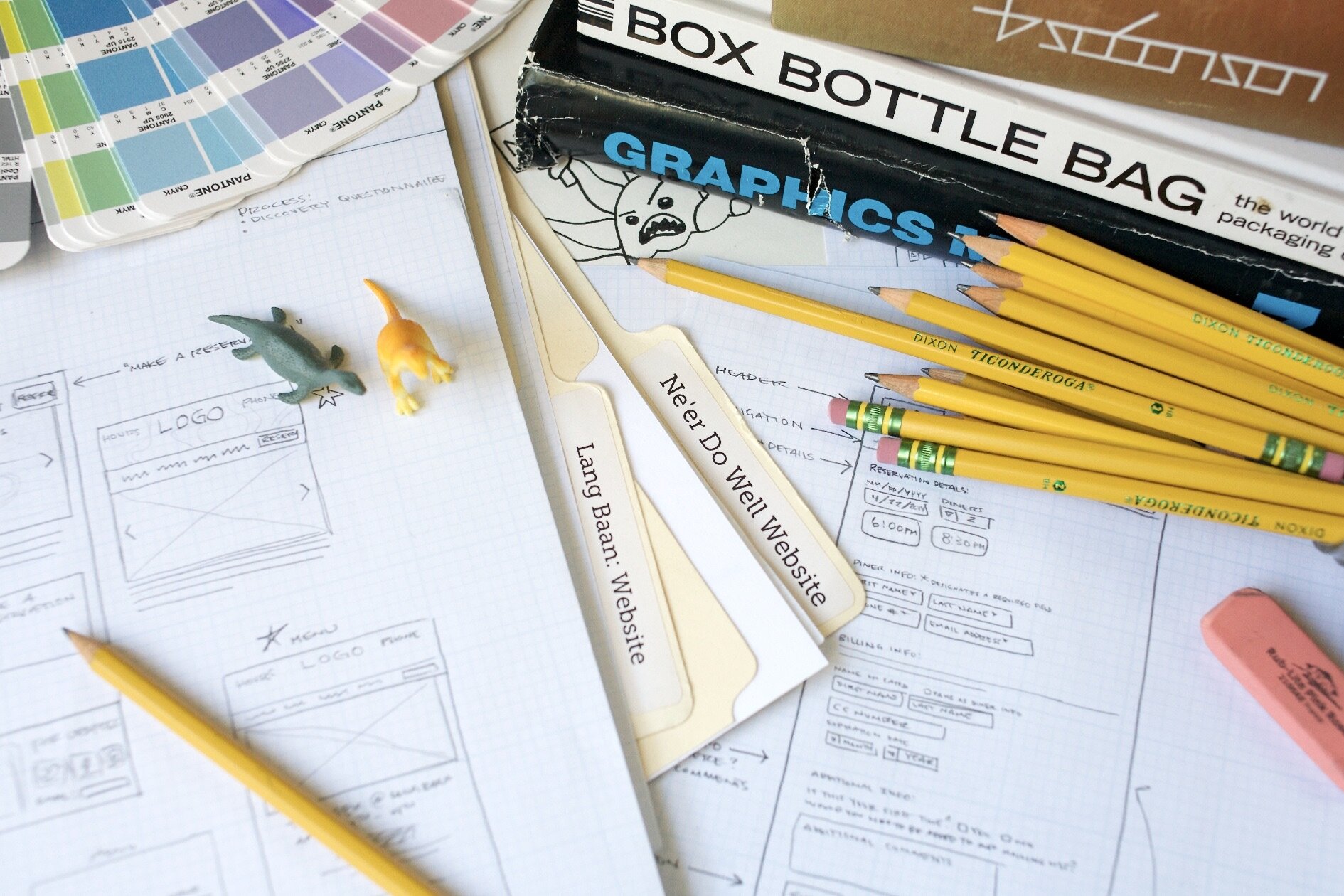
Biometric Photo Editing Software
UX/UI Design | Wireframing | design strategy
YEAR: 2022
The Client: This is from an actual project that was completed successfully, but I’ve obscured the client and software name for anonymity. This project was a collaboration between myself and another senior designer.
My role on this project: UX/UI Design, wireframing, stakeholder interview support & distilling meeting notes into design objectives.
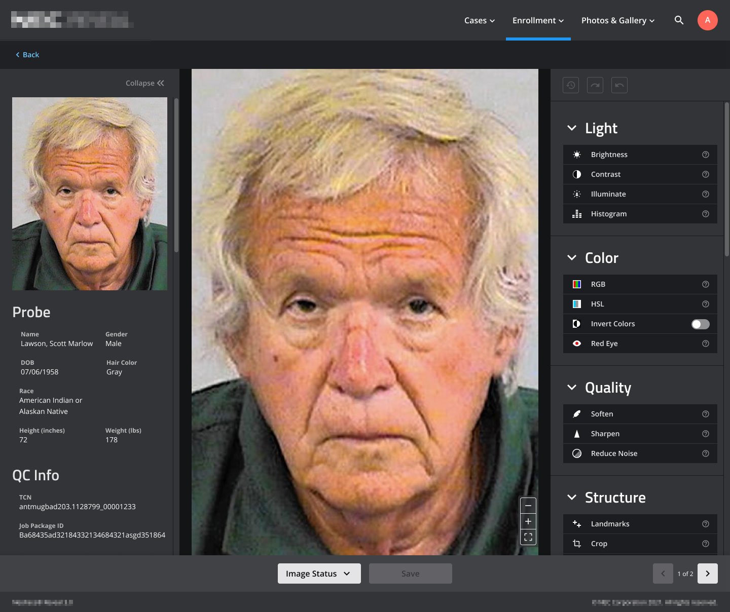

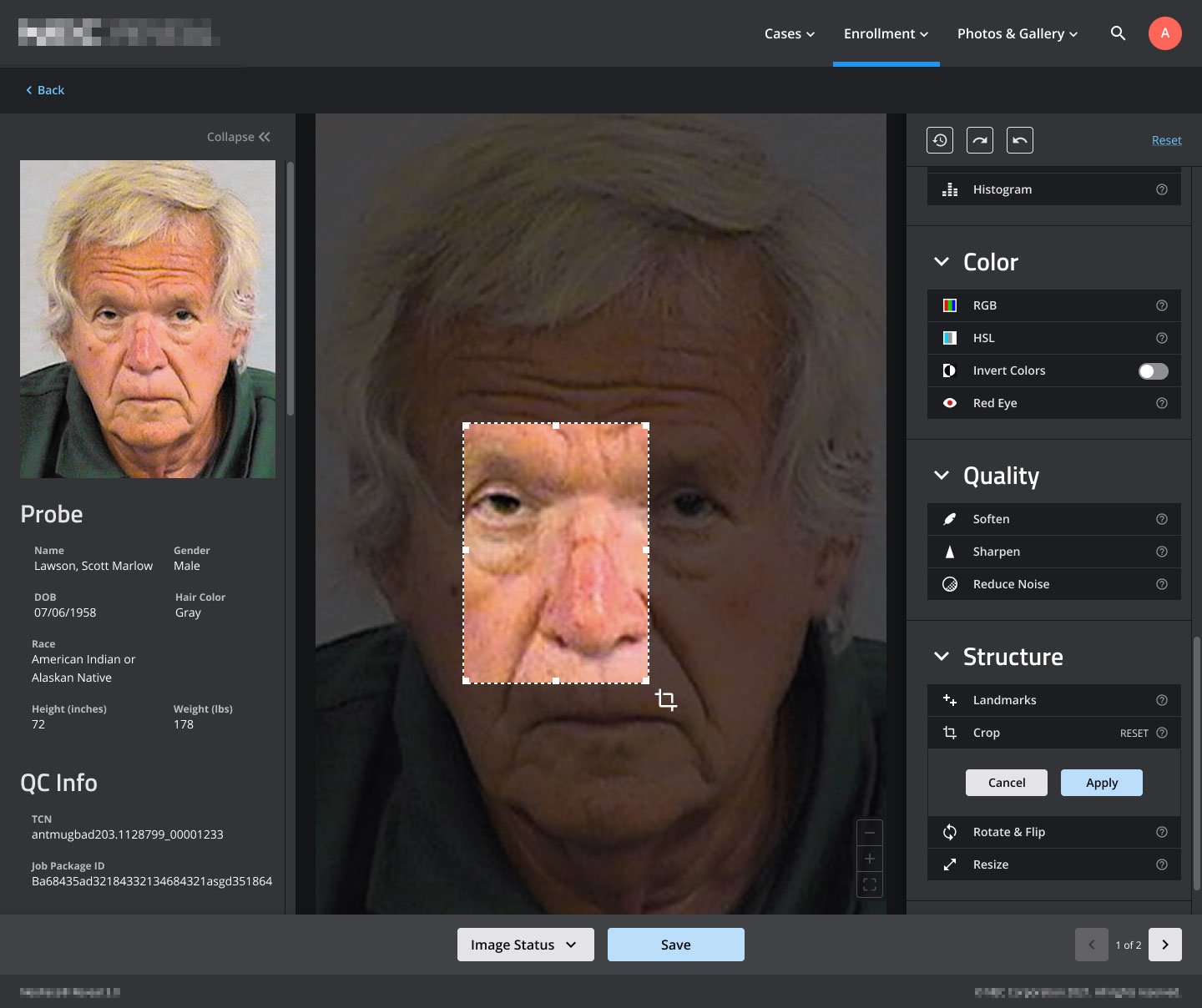
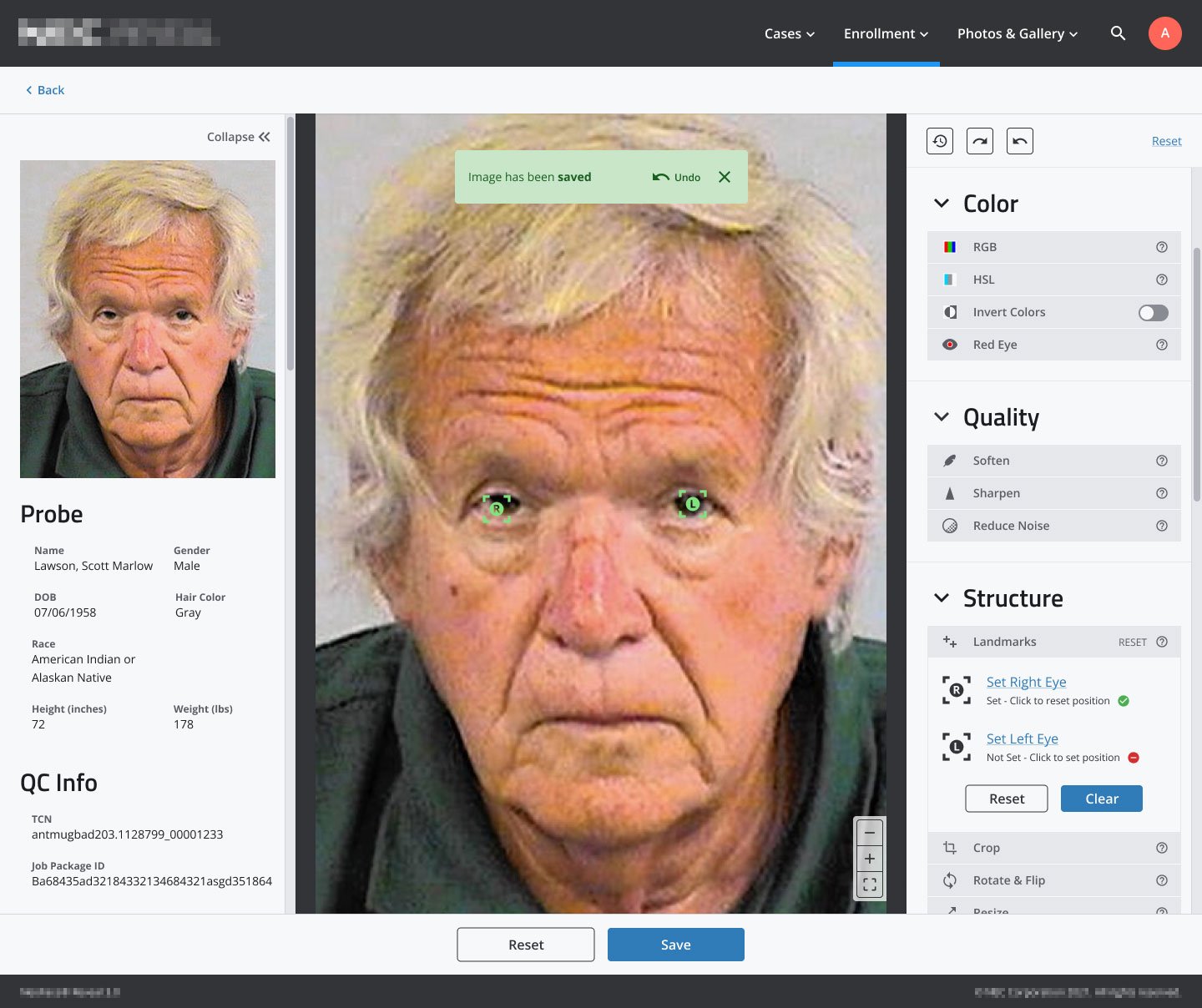
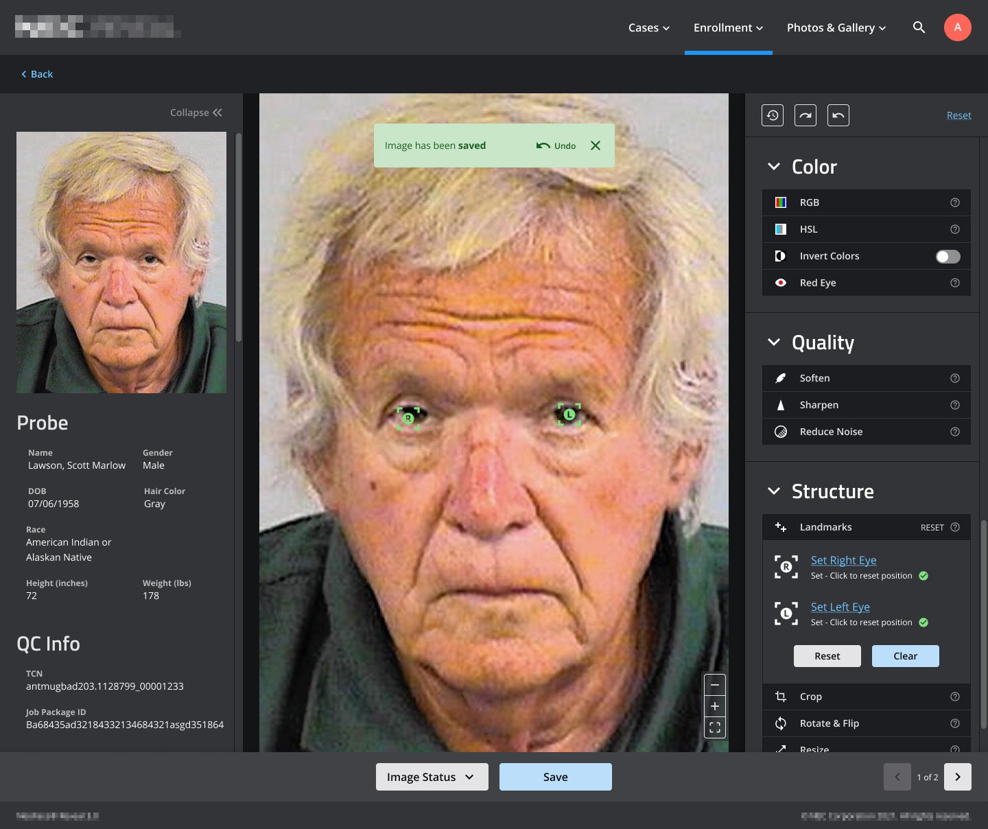
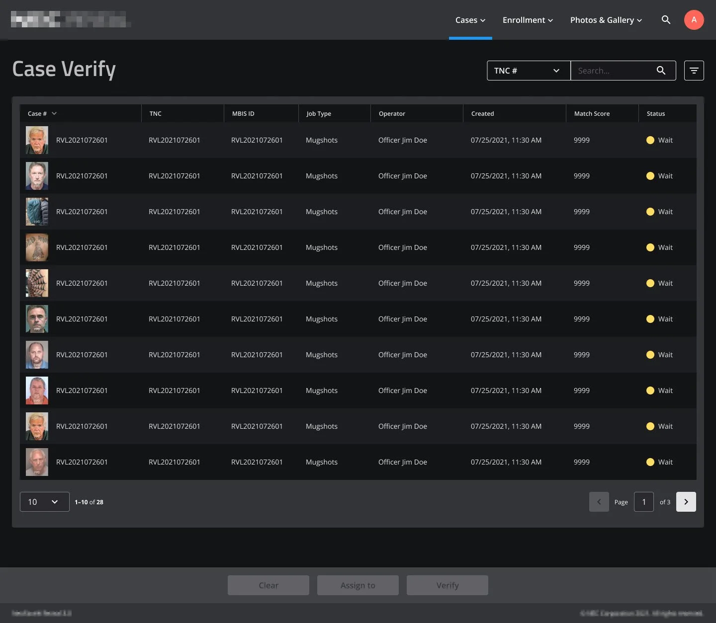
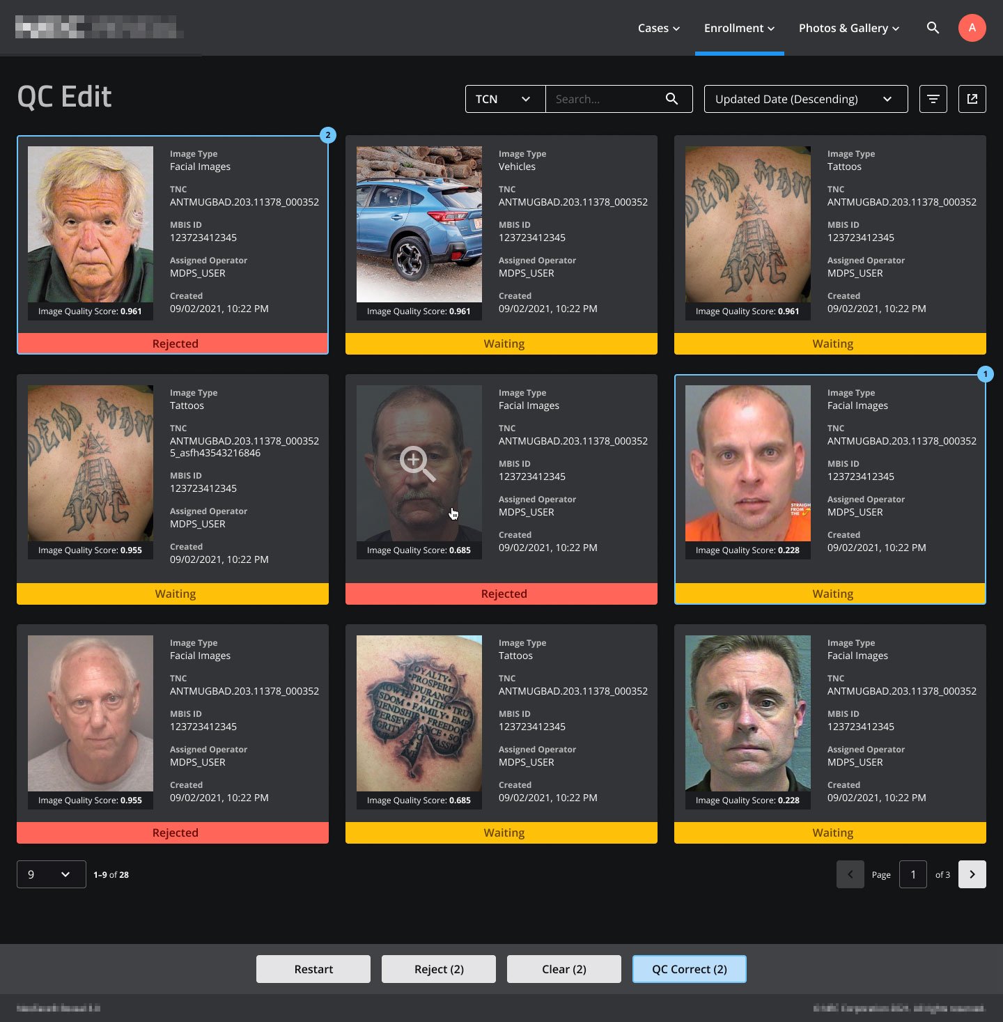
Image Review & Editing Interface
This is the starting state of the edit screen. All of the tool panels are collapsed by default (the RGB tool was expanded by the user in this view). On the third screen, the Crop tool has been activated.
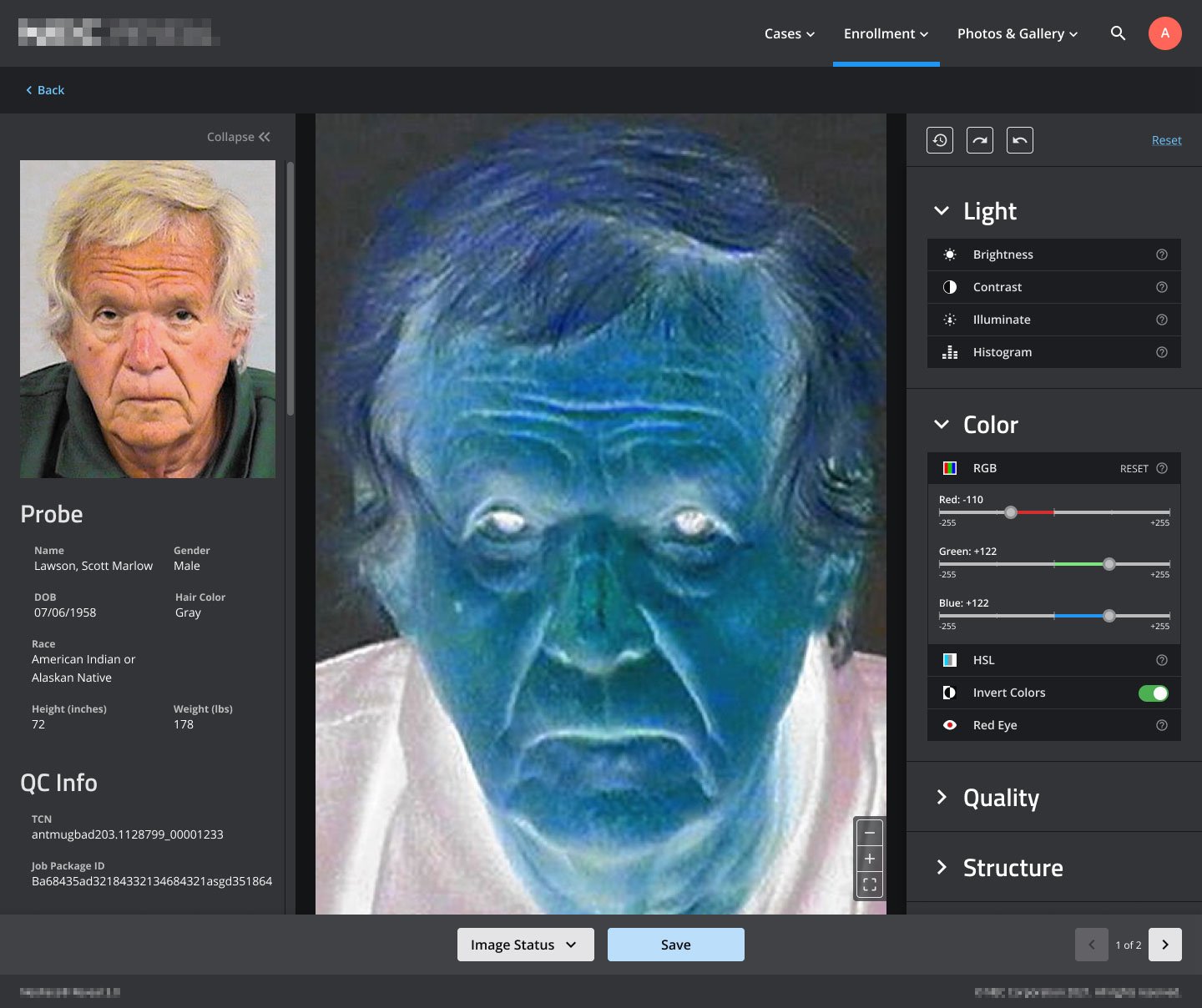
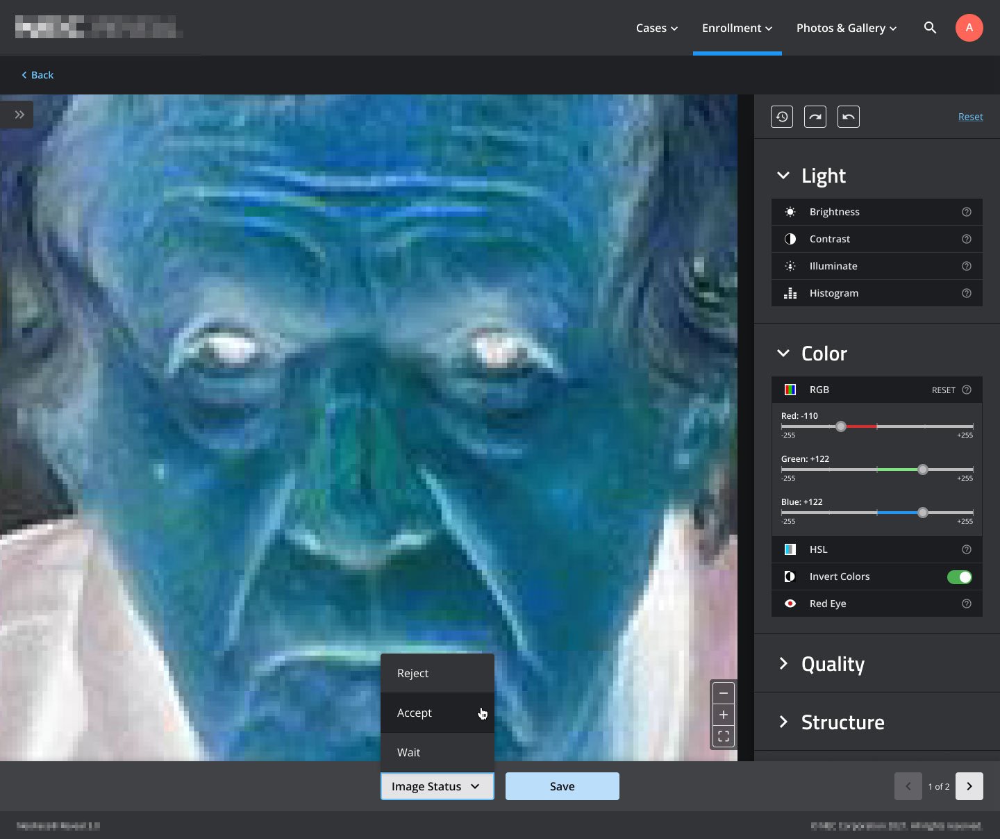
Color Inversion
In this series you’ll see the image colors inverted, the magnification level change, the Image Status menu becomes visible, and the left tool panel collapse.
Comparing Different Images
This UI state allows a user to edit and compare two different images at the same time.


Light & Dark UI Modes
Light and dark modes for the UI was a highly desired feature for the client’s user base. This slideshow cycles through the light and dark modes for several screens.
Tool Panels

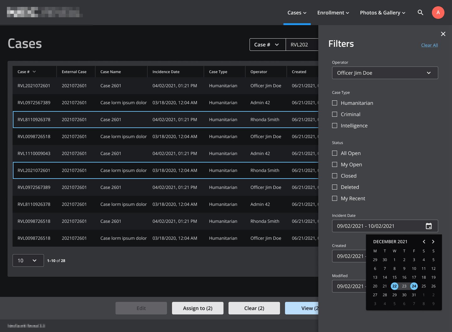
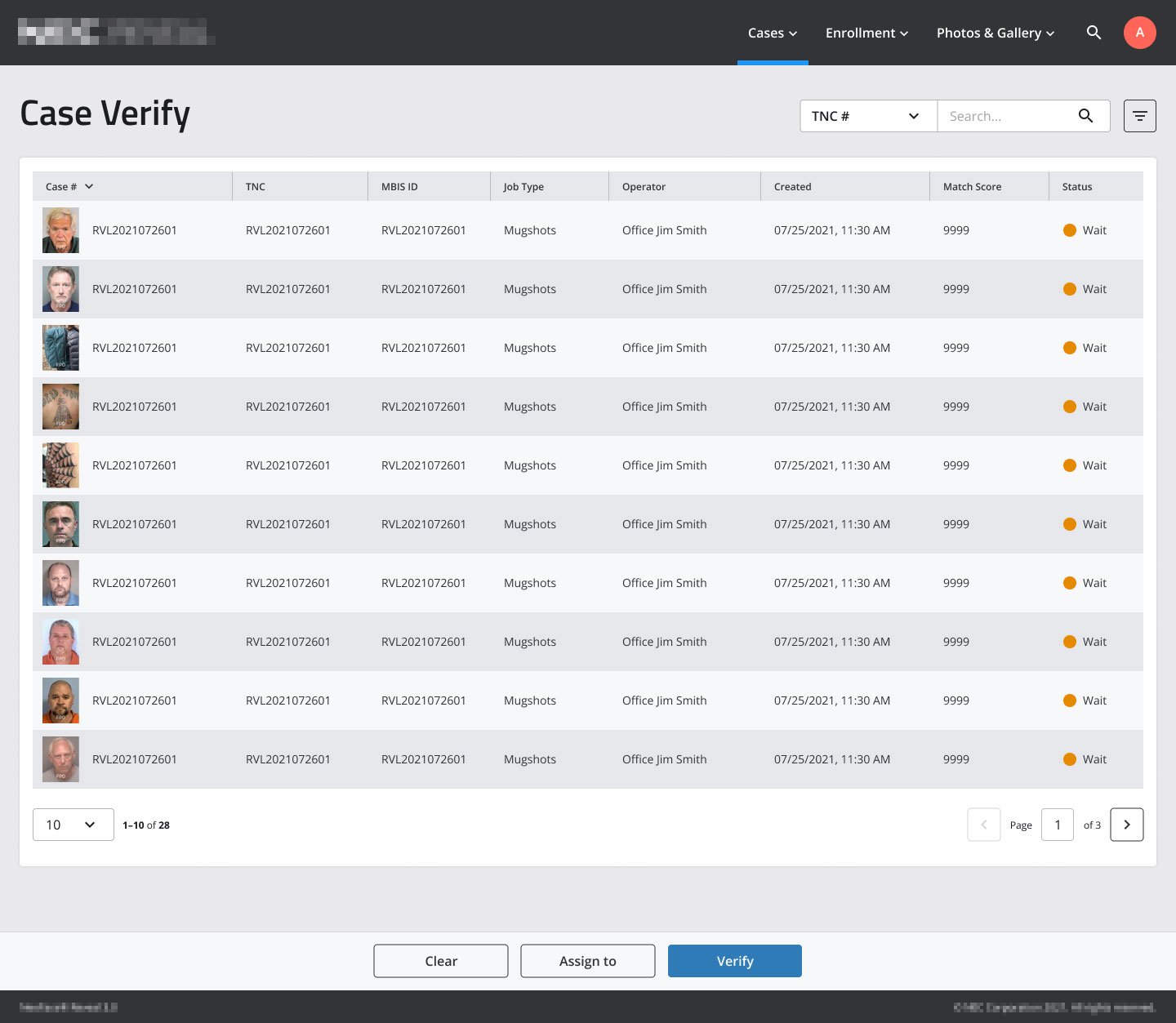
Organizing & Filtering Assets
This section of the UI allows a user to sort and filter the assets they’re working with, and demonstrates the table design used in the app.

Assets Card & Filter Drawer Views
Registering Assets
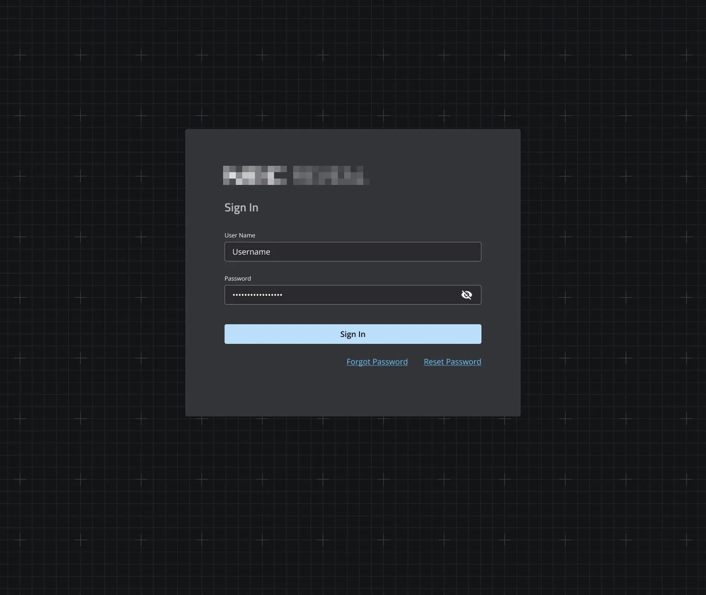

Login & Password Recovery

Goodwell Co.
UX/UI Design | ecommerce | Art Direction | wireframing
YEAR: 2019
The Client: Goodwell is a company with a mission. They create sustainable dental hygiene products in Portland, OR, and their flagship offering is a powered toothbrush that doesn’t use electricity or batteries. It’s a sustainable and revolutionary approach in a category of its own.
My role on this project: UX/UI Design, Discovery Research, Visual Design
Project Objective: Goodwell was experiencing a lot of issues with their preexisting website. The technology used on their Shopify site was not performing as needed, and the visual design created confusion in their visitors. Both of these challenges were resulting in diminished sales and engagement.
Our objective was to raise the visual design and branding to a level that reflected the excellent quality of their products and the care that went into their design, and to streamline the user experience to make the experience pleasurable and memorable.
User Personas
In order to identify where the project needed to go, the Creative Director and I conducted discovery interviews with key Goodwell stakeholders and distilled portions of the data gathered into these personas. These personas represent the real-world needs of their core demographic and marketplace, and everything that follows was designed to speak to these individuals.
User Stories
For each persona, we created a set of user stories, which are brief statements that express what that particular user wants or needs from the company. By envisioning what their customers wanted, we could tailor the site experience to give it to them.
Site Map
After identifying our user personas and stories, we were ready to lock in the new website’s site map.
Guiding Keywords
As part of our discovery, we carefully curated keywords that identified our client’s core values. These keywords kept us focused on what was most important, and gave us an at-a-glance measuring stick against which to gauge our design choices.
Core Messaging
Built from your guiding keywords, these core messages were succinct statements that express how each of Goodwell’s core values translates into benefits for their customers. As we moved forward, these messages informed and infused our choices for UX/UI design and copy.
Preliminary Mood Boards
These mood boards were created as a general reference for where the project was headed. We created these so that a highly visual client could have something to look at in addition to a lot of research results that we generated.
Wireframes
With all of that locked into place, it was time to give our discoveries and intentions shape.
Home Page

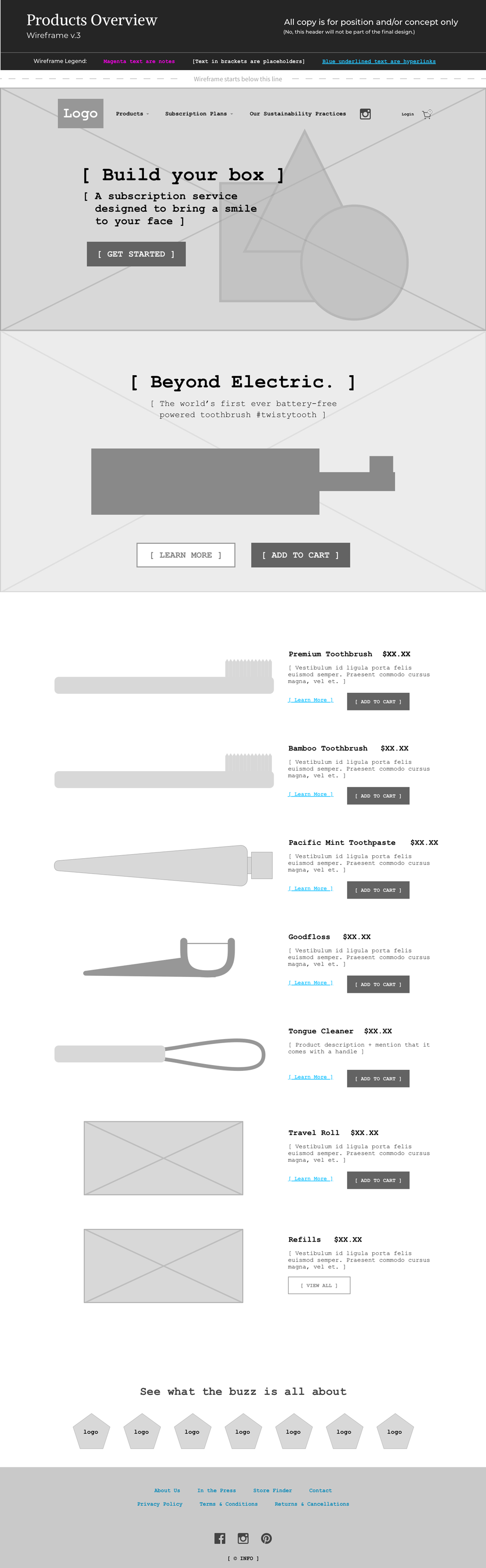
Products Overview
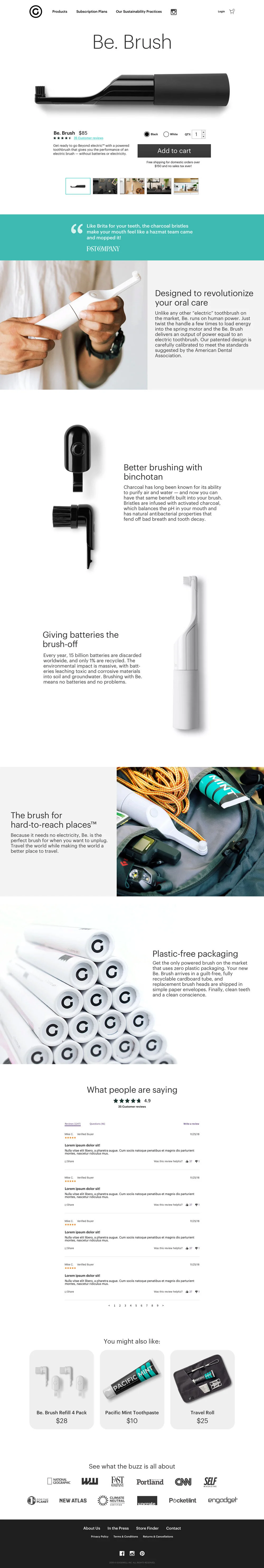
Product Detail Page (PDP)

Final Visual Design of PDP
(Product Detail Page)

Hestan Cue
UX/UI Design | Ecommerce | Wireframing
YEAR: 2018
The Client: Hestan Cue is a technology company that's developed an ingenious product that combines induction cookware and food prep education for the home chef.
My role on this project: UX/UI Design, Visual Design
Project Objective: Hestan Cue was introducing a new high-end product category to the home cooking market and needed their digital presence to reflect the quality and refinement of their product offerings. It also needed to communicate complex information about the technology in a way that was engaging and effectively painted the picture for the gourmet possibilities this new product would bring to any kitchen.
Wireframes
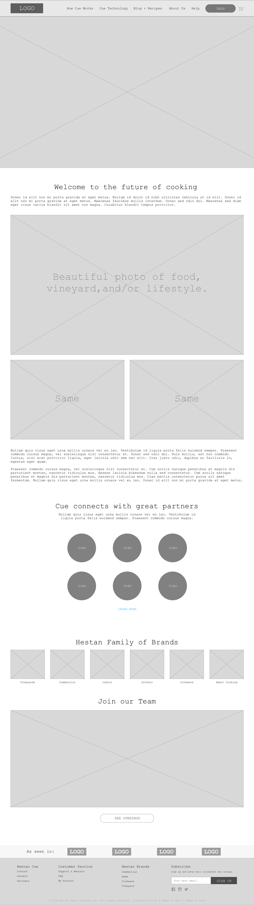
Home Page
The home page’s job is to introduce the product and accommodate the visitor’s subsequent intentions to learn more, be inspired, and ultimately purchase a new induction cooking system.

How it Works
The Hestan Cue product is more than a high-tech induction burner and pot or pan; it’s a rich and extensive library of recipes and education materials to improve one’s cooking skills. This page’s job is to present a complex amount of information in a concise and engaging way through written and visual story-telling.

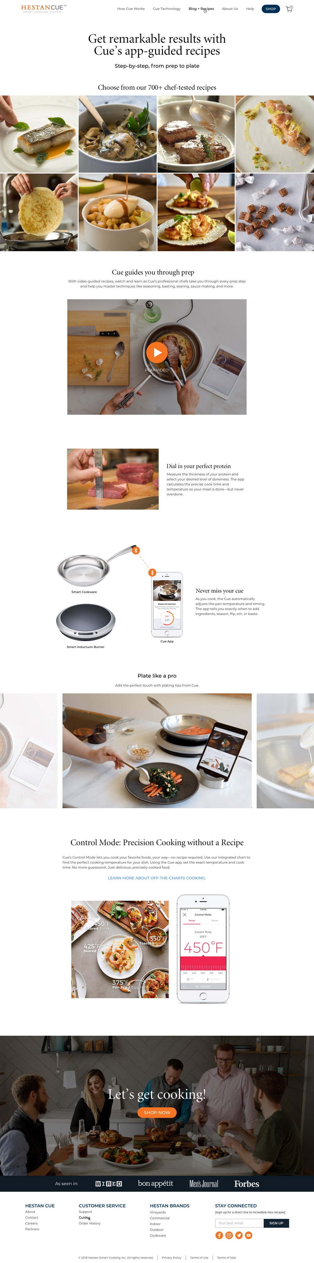
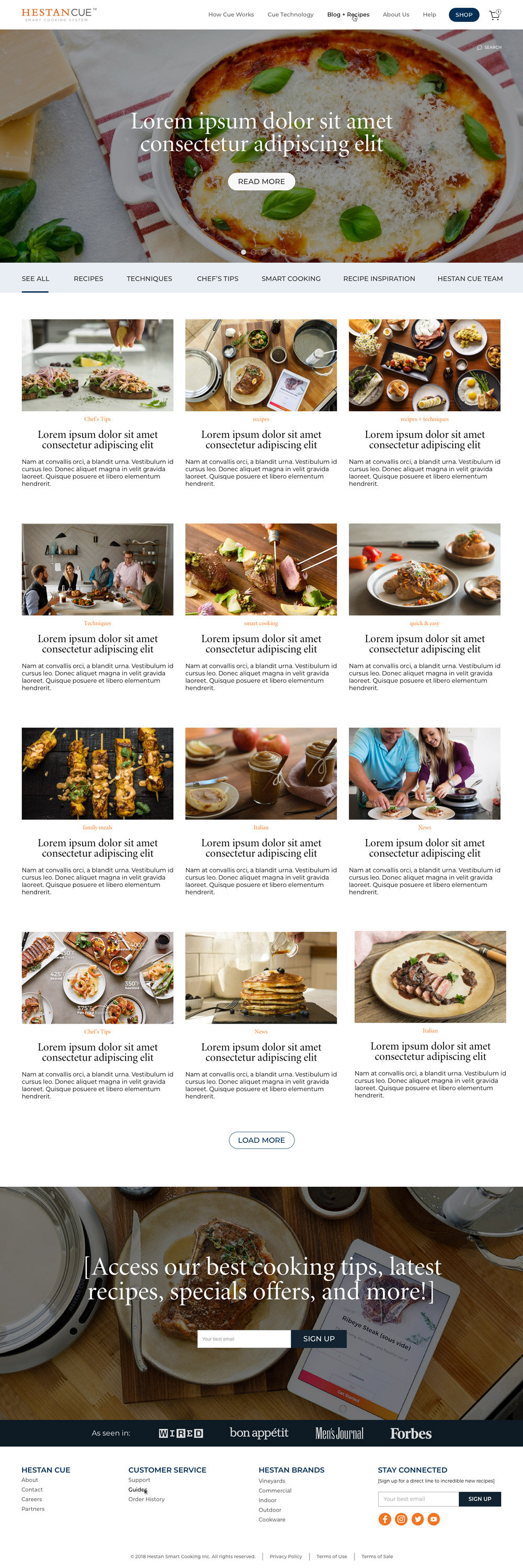
Blog Overview
A substantial part of the value Hestan Cue delivers to its customers is an extensive library of gourmet recipes created by some of the world’s best chefs. Their blog was designed to showcase beautiful photos of mouth-watering cuisine and enable hungry readers to easily find their next culinary adventure in a large collection of articles and recipes.

Blog Post Template
The Hestan Cue blog is an information resource for existing customers as well as a lead-generation tool for people who discover the company through their SEO marketing campaigns. The structure of the blog post template has been designed to facilitate these functions and an engaging journey through more of the website‘s offerings.

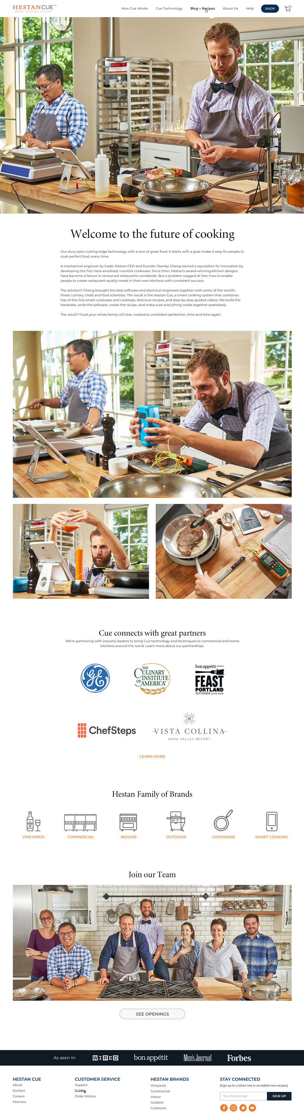
About Us
The purpose of the About page is to give specific information on the Hestan Cue team as well as a high-level overview of the extensive offerings of their parent company, Hestan Culinary. It’s also an invitation for interested parties to apply for positions that the company has open.
Final Designs
Home Page

How it Works
Blog Overview
Blog Post Template

About Us

Sleep Metrics
UX/UI Design | ecommerce | illustration | design strategy
YEAR: 2018
The Client: Sleep Metrics is an industry leader in providing CPAP (Continuous Positive Airway Pressure) tests and equipment for people experiencing sleep apnea.
My role on this project: UX/UI Design, Discovery Research, Visual Design, Illustration
Project Objective: Sleep Metrics needed a more humanized and welcoming brand experience to stand out in a field of competitors whose offerings were cold and even off-putting. They were also expanding their business model to include a mail-order service. We accomplished all of this while also navigating the complexities introduced by requirements of various manufacturers and the medical industry (e.g., HIPAA compliance).
User Personas
“As little as possible, as much as necessary” is my battle cry for all things design, and we took that approach in creating Sleep Metrics’ user personas. The user base for sleep apnea therapies is very extensive (as health doesn’t choose humans based on demographics or psychographics), but we were able to whittle it down to 5 customer personas and one doctor persona.
Click images to enlarge.
Diagram of Desires
This diagram shows the desires and needs that are unique to each persona as well as where there is overlap between different patients.
User Flow
This chart demonstrates the various flows and use-cases for our user personas.
Site Map
After identifying user personas and user flows, we’re ready to lock in the new website’s site map.
Wireframes
With all of that locked into place, it was time to collaborate with the Creative Director. She has a background in writing + editing and worked with a team of copywriters on the brand’s voice and website content. I was brought up to speed with the content strategy and copywriting and determined how it would all be best supported in the UI.
Home Page

At Home Sleep Test

Product Detail Page

Physician FAQ Page

Functionality Map
As part of the wireframing process, I created a functionality map to ensure that all user behaviors and needs were being effectively addressed.
Visual Design Keywords
One of the many things that our discovery interviews and research informed was a collection of keywords that were used to guide the voice in our copywriting and personality and tone of our visual designs. These are the keywords that captured what the client was eager to convey and what would set Sleep Metrics apart from their competitors.
Brand Ambassador
One of the particularly offputting (and even kind of disturbing) elements of a lot of Sleep Metrics’ competitors was their habit of using photos of people wearing CPAP equipment. Sure, that’s what it looks like, but there are better ways to humanize the experience for sleep apnea patients.

Competitor Photo

Competitor Photo

Competitor Photo

Competitor Photo
So my recommendation was to create a friendly character to be the Sleep Metrics ambassador. The character could be used to convey and address topics that look silly or deeply unpleasant when showing people in those situations, and it could add a level of warmth and playfulness to an understandably heavy topic.
Brand Ambassador Design


Brand Ambassador Auditions
Final Visual Design
This is where everything comes together in a visible, tangible, delightful, usable way.

Prototype Linking
This shows the interconnectivity that was implemented for the prototype that our internal team and client reviewed in Marvel.


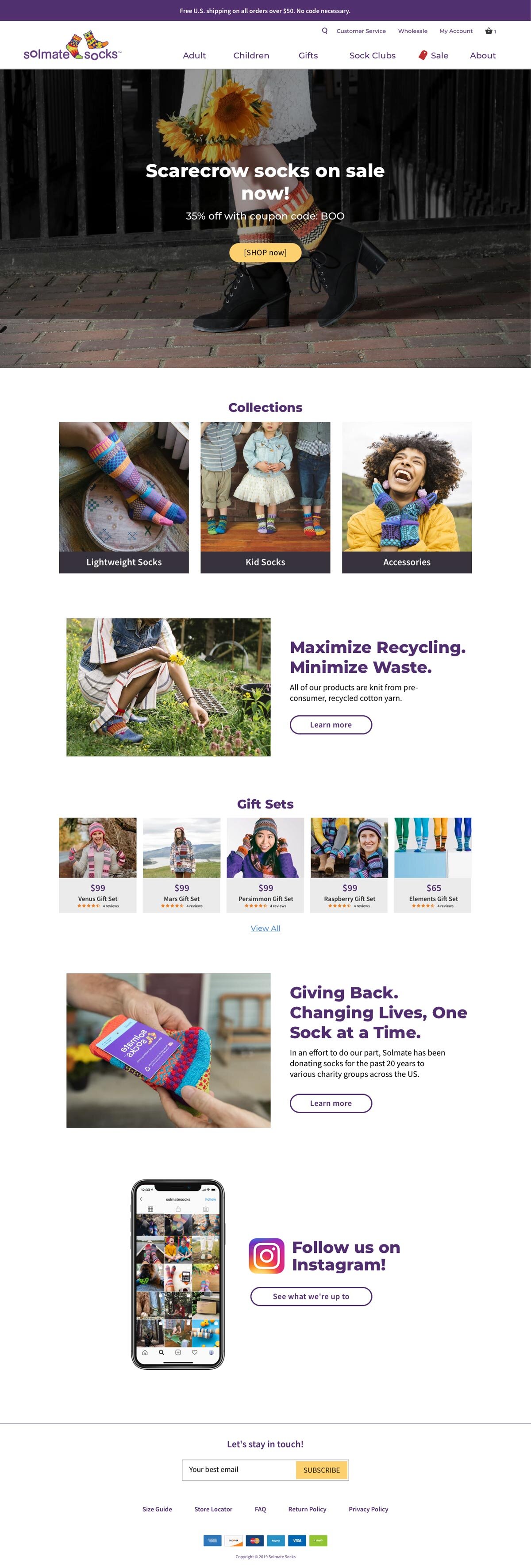
Solmate Socks
UX/UI Design | ecommerce
YEAR: 2018
The Client: Solemate Socks is a delightful Portland-based manufacturer of high quality, durable, and sustainable socks.
My role on this project: UX/UI Design, Discovery Research, Visual Design
Project Objective: Solmate Socks makes genuinely wonderful socks, but their ecommerce website wasn’t providing a wonderful experience that matched. The project’s goal was to modernize the site’s functionality, polish their onsite brand presence, and increase the site’s appeal to a more tech-savvy demographic. All without disrupting the experience of their existing fanbase by introducing anything shockingly new.
Measuring the Impact


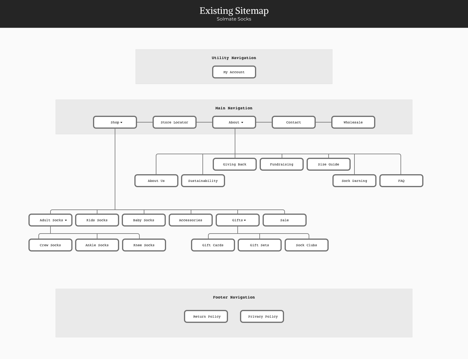
Streamlining the Site Map
The original site had a lot of great content, but it had come together in a way that didn’t provide an intentional path for visitors to follow through the site. It was likely that visitors wouldn’t be able to find what they were looking for or wouldn’t become aware of all the cool stuff Solmate Socks is up to. This was dramatically improved with the revised site map.

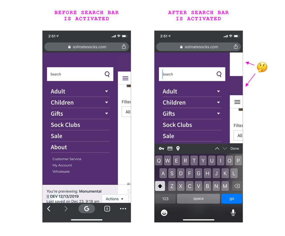
Improving the Website’s Responsiveness
Like most sites, the homepage hero area featured a photo, headline, and CTA (call-to-action) button. However, the mobile design was confusing. The photo — which looked big and beautiful on desktop — was shrunken on mobile. And the text — rather than being displayed on top of the photo — was put into a plain gray box just below it.
In the updated design, the image scales appropriately, the text and CTA button are included in the expected location, and everything meets the WCAG (Web Content Accessibility Guidelines) requirements.
Before: Original Design
Hero image wasn't responsive

After: Design Improvements
Proper responsive goodness

Helping the Products Stand Out
With the amount of content on the Solmates homepage and how it was structured, it was very easy to miss the products being highlighted. Additionally, only two products were displayed on the screen at the same time. The improved layout makes the difference in content-types clear and allows several products to be displayed at once.
Before: Original Design
There was a lot of content on the home page, but very few products being featured.

After: Design Improvements
We increased the number of products featured and introduced a new highly scannable visual convention.

Improving Legibility & WCAG Compliance
Website accessibility is as important as that of physical stores and locations. The previous convention of text being overlaid on top of images resulted in many instances where the category label was virtually invisible.
Before: Original Design
The existing website was using a convention of white text on top of images, which had several WCAG (Web Content Accessibility Guidelines) issues and also rendered some content virtually invisible.

After: Design Improvements
The updated design passes WCAG requirements and also increases the page's scanability.

Improving the Instagram CTA
Instagram is a key component of Solemate’s overall marketing strategy, and their presences there is lovely and engaging. But the existing CTA (call to action) design on their site was confusing and easy to miss.
Since the intention of this content block is to compel users to follow Solmate on Instagram, we wanted this to be immediately apparent to visitors.
Before: Original Design
The original Instagram feature was confusing and looked broken.

After: Design Improvements
A more eye-catching design and increased incentivization to click through to Instagram

Desktop
Before: Original Design

After: Design Improvements
Product Detail Page
Before: Original Design
(Mobile)
(Mobile)

After: Design Improvements
(Mobile)
(Mobile)

Before: Original Design
(Desktop)
(Desktop)
After: Design Improvements
(Desktop)
(Desktop)

QA Feedback for Developers
Ryan M. Snufflemuffin
Illustration | Animation | Print Design
YEARS: 2017–PRESENT
The Client: This is a personal brand of mine. I create content for children who need love, support, encouragement, and to be empowered to be their best selves. The main philosophy I explore with this work is “Choose who you’re going to be on purpose.”
My role on this project: Visual Design, Illustration, Writing, Animation, Voice Acting, Song Writing & more.
Project Objective: There’s a lot of pain in the world, and while I can’t remove all of what’s creating it, I can definitely contribute beautiful things to help counterbalance it. The only way to counter darkness in the world is to cast light into the environment, and this collection of work represents some of what I’m doing to help with that effort.
This work includes comics, animations, character creation, and delightful products like cards, stickers, and posters.
Brand Keywords

Snufflebear's Guide to Life
This is my first cartoon. I wrote the script, created the artwork, provided voice acting, recruited a few friends for additional voiceovers, wrote and recorded the soundtrack, and learned After Effects while animating it. It was a very involved, educational, and fulfilling project.
Cartoon Trailer

Cartoon Feature
snufflemuffin.com
Cute stuff for cute people
A collection of products and miscellaneous assorted random cuteness I feel compelled to share with the world. Tap here to see more.

Snufflemuffin Products
Here are a few products that I offer on snufflemuffin.com. These are original photos that I took.


Cuteness & Pareidolia
Pareidolia is a delightful perceptual anomaly where one sees faces in random patterns and inanimate objects. I see faces and critters with personalities everywhere I go. It's something I enjoy, and pointing them out is a great way to share delight with others, too. :)

Affirmation Grab Bag
These are a few screens from a social media video where the viewer takes a screenshot of a rapidly transitioning slideshow to see which message they get.
Tap here to see the video on Instagram.
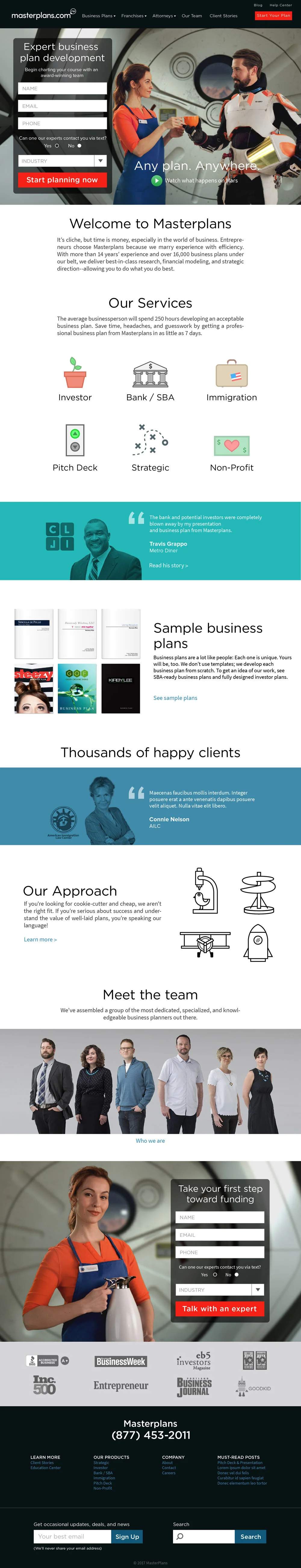
Masterplans
UX/UI design | wireframing | design strategy | illustration
YEAR: 2016
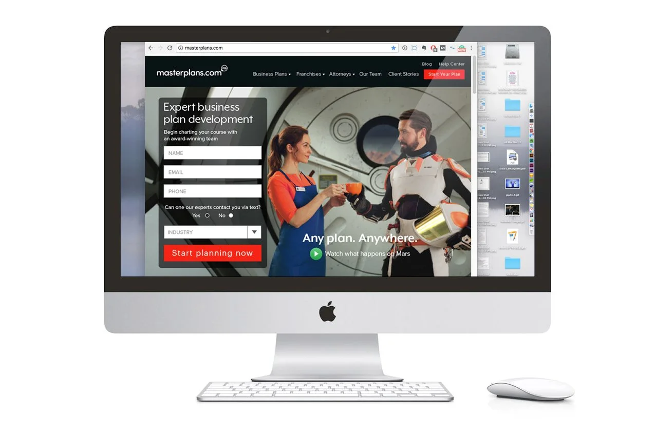
The Client: Masterplans is an Inc. 500 business plan writing company, & the leader of their industry.
My role on this project: UX/UI Design, Discovery Research, Visual Design
Project Objective: Masterplans was coming up on their fifteenth anniversary of being in business, and they weren't seeing the growth in engagement and sales that they wanted. As part of a major reboot, I worked with their core team to rebuild their brand identity and implement a highly effective new website.
The identity and website needed to reflect not only the passion and expertise of the team, but to better convey the high-quality of their services, differentiate them more clearly from their competition, and create a memorable impression.
Before we get into the design process, here are some of the results they experienced in the first two weeks of their new website and branding's launch:
Measuring the Impact


User Personas
To establish where the project needed to go, I conducted discovery interviews with key stakeholders and then distilled portions of the data I gathered into these personas. These personas represent the real-world needs of their core demographic and marketplace, and everything that follows was designed to speak to these individuals.
Site Map
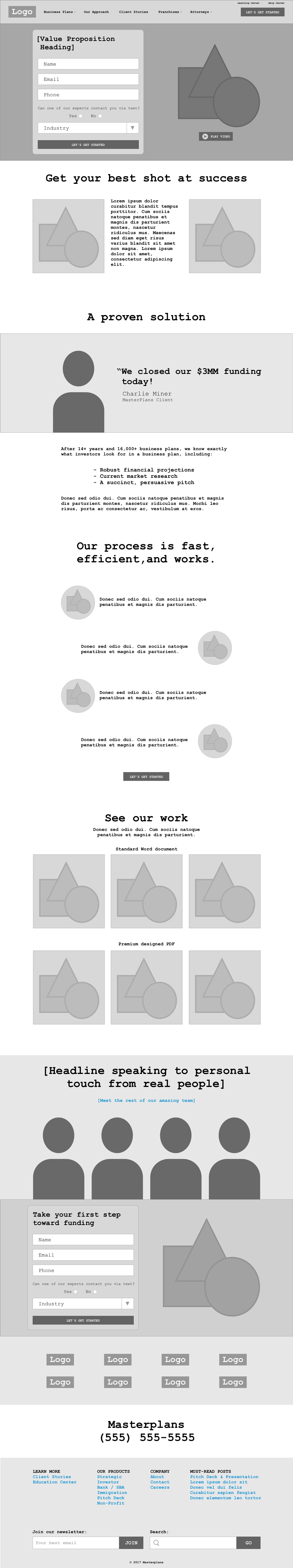
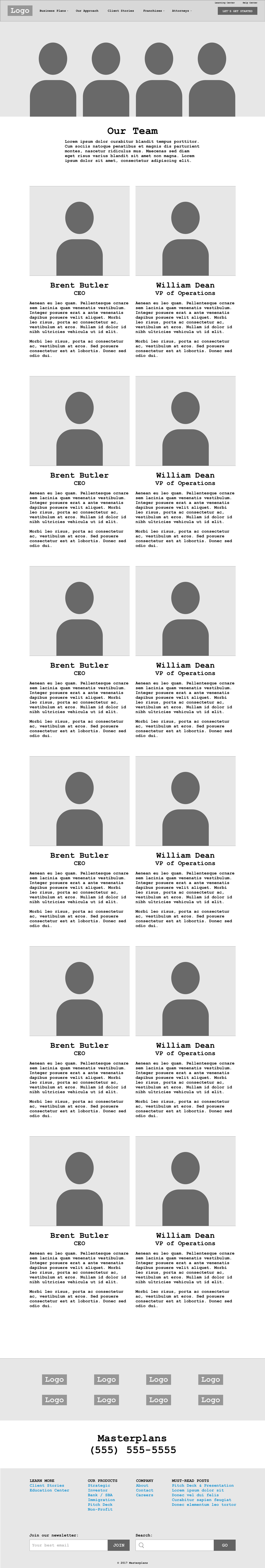
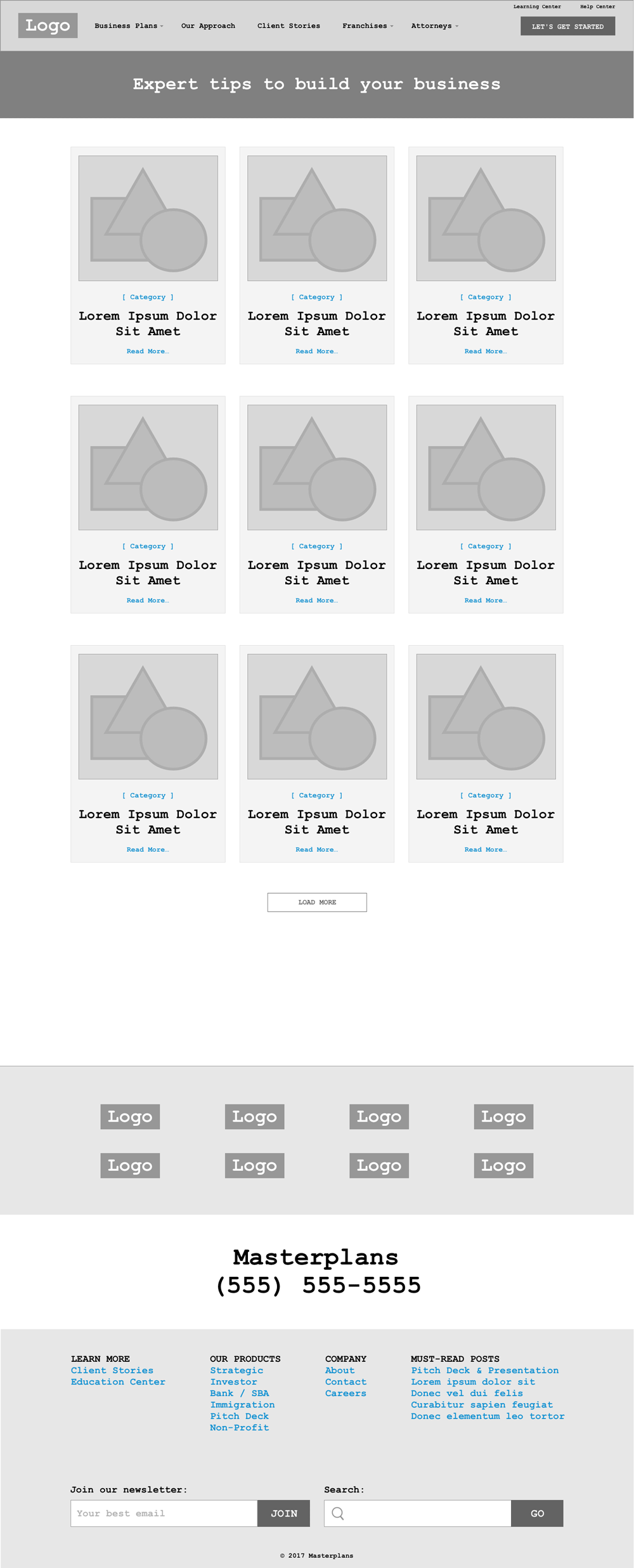
Wireframes
Here are a few examples of the process that went into planning the layout, structure, and flow of the website—long before any visual design pixels hit the screen.
Home
Our Team
Blog Overview
Blog Post Template
Visual Design
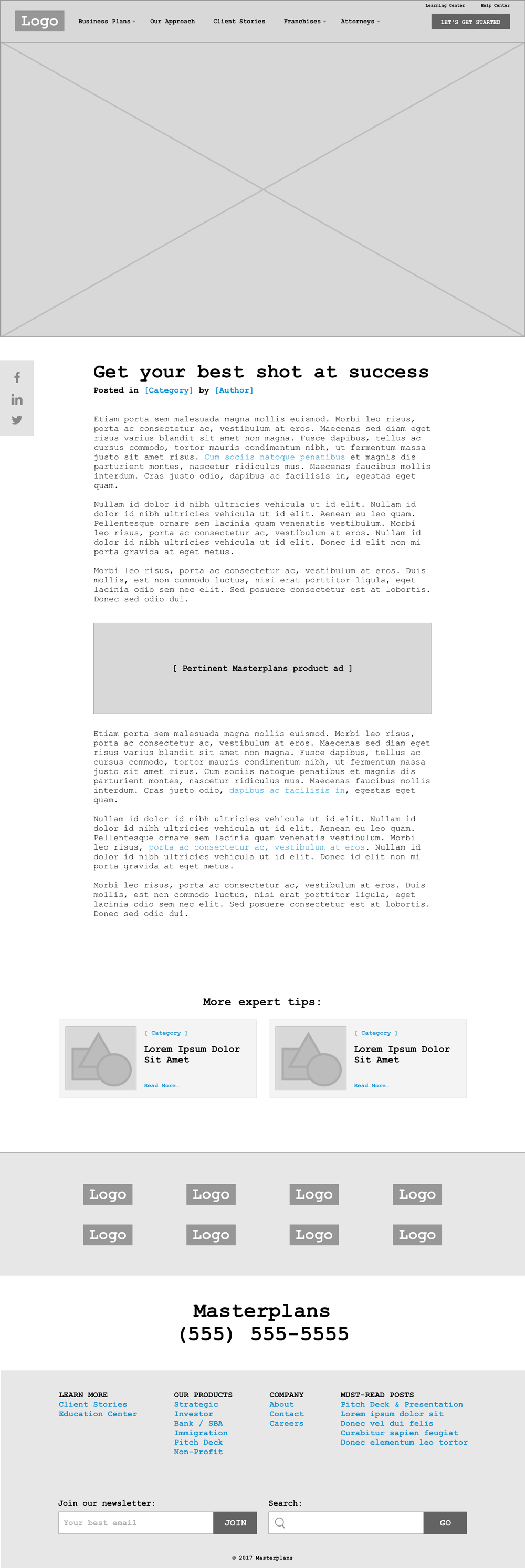
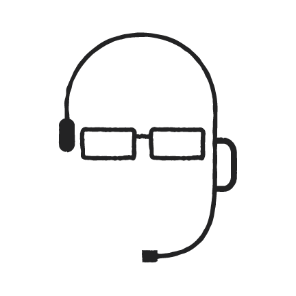
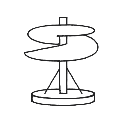
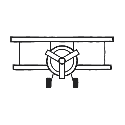
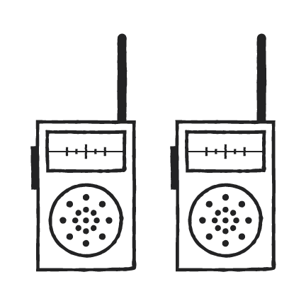
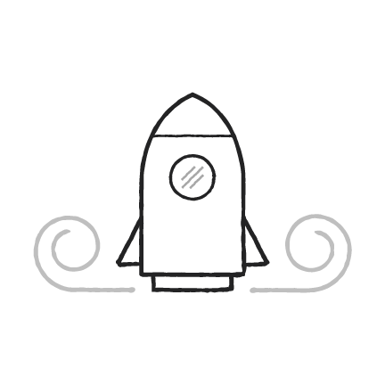
Our Approach Icons
These icons were created to represent the various stages of the Masterplans process, and to add a personable feel to the brand.
1. Kick Off Call
4. First Draft
2. Research
5. Revisions
3. Collaborate
6. Final Business Plan
Our Process Icons
"A project manager will lead your business plan team"
"We never miss a deadline"
"Have your plan in as little as 7 days"
Final Website Design
Here is how the overall rebranding and wireframing came together in the final designs.
Home Page
Mobile Layouts
Home Page

Our Approach

Product Page

Display Ads for Launch Advertising
Various display ads were created to support marketing efforts that direct potential customers to discreet landing pages based on their specific business interests. Here are a few of those ads.

Muse Storybuilder
UX/UI Design | wireframing
YEAR: 2016
The Client: The Muse Storybuilder is a web application that empowers filmmakers to tell more effective stories.
My role on this project: UX/UI Design, Discovery Research, Art Direction, Visual Design
Project Objective: The design, development, and release of the Muse Storybuilder was a watershed event for the new company that Patrick Moreau was building. It's a web application unlike anything else on the market and is based on the Muse Storytelling process. This process was developed by Moreau and the other principals of the 5-time Emmy Award-winning firm, Stillmotion.
The application needed to be immediately familiar to professionals who were already versed in industry-standard video editing software, distill the great complexity and power of the Muse storytelling process into an intuitive interface, and help teach the process itself through its use.
It was a huge challenge, and we were extremely successful in its execution.
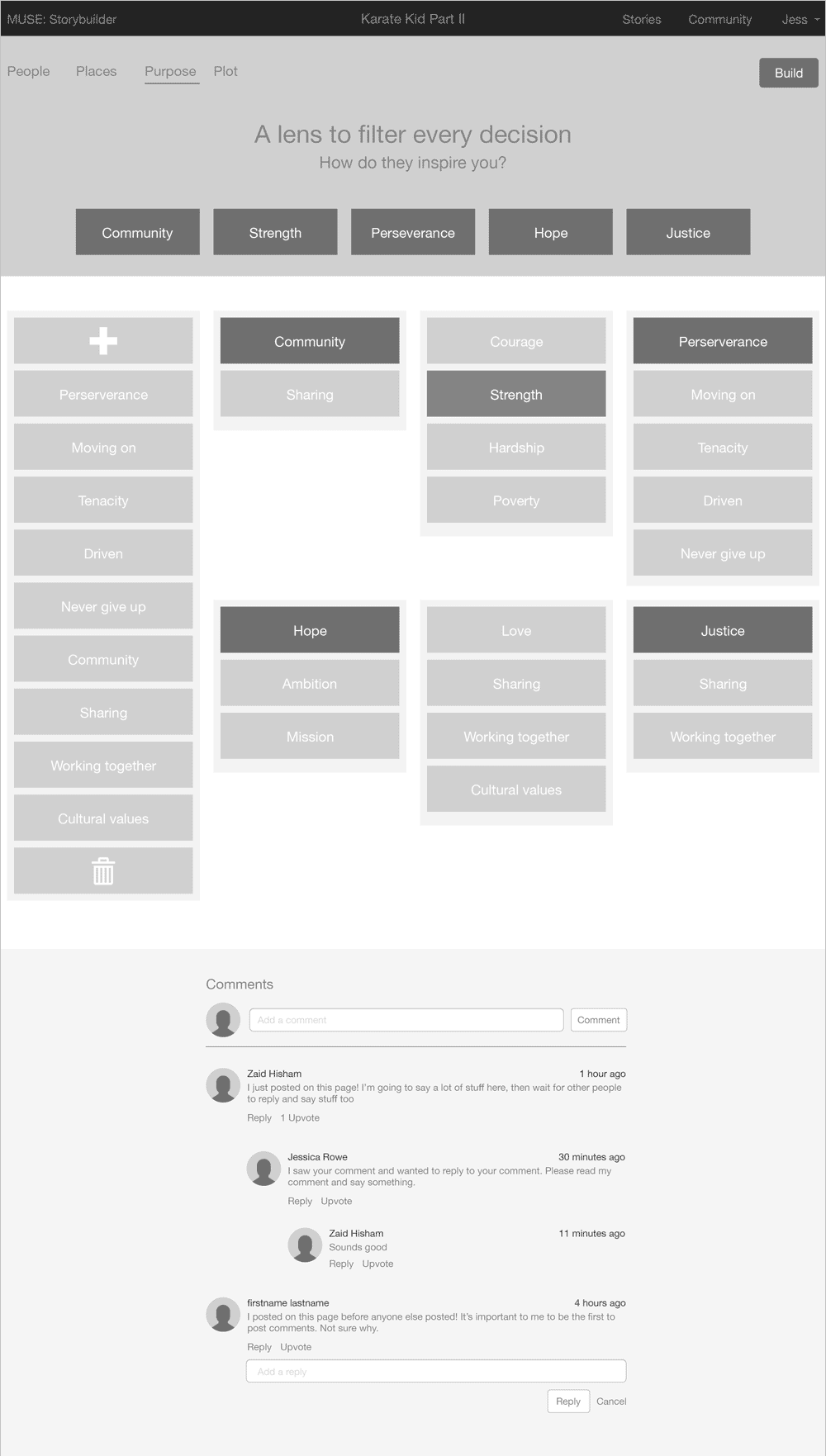
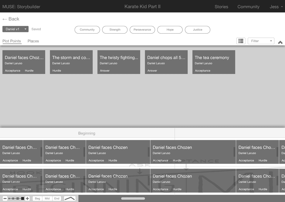
The 4 Pillars of Story: UX Design
In the Muse Storytelling process, there are 4 Pillars of Story: People, Place, Purpose, and Plot. The project began with identifying the key functions, layout, and elements through wireframing. These wires were created in collaboration with Zaid Hisham.
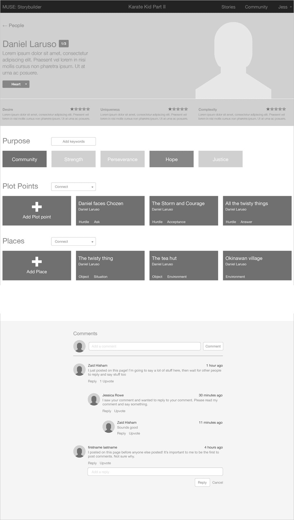
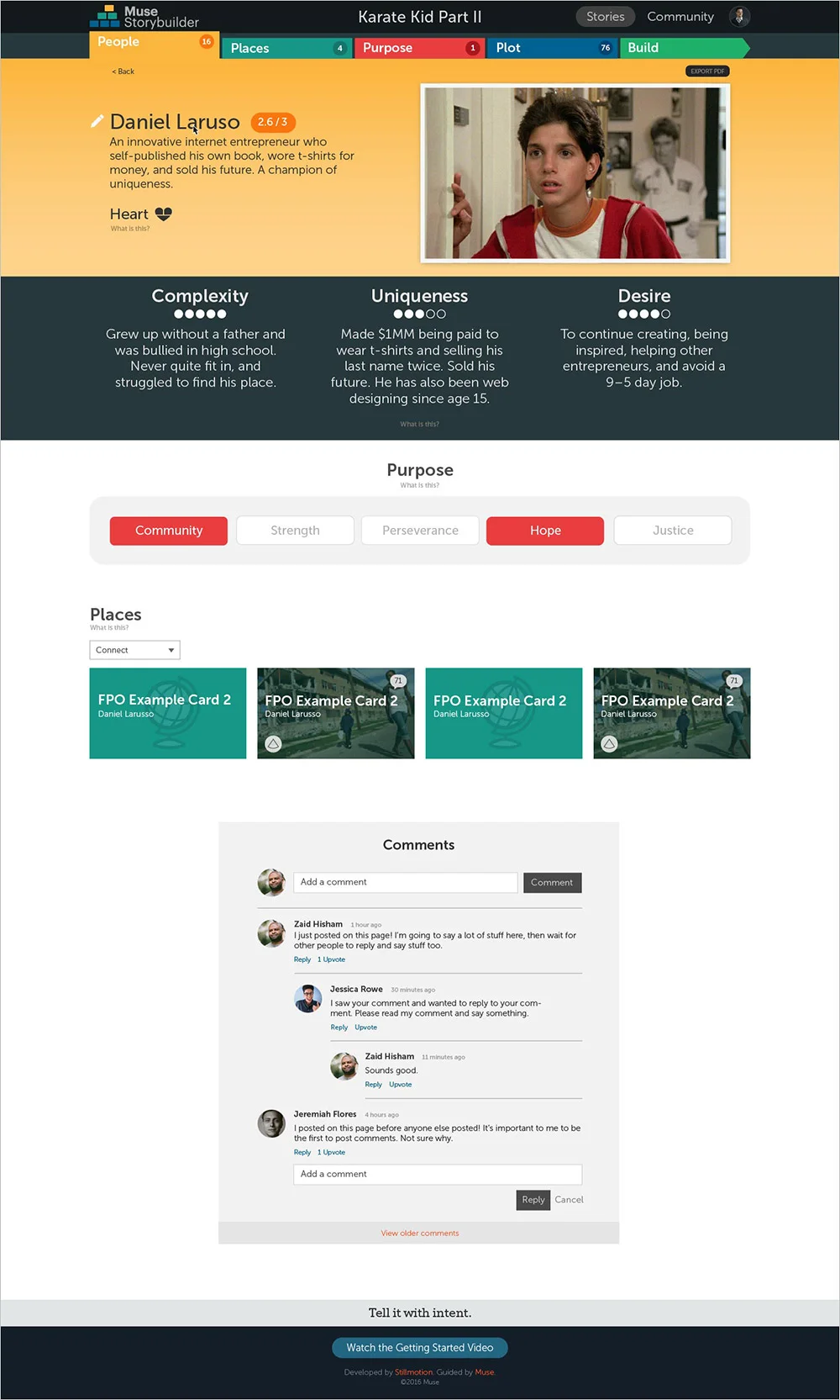
Character Detail View
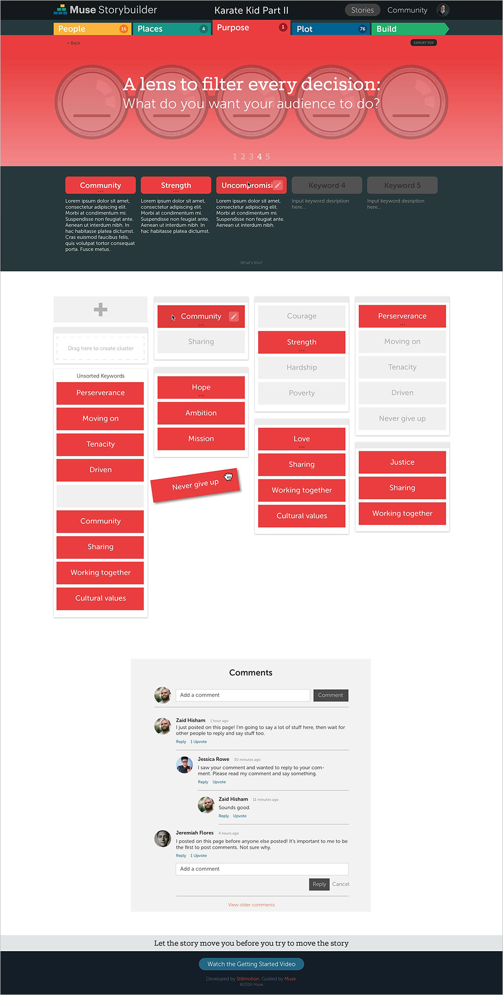
Keyword Discovery View
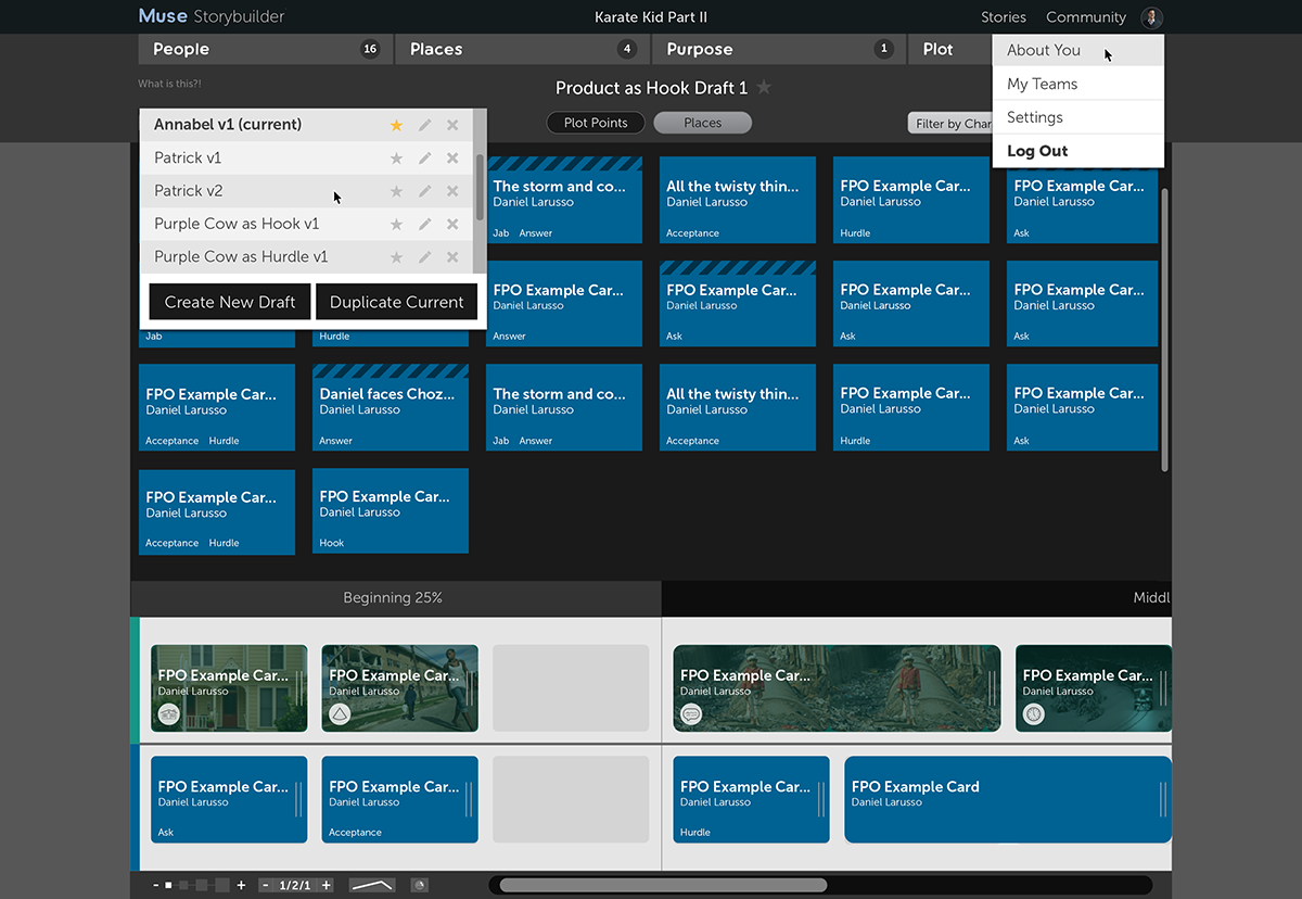
"Build Mode"
The Four Pillars of Story: UI Design
These thumbnails show the overview pages for each pillar.
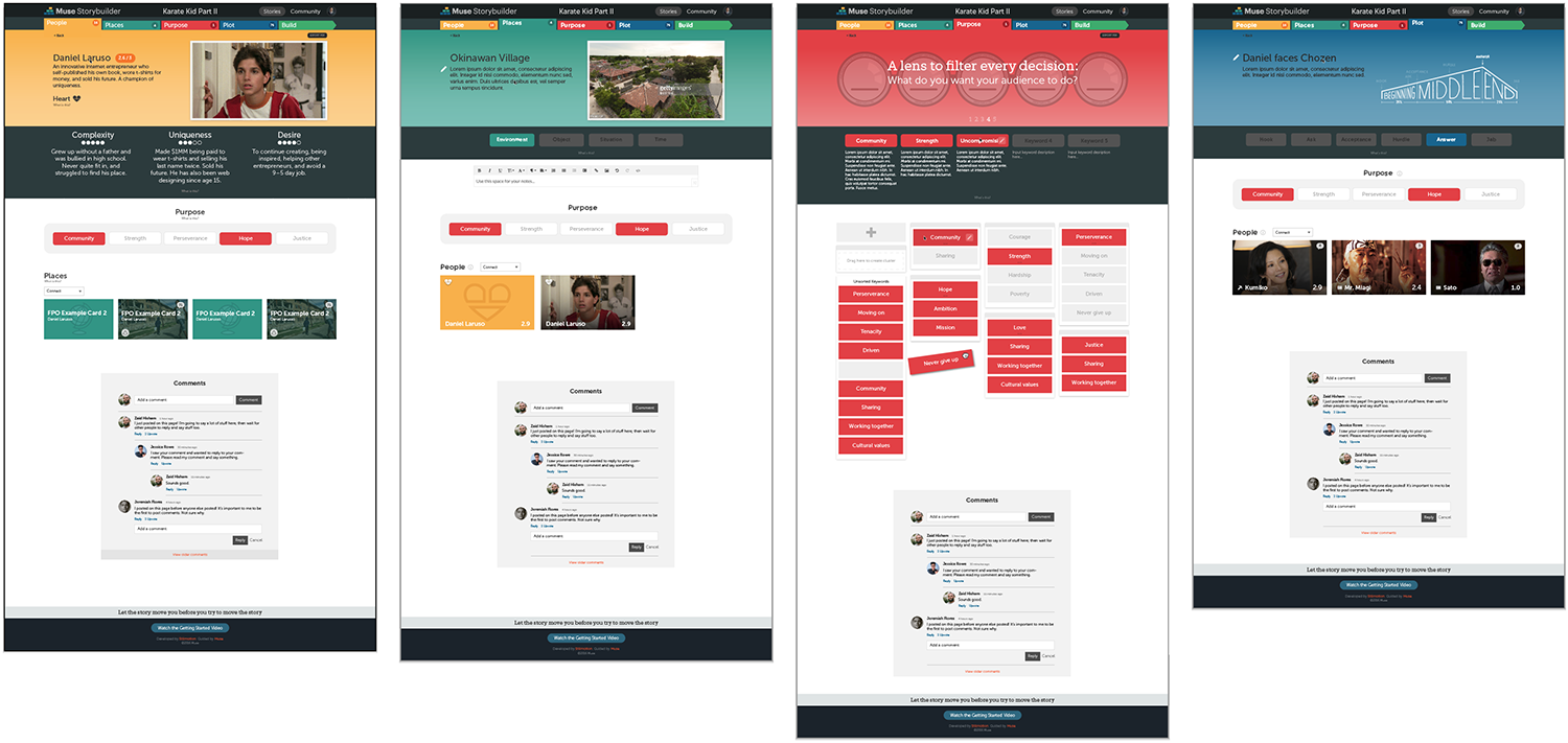
The People Pillar
The Muse Storytelling process is for telling stories about people. People are what we most relate to, and the People page is where a storyteller begins building out their potential characters.
The Purpose Pillar
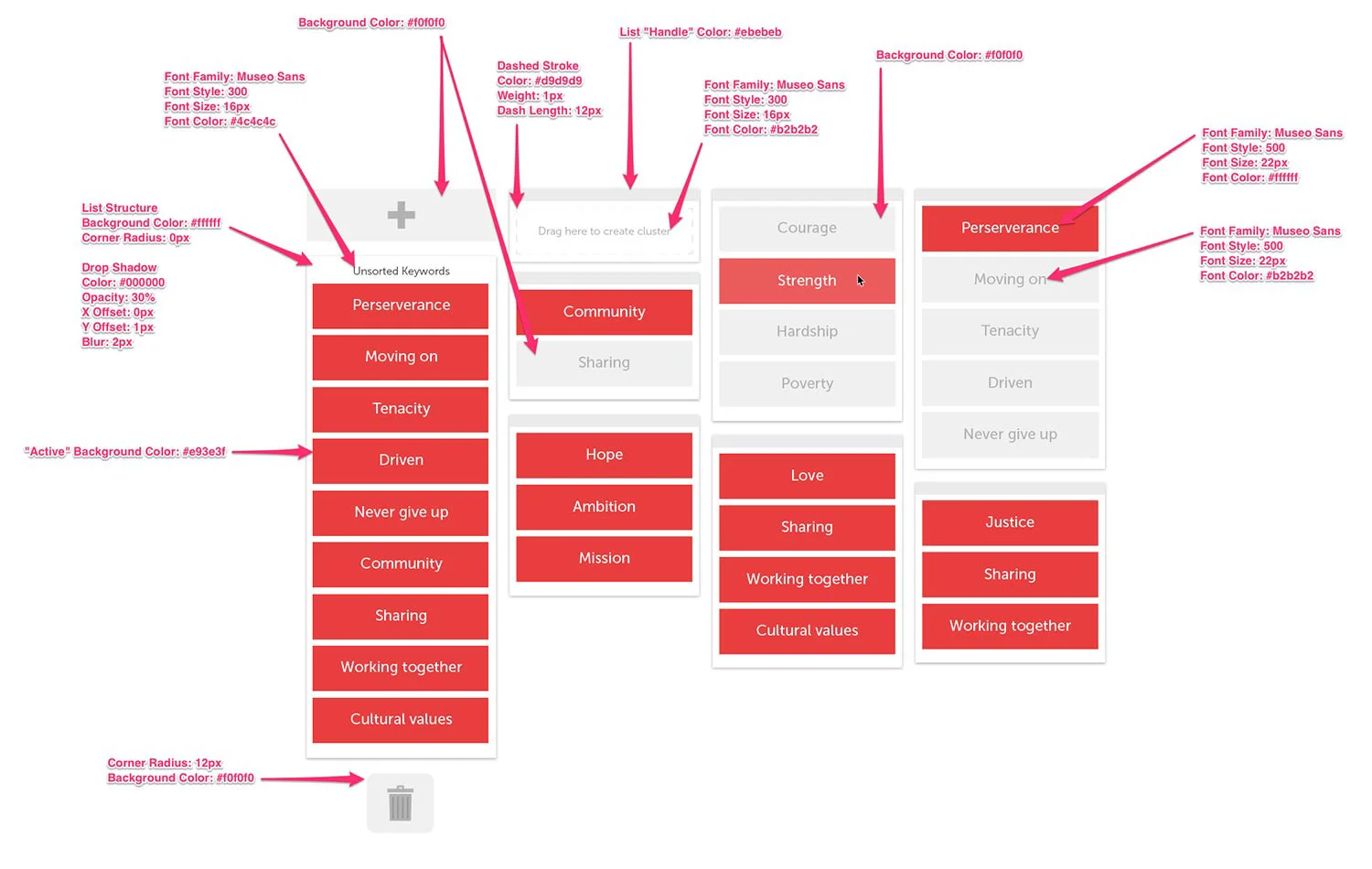
If you're not sure what you're trying to say, you're probably not going to say it well. So the Purpose page assists the user in brainstorming, selecting, rejecting, and making notes on the various Keywords that might guide the creation of their story.
As the user inputs potential keywords, small tiles are created with drag-and-drop functionality (similar to Trello) for sorting them into clusters. :)
Place & Plot Pillars
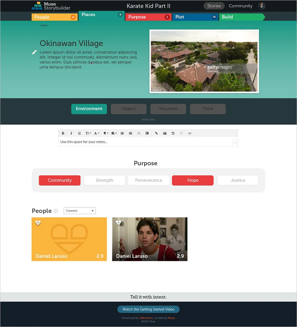
These are the last two Pillars in the Muse framework. The Place page is where a storyteller creates cards that represent the various locations and objects they're considering for their story (e.g., Mr. Marmalade's Ice Cream Parlor). The Plot Pillar is where they identify the potential plot points, or the "beats" of their story (e.g., Billy encounters a chubby baby duck at the ice cream shop).

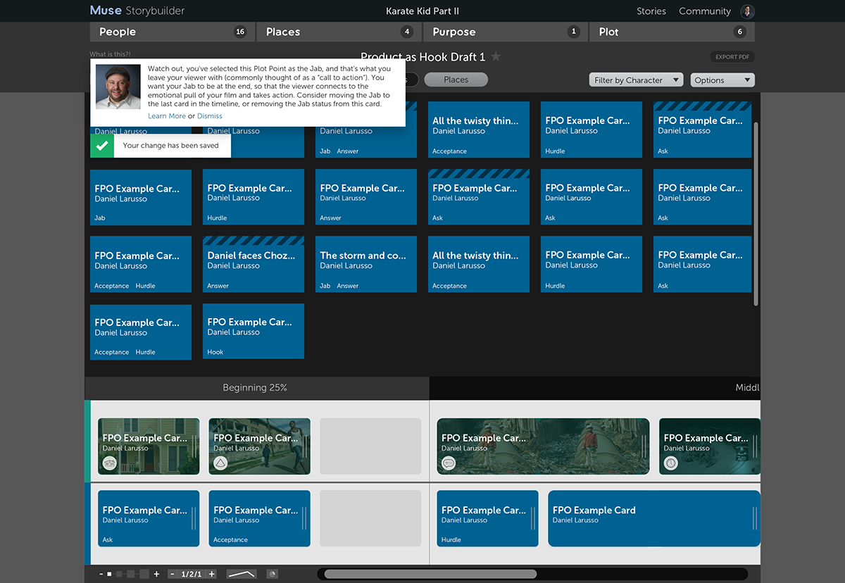
Putting All the Pieces Together: Build Mode
This is where the rubber really meets the road in Storybuilder. All the elements that a user created in the earlier stages come together here to build the final story.
The interface of the Build Mode is achromatic so that it essentially fades into the background and allows the color convention of the cards (which reference their corresponding "Pillar") to shine through.
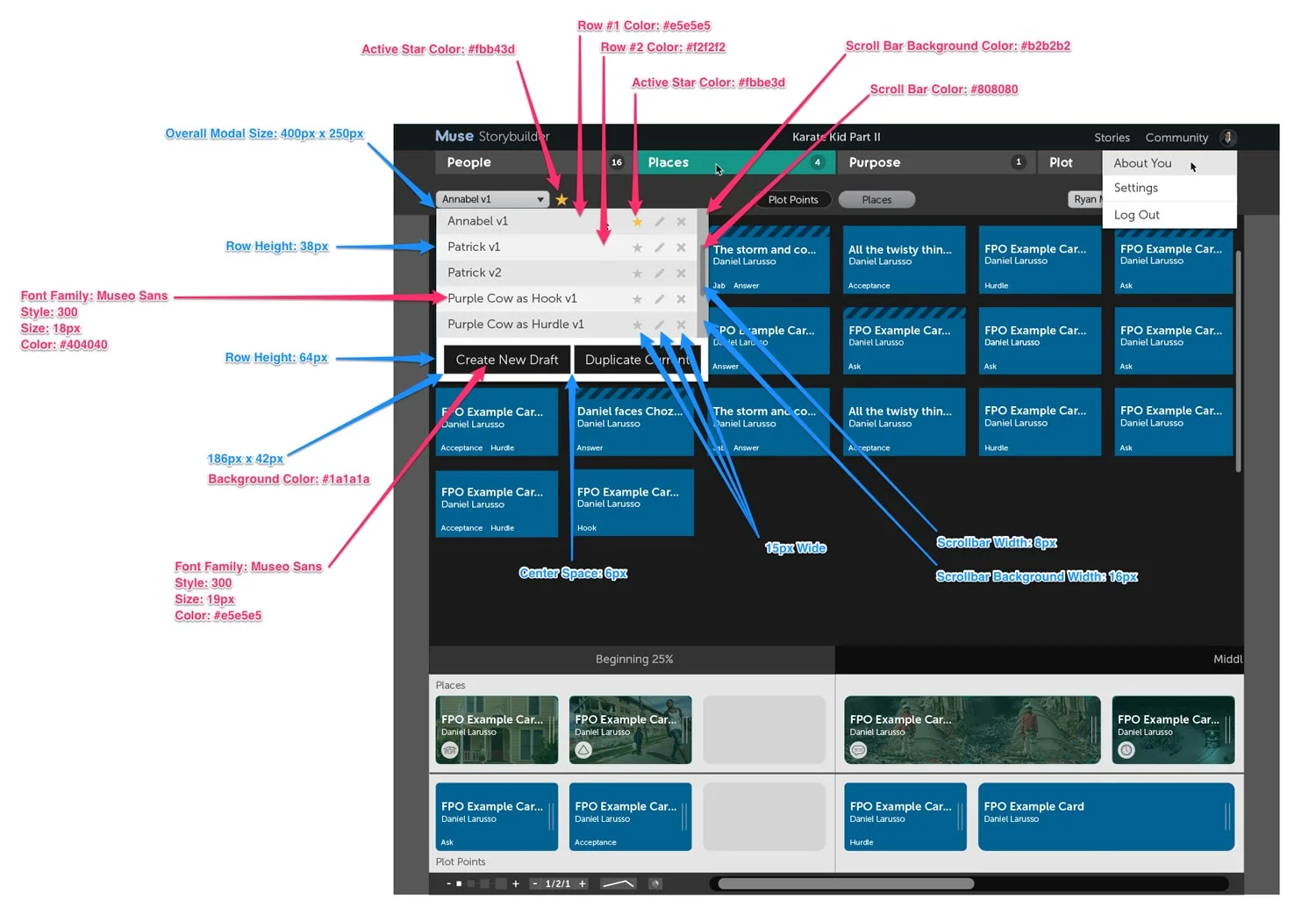
There are a lot of powerful features in this li’l puppy. The slideshow below shows a few of its features, as well as the design grid it's based on.


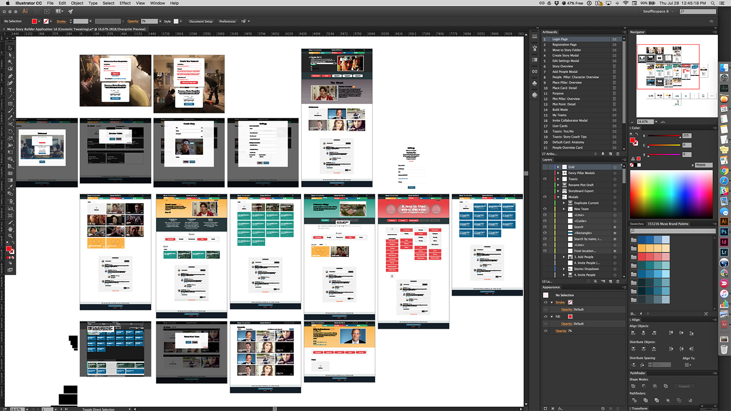
UI Creation
Here's a screenshot of the Adobe Illustrator document where I created the Muse Storybuilder.
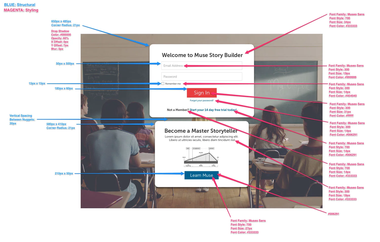
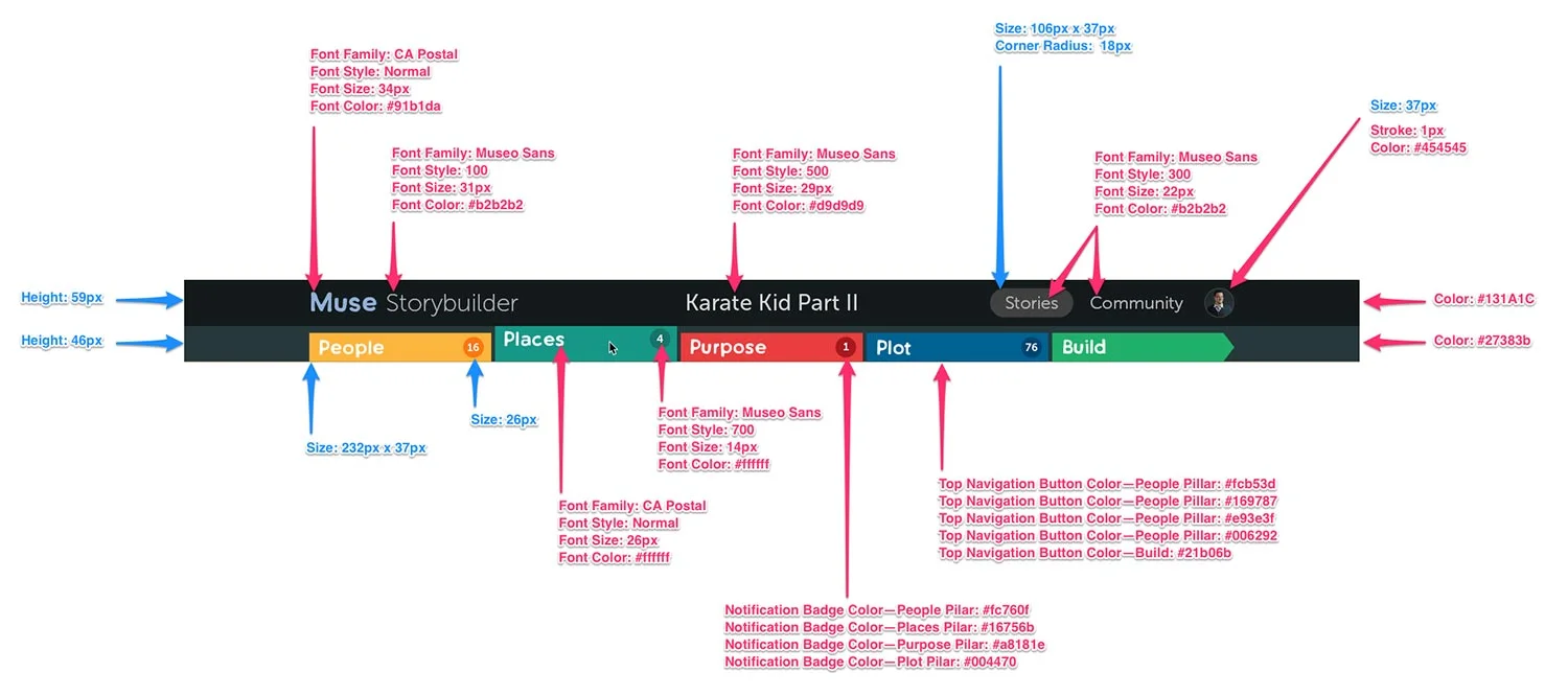
Annotations for the App Developers
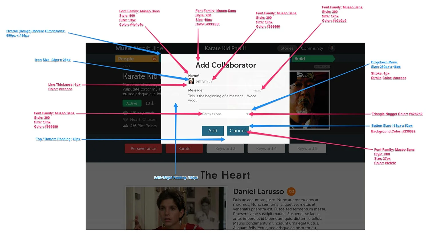
I am very meticulous, and it's really important to me that the other people on my teams have what they need to do their jobs well. To that end, I always deliver detailed annotations with both structural details and the corresponding CSS code for developers.
Here are a few of the annotated designs that I put together for the Storybuilder.
Founder Testimonial
“As the co-founder of Muse Storytelling and Stillmotion, two companies that have worked with hundreds of designers in our 10+ years, Ryan is without a doubt one of the most talented folks I’ve ever worked with and we were incredibly fortunate to have him shape our brand.
He’s incredibly detail oriented, is always ensuring that he’s considering the bigger picture, and has a rare talent for bringing intention and purpose to everything he crafts.
I’ve never worked with an Art Director or Designer that brings the same level of passion and commitment to what he does as Ryan.”
Patrick Moreau
Co-Founder of Muse Storytelling & Stillmotion

Manifest Insights
UX/UI Design | Wireframing | Illustration
YEAR: 2014
The Client: Manifest Insights is a consulting firm and software development company that offers business intelligence solutions.
My role on this project: UX/UI Design, Discovery Research, Visual Design, Illustration
Project Objective: Manifest Insights needed a new website. Their primary SAAS offering had a complex feature-set that wasn't being effectively presented to their potential customers. The new website needed to highlight key features of the software, convey the company's personalized services that differentiated them from their competitors, and present it all in a friendly yet professional light.
I worked closely with their team to clarify their messaging, create new copy, and develop custom iconography. In the end, everything came together in a fresh and charming new website that hit all of our project's goals.
Preexisting Website
The client wanted to keep the same basic brochure-style structure they were currently working with, but ramp up its efficacy.

Website Wireframe
I got to work fleshing out the basic structure of the page. This communicated the new direction to the client, his developers, and gave the marketing strategist important direction to reference and work from in her efforts.

Mood Boards
Mood boards were created to convey the visual design direction for the new website.


Icon Design
I created a series of icons to showcase key features of the platform and lend a friendly and playful tone. Here are a few examples of original sketches and the final icons.


Final Design


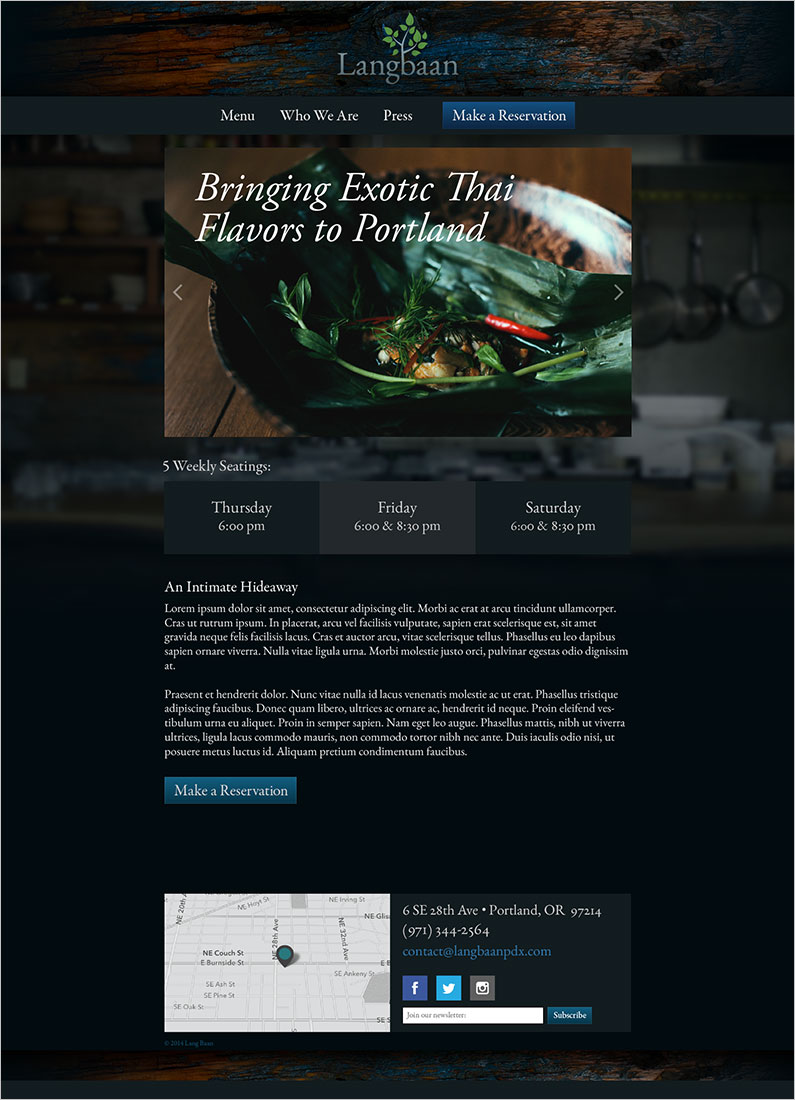
Lang Baan Website
UX/UI Design | Wireframing
YEAR: 2015
The Client: Lang Baan is an award-winning Thai restaurant in Portland, Oregon.
My role on this project: UX/UI Design, Discovery Research, Visual Design
Project Objective: Lang Baan was voted the “2014 Restaurant of the Year” by Portland Monthly Magazine. It was experiencing a huge period of growth following this well-deserved bit of press, and owner Earl Ninsom needed a website that could keep up with the needs of his diners and restaurant staff.
The new website's job was to present the restaurant's uniqueness, make the menus easily accessible, streamline the process of booking reservations, and save time by simplifying his staff's workflow.
Wireframes
These are a couple of my hand drawn wireframes from the planning phase of this project.

Mood Boards
The mood boards consisted of photos I took of the restaurant's interior. The intention was to create an impression of how dining at Lang Baan feels, & these photos inspired the visual design.


(Photo of Earl Ninsom by Christine Dong)
Landing Page
And here is where it all came together in the final designs!
Who We Are Page

Menu Page

Responsive Layouts


The OMG Friends!
UX/UI Design | Illustration | Print Design | Photography
YEARS: 2011–2014
The OMG Friends are a family of pocket-sized adventure plushes that I created, mass-produced, and developed into a product line.
My role on this project: Creative Direction, Web Design, Print Design, Photography, Illustration, Branding, Character Design
Project Objective: To create a brand and eCommerce website that delighted, enticed, and introduced the world to a new and beautiful family of wonderful products.
This was a mammoth project that I worked on full-time with angel investors for two years. Strap in, because there's a lot of cuteness below.
omgfriends.com
Examples of the eCommerce site where the OMG Friends were marketed and sold.
Brand Identity
The OMG Friends logo was designed to embody the delight and excitement that people express when first seeing the critters. I created a custom typeface for the word "friends" to lend a friendly and handmade feel to the logo.

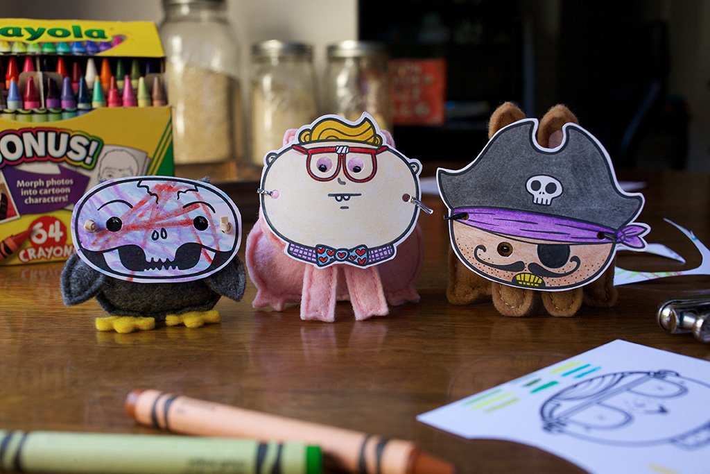
Sgt. Peepers the Adventure Owl
This is Sgt. Peepers the Adventure Owl. He is a seasoned world-traveler whose favorite means of transportation is riding in pockets.
Butterscotch the Adventure Bunny
This is Butterscotch the Adventure Bunny. He enjoys candlelit cabbages and long walks along produce departments. He can frequently be heard asking “what’s for dinner?” and “are you gonna eat that?”
Truffles the Adventure Pig
This is Truffles the Adventure Pig. She loves warm socks, pancakes, books about quantum mechanics, and going to the library. It's not uncommon to hear her say things like “Do you have a library card? Let’s go get some books! Oooh! and french fries!”
And in case you're wondering, that is a tiny glass of milk and miniature books that I made. :)
Shipping & Retail Display
The OMG Friends traveled to their new homes in stylish cardboard boxes, and congregated in retail shops in the beautiful wooden boxes you see below.
Plushes to Illustrations
Most of my work begins with sketches, but I designed the OMG Friends through a process of iterating hand-sewn plushes. I eventually had to work my way backwards and figure out how to draw 2D versions of what I'd only known as 3D critters.
Scout Books & Postcards
I love finding old journals and getting to review what my life was about back then. That was the inspiration for these OMG Friends Scout Books. Each Adventure Journal has 32 blank pages, that are perfect for recording bits of epic journeys and general life-bits, and they’re high-quality, meaning they’ll be around for years to come. :)
Doernbecher Children's Hospital Donations
I had the opportunity to donate a few hundred OMG Friends! to Doernbecher Children's Hospital on Christmas Eve. Stuffed animals weren't going to cure what was ailing any of those precious wee ones, but love and delight are excellent medicines, and the OMG Friends! had a lot of both to give.
Miscellaneous Cuteness


Related Project
Be sure to check out the OMG Friends' Halloween Mask Activity Sheet project for more cuteness and delight.

Muse Storytelling, Inc.
Design Strategy | Illustration | Print Design
YEAR: 2015
The Client: Muse is the patent-pending storytelling process developed by 5-time Emmy Award-Winning video production company, Stillmotion.
My role on this project: Art Direction, Visual Design, Illustration
Project Objective: A brand identity had been created for Muse Storytelling, Inc. before I joined their team as Art Director, but the prevailing opinion was that it was "cold," "too masculine," and "confusing." A complete overhaul was needed to convey the intended tone and reduce confusion in learners.
I collected feedback from the founders and their customers to completely redesign their brand, educational collateral, and to develop visual communication conventions that would extend through all of the company's offerings. In the end, a brand emerged that was clear, succinct, and friendly, while still conveying authority.
Final Revised Poster & Iconography
Simplicity is frequently mistaken as the result of an equally simple process, but arriving at what you see below was remarkably complex (we'll review the process and my thinking in detail below). A great deal of work was required to whittle down the depth and nuance of the Muse Storytelling system into an easily digestible reference and educational poster.

Final Revised Poster
Simple, clean, & clear
The Preexisting Visual Design Convention
At first pass the original poster looks cool, but in use, the visual conventions and design bells-and-whistles break down. There are many mixed metaphors being used, and the intended meanings behind various icons don't come across well.
The poster has to convey information that is really complex, so simplifying the poster required a lot of work and thoughtfulness.
Preexisting Design

Preexisting Poster
Very busy & confusing to learners
The Big 3 Things
The Muse Storytelling process is for telling stories about people. And in the Muse framework, a strong character has to have 3 things: complexity, uniqueness, and desire. The character who possesses high ratings in each and lends themselves to telling a compelling story is chosen to be the "Heart" (or main character) of the story.
Preexisting Design
To effectively redesign the components of the brand I had to learn the Muse process inside and out, but I couldn't make sense of a lot of what I was seeing. This heart represented a very key concept, but the intended meaning was obscured by conventions that were too subjective.
The hatched pattern was meant to convey “complexity,” but that only became apparent after someone told me that's was the intended meaning. Also, the markers point at different parts of the heart implying that's where those traits are found, but I couldn’t make sense of why they would be located in those places. It seemed arbitrary.
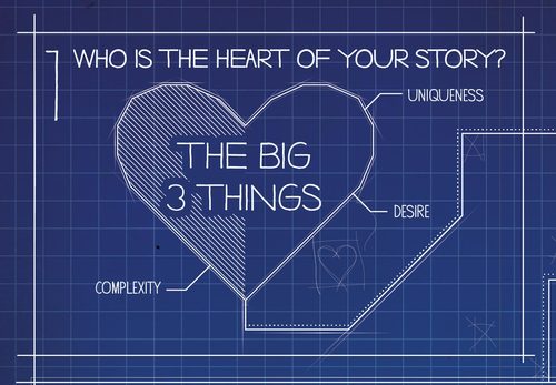
Final Revised Design
The final graphic I created shows three distinct and clearly interrelated parts that make up a "Heart," and the labels now clearly demonstrate the Heart's anatomy and that the three combine to make a whole.

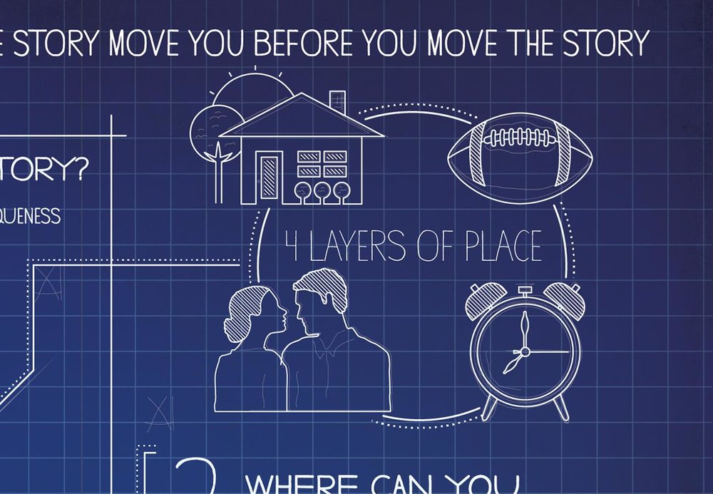
The 4 Layers of Place
Next comes the 4 Layers of Place. This is what lends a story the authenticity required to transport the audience into another world. The 4 Layers of Place are: Location, Objects, Situation, and Time.
These are not easy concepts to succinctly communicate graphically. :)
Preexisting Design
When I first saw these icons I thought "house, football, romance, and clock." Granted, there is always going to be some risk of possible misinterpretation in abstract iconography, but what these conveyed was pretty far from the intended meaning.
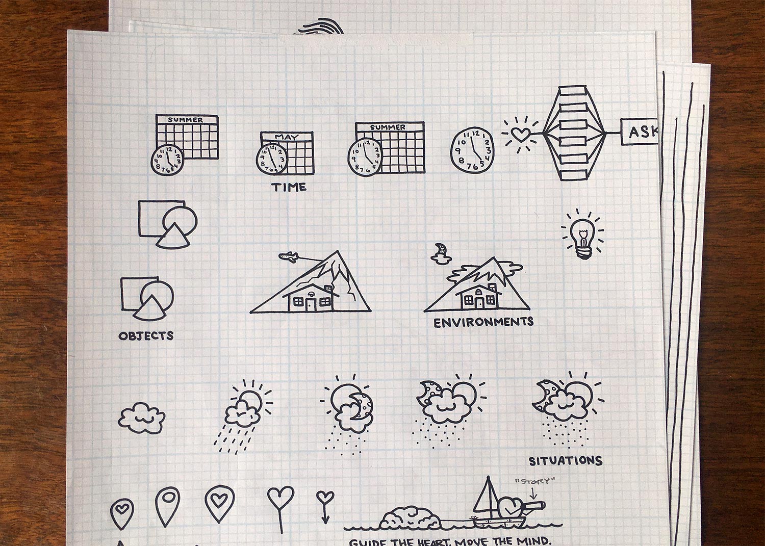
Sketching
To lend a more human and warm feeling to the final graphics, I sketched many ideas and eventually landed on a set of icons that would become final.
Final Revised Designs
Here they are! The final set of icons for The 4 Layers of Place. You wouldn't catch this yet, but the shape of the mountain mimics the Muse Plot Arch (which you'll meet a little further on).

Purpose Lens & "Chain"
Identifying the purpose behind the story you want to tell is required if you're going to say what you mean to say. As such, Purpose is a key concept in Muse.
Preexisting Design
The shape of the original graphics were meant to represent the aperture of a camera lens, but it was a little esoteric and easy to miss. Also, the company wanted to move beyond just speaking to filmmakers (their initial audience), and the aperture reference would be lost on a lay-person.

Final Revised Design
In Muse, Purpose is the lens you use to focus your message. I developed the aperture concept from the previous design into a graphic most people would recognize and be able to quickly understand the implied meaning.

Plot Arch
Ok, this was a really tricky one. Plot is an extremely complex concept that has several interrelated components that needed to come across clearly.
Preexisting Design
Hoo boy. There's a lot going on here. There are many superfluous deign embellishments that are confusing if you're looking to the graphic for educational information.
The wavy line between the punching glove and fishing hook was meant to convey the "bob and weave" of a narrative's arch; the Heart in the upper left of the Plot Arch is just decorative; the... ok, I'm going to stop there—looking at this thing makes me dizzy. :)

Sketching
Sooooooo many fun sketches came out of exploring how to both simplify and expand this concept. Here are a few.
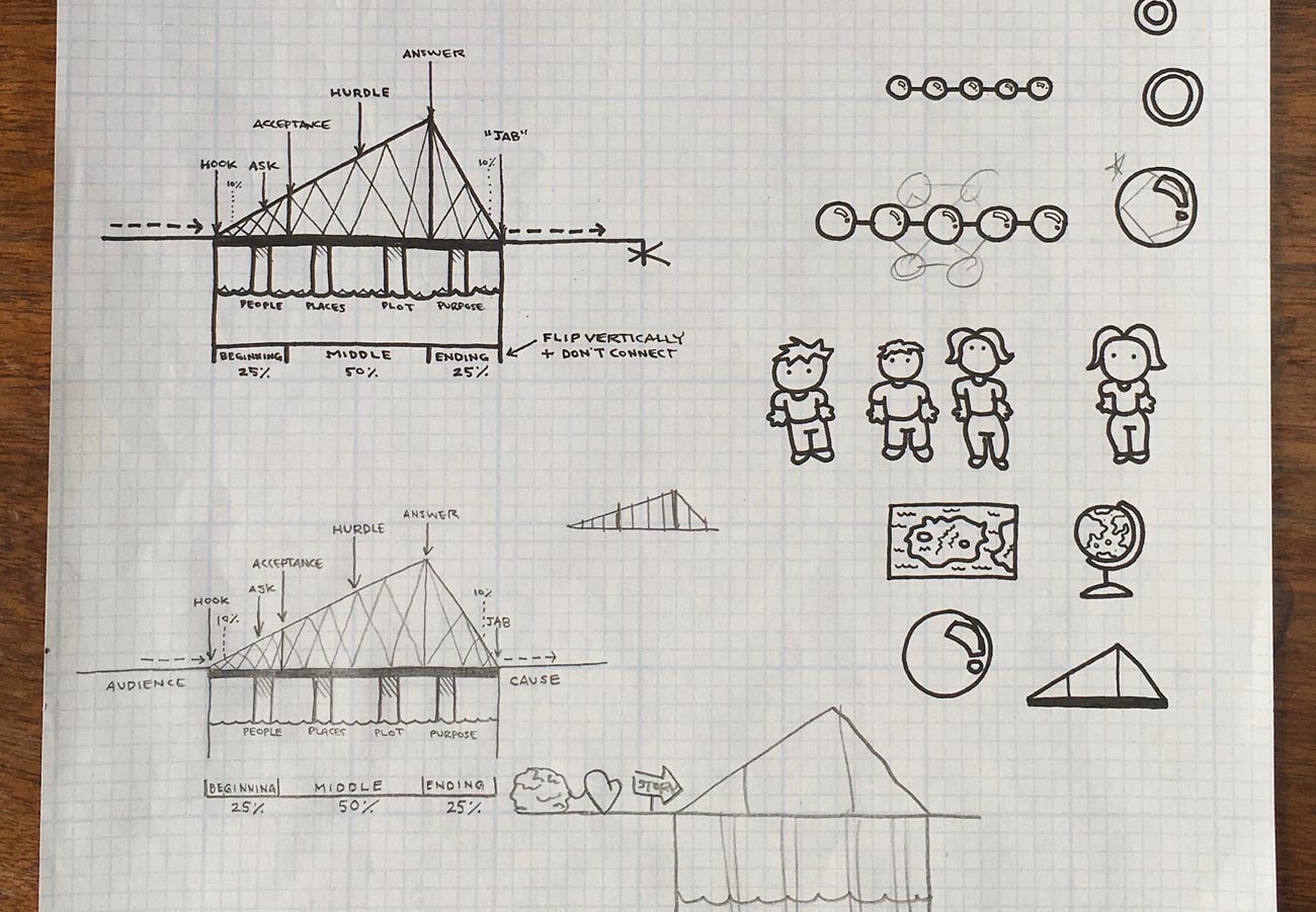
The Six Universal Conflicts
Before getting to the final Plot Arch design we need to make a quick detour to The Six Universal Conflicts. The Plot Arch represents the "shape" of the Heart's story, but it's one of the Six Universal Conflicts that starts the whole journey.
Preexisting Design

I wanted to find a way to unify the Six Universal Conflicts with the Plot Arch to show how they're connected.
Final Revised Design

The angled shape of the Plot Arch demonstrates the crescendo of intensity (or tension) in the story; the anatomy markers at the top show where the 6 Essential Plot Points (i.e., Hook, Ask, Acceptance, Hurdle, Answer, Jab) ideally fall; the markers at the bottom remind the user of the generally best-practice story formula of 25% / 50% / 25%; and the nuggets at the top represent The Six Universal Conflicts that initiate a journey.
I told you it was complex. :)
Bringing it All Together
All of these icons and conventions then needed to be unified into a clear, concise, and beautiful poster for people to learn with and reference as they create their work.
Here is the final revised poster again. The Heart goes on a journey through one of the Six Universal Conflicts, and works its way through the primary Essential Plot Points of the Plot Arch.

Founder Testimonial
“As the co-founder of Stillmotion and Muse Storytelling, two companies that have worked with hundreds of designers in our 10+ years, Ryan is without a doubt one of the most talented folks I’ve ever worked with and we were incredibly fortunate to have him shape our brand.
He’s incredibly detail oriented, is always ensuring that he’s considering the bigger picture, and has a rare talent for bringing intention and purpose to everything he crafts.
I’ve never worked with an Art Director or Designer that brings the same level of passion and commitment to what he does as Ryan.”
Patrick Moreau
Co-Founder of Muse Storytelling & Stillmotion

Muse Storybuilder Launch Ad
Illustration
YEAR: 2016
The Client: Muse is the patent-pending storytelling process developed by 5-time Emmy Award-Winning video production company, Stillmotion.
My role on this project: Art Direction, Illustration, Visual Design
This is an ad created for the Muse Storybuilder launch campaign. The plot arch above Kathryn's head has various illustrations floating around it representing ideas in a brainstorm, and you can see the ideas beginning to be attached to key points on the plot arch to create a strong story.
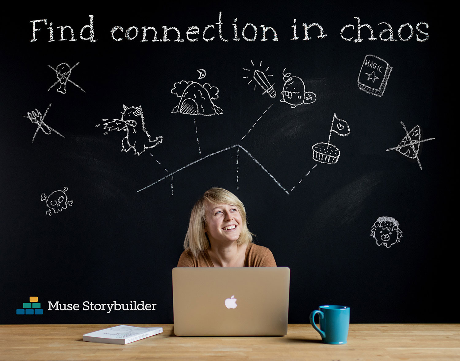
I think we're witnessing the birth of a story about a dragon, a cupcake claimed in the name of love, and a beaver with a unicorn horn brandishing a magical sword? Who knows. What we do know for sure is that a chicken leg, a fork, and a wizard hat have no place in this story.

The Ne'er-Do-Well
illustration | photography
YEAR: 2014
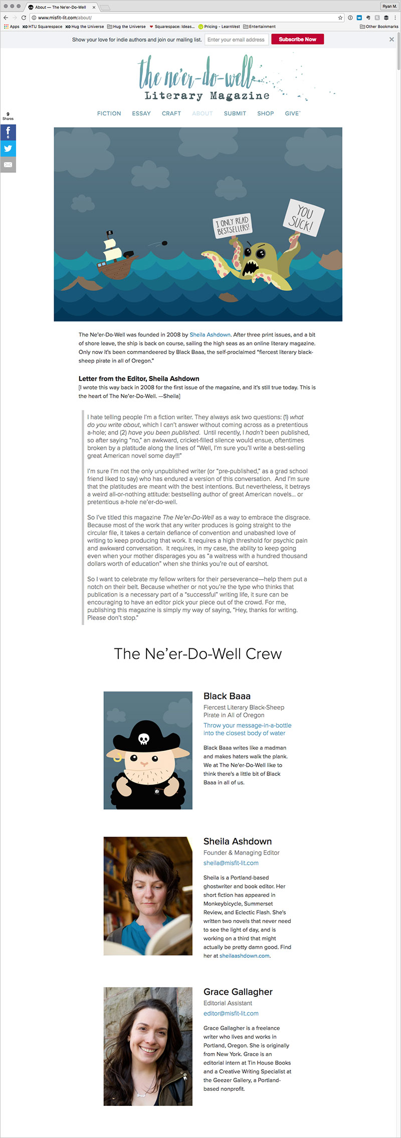
The Client: The Ne’er-Do-Well is a literary magazine that publishes what they lovingly refer to as “misfit lit.” The magazine is operated by Sheila Ashdown, a professional writer and editor, and proudly self-proclaimed book nerd.
My role on this project: Creative Direction, Discovery Research, Visual Design, Photography, Illustration
Project Objective: Sheila wanted to create a website and brand that spoke to the “oddly universal experience of feeling like the odd one out,” and the challenges writers often experience in pursuit of their craft (things like writer’s block, crippling self-doubt, “get a real job” mentality, and other writerly tribulations).
So, we embarked on a journey to discover how to convey that in a way that was clean, cute, lighthearted, and contemporary (desired traits identified in our discovery phase).
The concept that hit all the desired targets was that of a black sheep pirate named “Black Baaa.” The concept is literary (pirates), personifies the feeling of being the odd one out (a black sheep), and represents the ethos of “misfit lit” (also pirates).
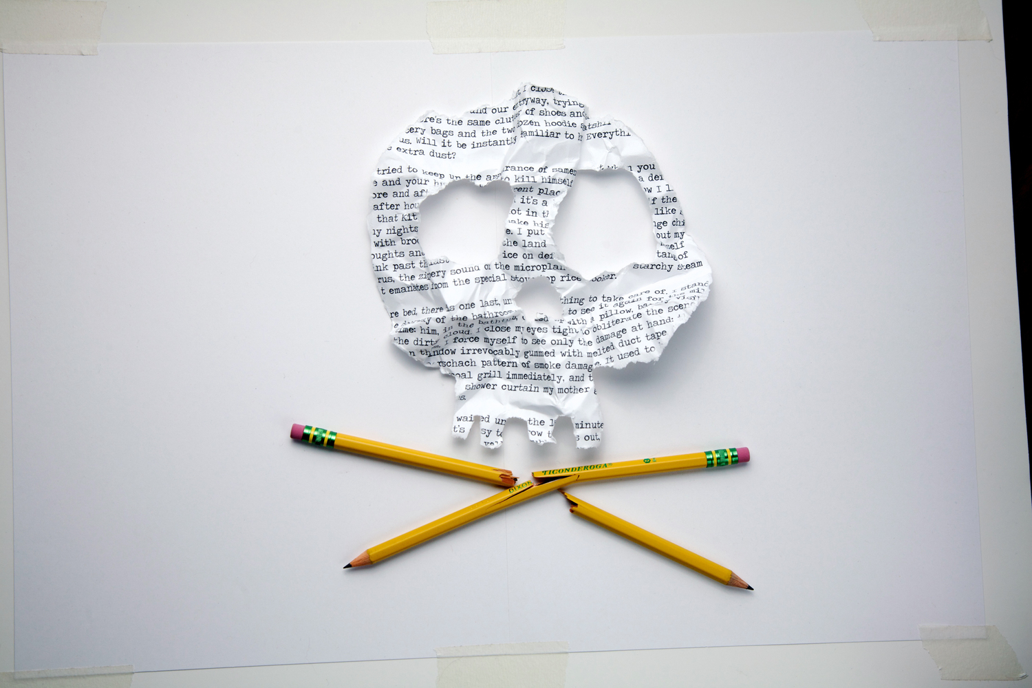
Skull & Crossbones
How do you visually combine the pirate theme with the experience of frustrated writers? With a skull-shaped crumpled-up typewriter page over broken pencil crossbones, of course! I whipped up some sketches of this concept, showed it to Sheila, and got an enthusiastic “YES!”
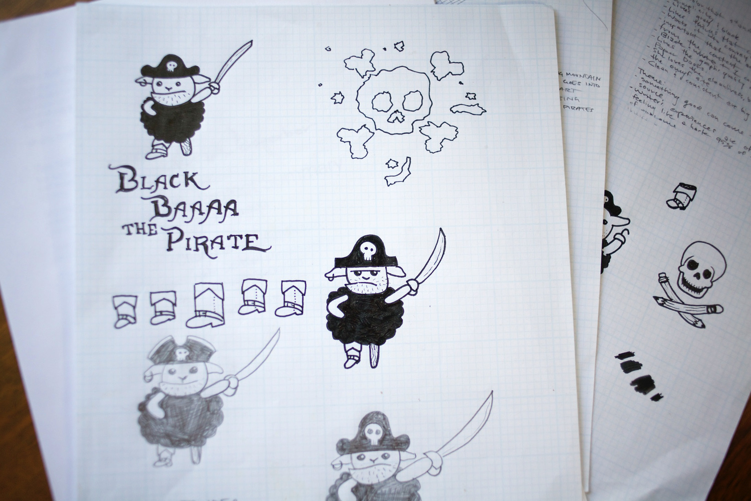
The Birth of Black Baaa
So, what does a black sheep pirate look like? Who knows?! I consulted my sketch pad for the answer. What you see below are some of the sketches that became the final design for Black Baaa the Pirate.

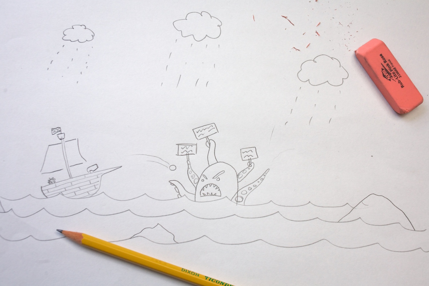
The Kraken
Every good hero needs a villain, and what better villain for a black sheep pirate writer than a discouragingly critical kraken?
During the discovery phase, Sheila realized that she's drawn to sites that have “scenes.” So I created a scene for the footer of her website with Black Baaa’s ship battling a discouraging kraken (who apparently only reads bestsellers and thinks Black Baaa’s writing sucks).
That kraken is clearly kind of a butthead. This was the process of creating him.


Updated Kraken Illustration
When we updated Sheila's website to launch v.2 I reworked the footer illustration for use as a hero image.

Website Design

Facebook Cover Image

Headshots

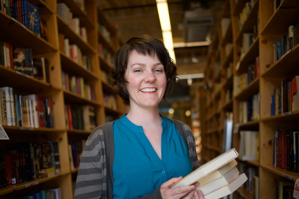
Sheila Ashdown
Founder & Managing Editor

Grace Gallagher
Editorial Assistant
Client Testimonial
“Before I started working with Ryan, I felt aimless and stressed about my website project. I’d worked with three other designer/illustrators and was never completely happy with the outcome—mostly because I wasn't able to fully articulate what I wanted. (I’m a writer—not so great with the visuals.)
Then I found Ryan, and he totally rescued the project for me. He started with a thorough discovery process that was unlike anything I’d experienced with a designer. He asked all the right questions and had a seemingly magical ability to draw out ideas that I didn’t even know were inside me. And he really listened. The theme he came up with (a literary black-sheep pirate) was totally spot-on. As soon as I heard it, I thought, 'I didn’t know that I wanted a black-sheep pirate theme, but hell yeah, that’s exactly what I want!' I laughed with delight for about 5 straight minutes when he presented it to me.
Honestly, I get a little emotional looking at my website, because I’m just so thrilled and delighted with it, and have gotten nothing but enthusiastic feedback. He put such heart and care into my project, and I feel grateful to have found him.”
Sheila Ashdown
Professional Writer and Editor

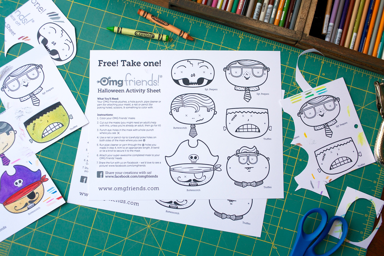
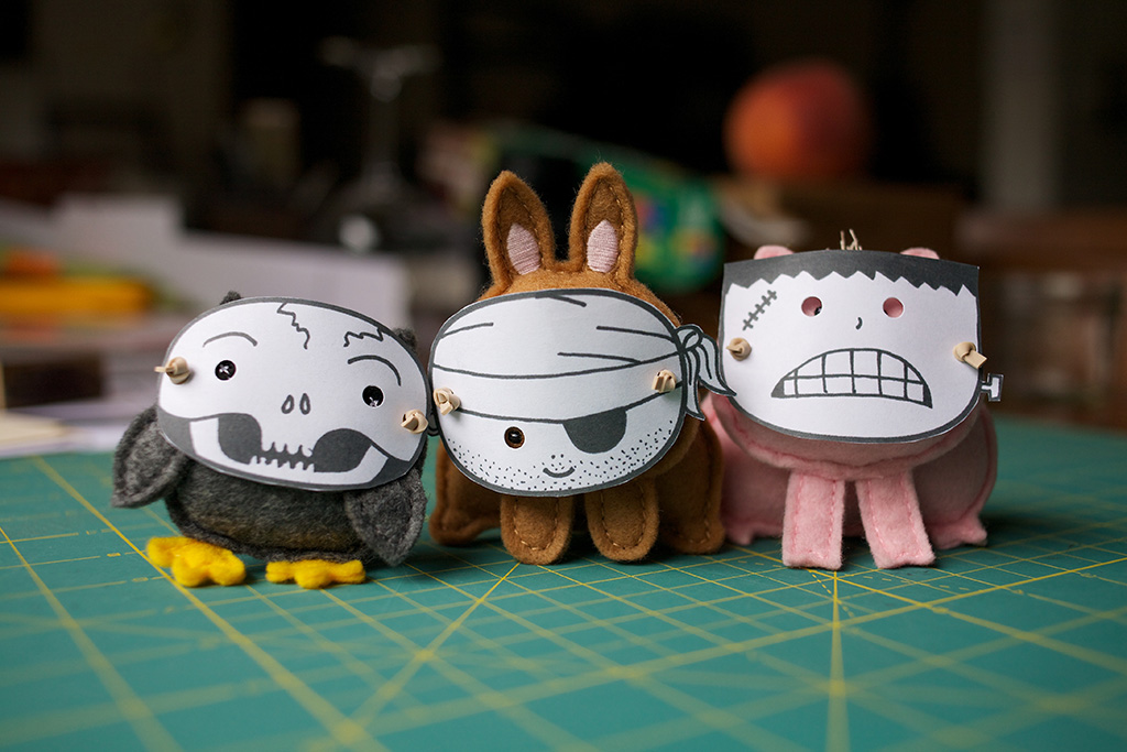
OMG Friends Halloween Mask Activity Sheet
Illustration | Photography
YEAR: 2014
The OMG Friends love creative projects. They also love dressing up! This is a Halloween activity I created for fans to complete with their OMG Friends adventure plushes.
My role on this project: Creative Direction, Character Design, Photography, Visual Design, Illustration
Sketching Ideas

Testing Designs

Final Activity Sheet
Related Project
If you're wondering who the OMG Friends are, be sure to check out this project.

Kinokophonography Event Poster
YEAR: 2010
The Client: Kinokophonography is a collective that organizes live social events for people who are interested in field-recording.
My role on this project: Creative Direction, Illustration, Visual Design

Kinokophonography is a field-recordist collective that started in Manchester, England, and is now centered in New York. They create community and host live events where field recordists can share and listen to their field recordings.
"Kinoko" is the Japanese word for “mushroom"; "phone" pertains to sound (e.g. telephone, microphone, headphone); and “graphy” relates to a style or method of doing something. The founders of the group used a microphone head on a mushroom stalk as their mascot, which I expanded on for this poster.

Design & Marketing Photography
YEAR: 2011
I love photography. It’s something I use frequently in my projects either as actual content, or some part of the creative process. Here is a collection of some of my design and marketing related photography.
My role on this project: Creative Direction, Photography
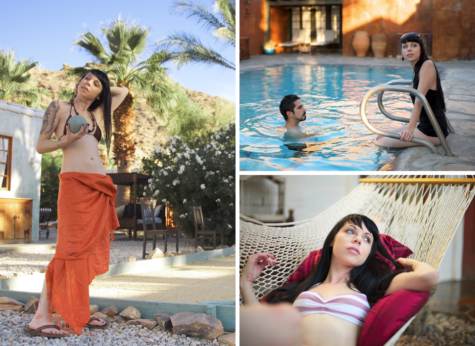
Korakia Pensione
Korakia Pensione is a Moroccan-themed boutique hotel in Palm Springs, California. The client needed to capture the ambiance of the property, showcase various amenities of the hotel, and promote the extensive renovations that had been done by the new owners.

Core Home Fruit
Core Home Fruit is a pruning and consulting business owned and operated by fruit-growing expert, Monica Maggio. Monica needed photos to use in her marketing collateral, as well as the presentations featured in her popular teaching events.

The Ne'er-Do-Well
The Ne’er-Do-Well is an online literary magazine founded and curated by Sheila Ashdown, a professional freelance writer and editor. The website publishes “misfit lit,” and the branding that I developed for this website features a black sheep pirate called “Black Baaa The Pirate.”
The image is of a crumpled-up page from a typewriter that I fashioned into the shape of a skull and placed over broken pencil crossbones. This represents the frustrations writers often experience with self-doubt and writer's block.

The OMG Friends
The OMG Friends are a family of pocket-sized adventure plushes that I created and developed into a product line. The characters’ personalities and stories include meaningful messages about friendship, courage, creativity, exploration, overcoming obstacles, and accomplishing awesome stuff in the world.
The product photos needed to communicate compelling things about the characters’ personalities and stories, as well as support things like holiday promotions.