
Sleep Metrics
YEAR: 2018
The Client: Sleep Metrics is an industry leader in providing CPAP (Continuous Positive Airway Pressure) tests and equipment for people experiencing sleep apnea.
My role on this project: UX/UI Design, Discovery Research, Visual Design, Illustration
Project Objective: Sleep Metrics needed a more humanized and welcoming brand experience to stand out in a field of competitors whose offerings were cold and even off-putting. They were also expanding their business model to include a mail-order service. We accomplished all of this while also navigating the complexities introduced by requirements of various manufacturers and the medical industry (e.g., HIPAA compliance).
User Personas
“As little as possible, as much as necessary” is my battle cry for all things design, and we took that approach in creating Sleep Metrics’ user personas. The user base for sleep apnea therapies is very extensive (as health doesn’t choose humans based on demographics or psychographics), but we were able to whittle it down to 5 customer personas and one doctor persona.
Click images to enlarge.
Diagram of Desires
This diagram shows the desires and needs that are unique to each persona as well as where there is overlap between different patients.
User Flow
This chart demonstrates the various flows and use-cases for our user personas.
Site Map
After identifying user personas and user flows, we’re ready to lock in the new website’s site map.
Wireframes
With all of that locked into place, it was time to collaborate with the Creative Director. She has a background in writing + editing and worked with a team of copywriters on the brand’s voice and website content. I was brought up to speed with the content strategy and copywriting and determined how it would all be best supported in the UI.
Home Page

At Home Sleep Test

Product Detail Page

Physician FAQ Page

Functionality Map
As part of the wireframing process, I created a functionality map to ensure that all user behaviors and needs were being effectively addressed.
Visual Design Keywords
One of the many things that our discovery interviews and research informed was a collection of keywords that were used to guide the voice in our copywriting and personality and tone of our visual designs. These are the keywords that captured what the client was eager to convey and what would set Sleep Metrics apart from their competitors.
Brand Ambassador
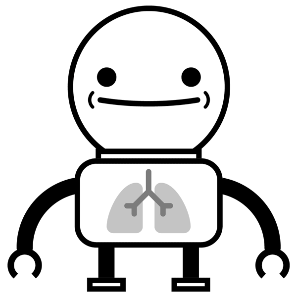
One of the particularly offputting (and even kind of disturbing) elements of a lot of Sleep Metrics’ competitors was their habit of using photos of people wearing CPAP equipment. Sure, that’s what it looks like, but there are better ways to humanize the experience for sleep apnea patients.

Competitor Photo

Competitor Photo

Competitor Photo

Competitor Photo
So my recommendation was to create a friendly character to be the Sleep Metrics ambassador. The character could be used to convey and address topics that look silly or deeply unpleasant when showing people in those situations, and it could add a level of warmth and playfulness to an understandably heavy topic.
Brand Ambassador Design


Brand Ambassador Auditions
Final Visual Design
This is where everything comes together in a visible, tangible, delightful, usable way.

Prototype Linking
This shows the interconnectivity that was implemented for the prototype that our internal team and client reviewed in Marvel.
