Solmate Socks
YEAR: 2018
The Client: Solemate Socks is a delightful Portland-based manufacturer of high quality, durable, and sustainable socks.
My role on this project: UX/UI Design, Discovery Research, Visual Design
Project Objective: Solmate Socks makes genuinely wonderful socks, but their ecommerce website wasn’t providing a wonderful experience that matched. The project’s goal was to modernize the site’s functionality, polish their onsite brand presence, and increase the site’s appeal to a more tech-savvy demographic. All without disrupting the experience of their existing fanbase by introducing anything shockingly new.
Measuring the Impact


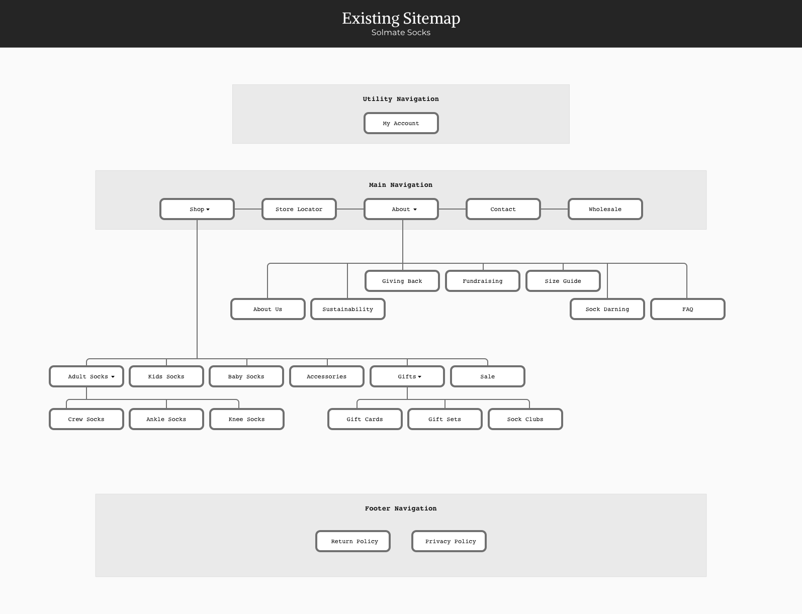
Streamlining the Site Map
The original site had a lot of great content, but it had come together in a way that didn’t provide an intentional path for visitors to follow through the site. It was likely that visitors wouldn’t be able to find what they were looking for or wouldn’t become aware of all the cool stuff Solmate Socks is up to. This was dramatically improved with the revised site map.

Improving the Website’s Responsiveness
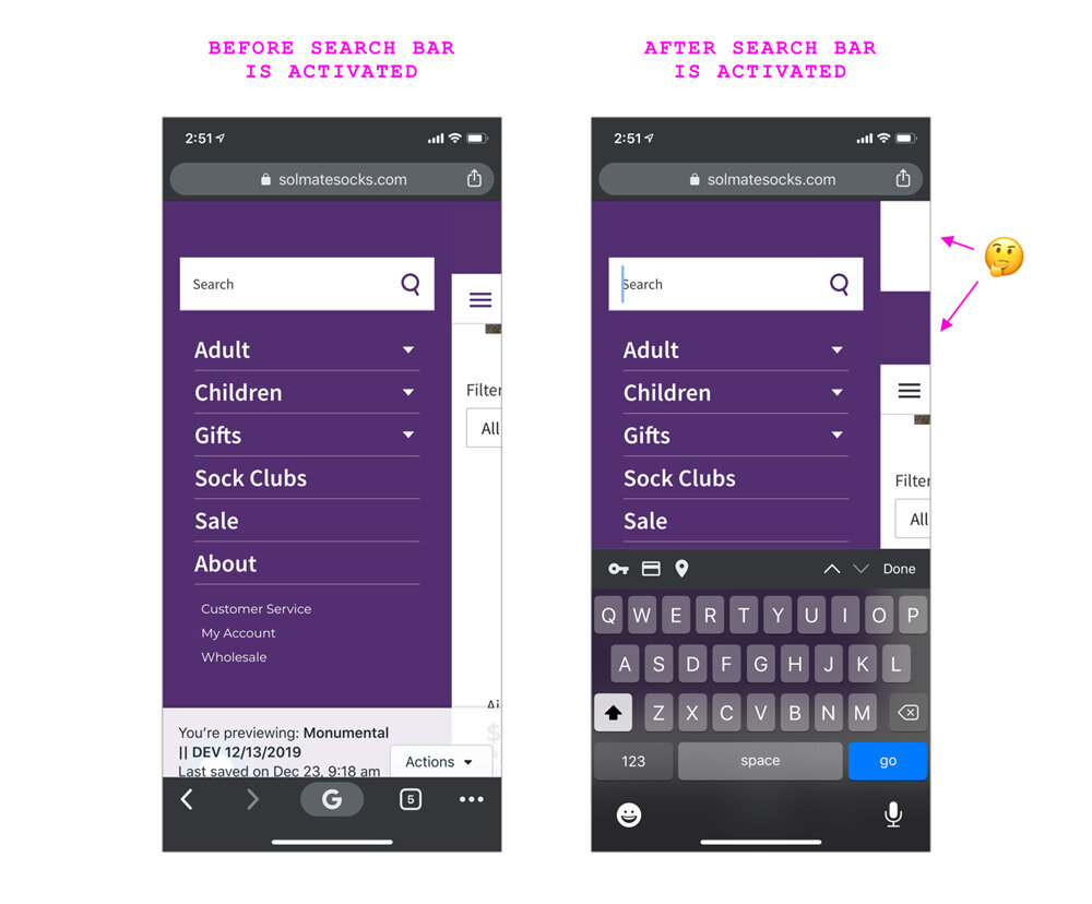
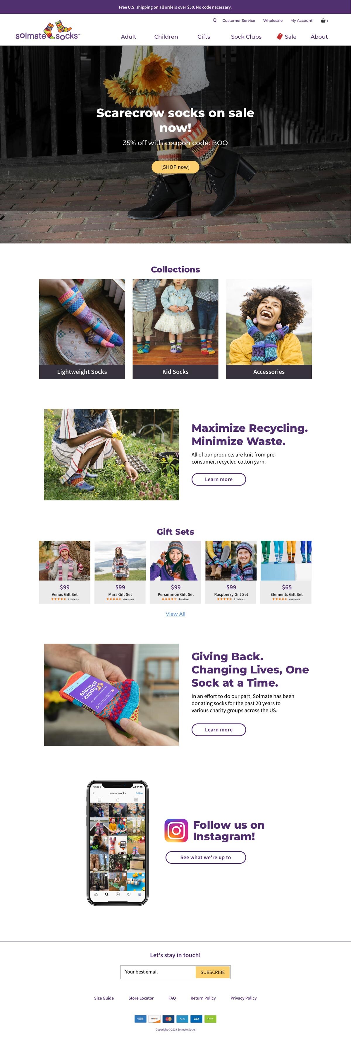
Like most sites, the homepage hero area featured a photo, headline, and CTA (call-to-action) button. However, the mobile design was confusing. The photo — which looked big and beautiful on desktop — was shrunken on mobile. And the text — rather than being displayed on top of the photo — was put into a plain gray box just below it.
In the updated design, the image scales appropriately, the text and CTA button are included in the expected location, and everything meets the WCAG (Web Content Accessibility Guidelines) requirements.
Before: Original Design
Hero image wasn't responsive

After: Design Improvements
Proper responsive goodness

Helping the Products Stand Out
With the amount of content on the Solmates homepage and how it was structured, it was very easy to miss the products being highlighted. Additionally, only two products were displayed on the screen at the same time. The improved layout makes the difference in content-types clear and allows several products to be displayed at once.
Before: Original Design
There was a lot of content on the home page, but very few products being featured.

After: Design Improvements
We increased the number of products featured and introduced a new highly scannable visual convention.

Improving Legibility & WCAG Compliance
Website accessibility is as important as that of physical stores and locations. The previous convention of text being overlaid on top of images resulted in many instances where the category label was virtually invisible.
Before: Original Design
The existing website was using a convention of white text on top of images, which had several WCAG (Web Content Accessibility Guidelines) issues and also rendered some content virtually invisible.

After: Design Improvements
The updated design passes WCAG requirements and also increases the page's scanability.

Improving the Instagram CTA
Instagram is a key component of Solemate’s overall marketing strategy, and their presences there is lovely and engaging. But the existing CTA (call to action) design on their site was confusing and easy to miss.
Since the intention of this content block is to compel users to follow Solmate on Instagram, we wanted this to be immediately apparent to visitors.
Before: Original Design
The original Instagram feature was confusing and looked broken.

After: Design Improvements
A more eye-catching design and increased incentivization to click through to Instagram

Desktop
Before: Original Design

After: Design Improvements
Product Detail Page
Before: Original Design
(Mobile)
(Mobile)

After: Design Improvements
(Mobile)
(Mobile)

Before: Original Design
(Desktop)
(Desktop)
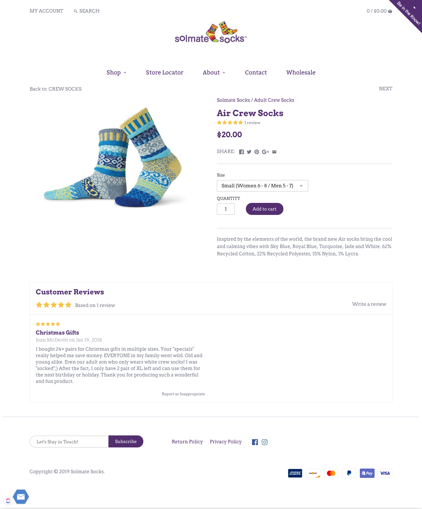
After: Design Improvements
(Desktop)
(Desktop)