Muse Storytelling, Inc.
YEAR: 2015
The Client: Muse is the patent-pending storytelling process developed by 5-time Emmy Award-Winning video production company, Stillmotion.
My role on this project: Art Direction, Visual Design, Illustration
Project Objective: A brand identity had been created for Muse Storytelling, Inc. before I joined their team as Art Director, but the prevailing opinion was that it was "cold," "too masculine," and "confusing." A complete overhaul was needed to convey the intended tone and reduce confusion in learners.
I collected feedback from the founders and their customers to completely redesign their brand, educational collateral, and to develop visual communication conventions that would extend through all of the company's offerings. In the end, a brand emerged that was clear, succinct, and friendly, while still conveying authority.
Final Revised Poster & Iconography
Simplicity is frequently mistaken as the result of an equally simple process, but arriving at what you see below was remarkably complex (we'll review the process and my thinking in detail below). A great deal of work was required to whittle down the depth and nuance of the Muse Storytelling system into an easily digestible reference and educational poster.

Final Revised Poster
Simple, clean, & clear
The Preexisting Visual Design Convention
At first pass the original poster looks cool, but in use, the visual conventions and design bells-and-whistles break down. There are many mixed metaphors being used, and the intended meanings behind various icons don't come across well.
The poster has to convey information that is really complex, so simplifying the poster required a lot of work and thoughtfulness.
Preexisting Design

Preexisting Poster
Very busy & confusing to learners
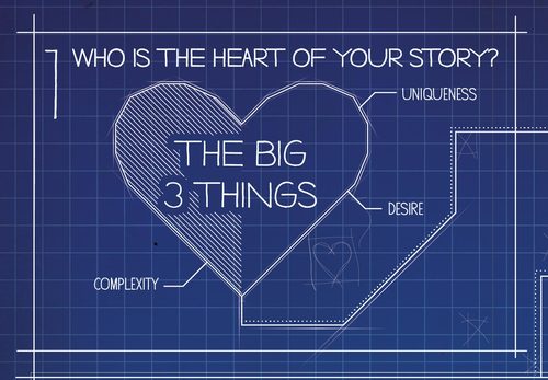
The Big 3 Things
The Muse Storytelling process is for telling stories about people. And in the Muse framework, a strong character has to have 3 things: complexity, uniqueness, and desire. The character who possesses high ratings in each and lends themselves to telling a compelling story is chosen to be the "Heart" (or main character) of the story.
Preexisting Design
To effectively redesign the components of the brand I had to learn the Muse process inside and out, but I couldn't make sense of a lot of what I was seeing. This heart represented a very key concept, but the intended meaning was obscured by conventions that were too subjective.
The hatched pattern was meant to convey “complexity,” but that only became apparent after someone told me that's was the intended meaning. Also, the markers point at different parts of the heart implying that's where those traits are found, but I couldn’t make sense of why they would be located in those places. It seemed arbitrary.
Final Revised Design
The final graphic I created shows three distinct and clearly interrelated parts that make up a "Heart," and the labels now clearly demonstrate the Heart's anatomy and that the three combine to make a whole.

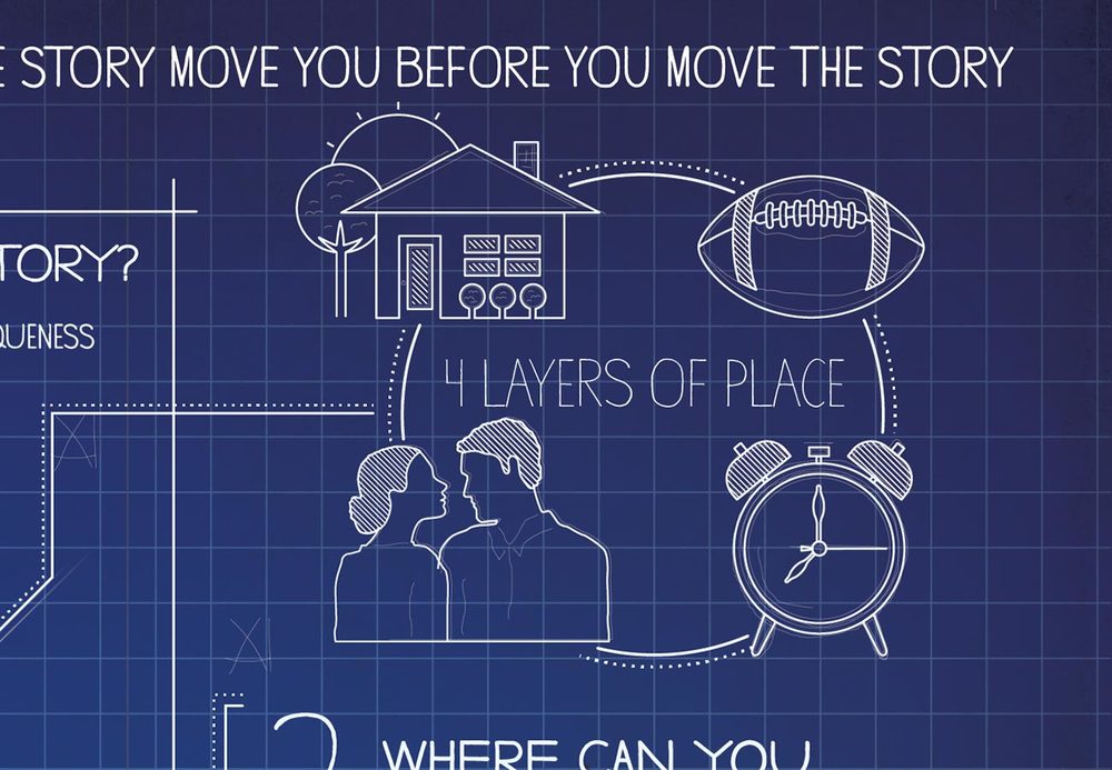
The 4 Layers of Place
Next comes the 4 Layers of Place. This is what lends a story the authenticity required to transport the audience into another world. The 4 Layers of Place are: Location, Objects, Situation, and Time.
These are not easy concepts to succinctly communicate graphically. :)
Preexisting Design
When I first saw these icons I thought "house, football, romance, and clock." Granted, there is always going to be some risk of possible misinterpretation in abstract iconography, but what these conveyed was pretty far from the intended meaning.
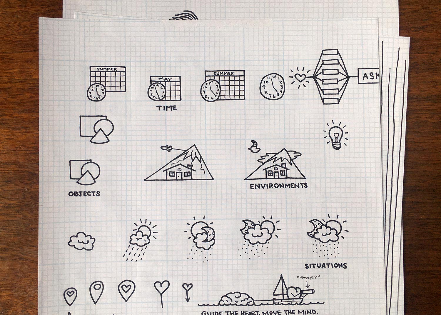
Sketching
To lend a more human and warm feeling to the final graphics, I sketched many ideas and eventually landed on a set of icons that would become final.
Final Revised Designs
Here they are! The final set of icons for The 4 Layers of Place. You wouldn't catch this yet, but the shape of the mountain mimics the Muse Plot Arch (which you'll meet a little further on).

Purpose Lens & "Chain"
Identifying the purpose behind the story you want to tell is required if you're going to say what you mean to say. As such, Purpose is a key concept in Muse.
Preexisting Design
The shape of the original graphics were meant to represent the aperture of a camera lens, but it was a little esoteric and easy to miss. Also, the company wanted to move beyond just speaking to filmmakers (their initial audience), and the aperture reference would be lost on a lay-person.

Final Revised Design
In Muse, Purpose is the lens you use to focus your message. I developed the aperture concept from the previous design into a graphic most people would recognize and be able to quickly understand the implied meaning.

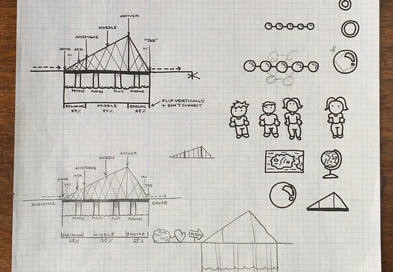
Plot Arch
Ok, this was a really tricky one. Plot is an extremely complex concept that has several interrelated components that needed to come across clearly.
Preexisting Design
Hoo boy. There's a lot going on here. There are many superfluous deign embellishments that are confusing if you're looking to the graphic for educational information.
The wavy line between the punching glove and fishing hook was meant to convey the "bob and weave" of a narrative's arch; the Heart in the upper left of the Plot Arch is just decorative; the... ok, I'm going to stop there—looking at this thing makes me dizzy. :)

Sketching
Sooooooo many fun sketches came out of exploring how to both simplify and expand this concept. Here are a few.
The Six Universal Conflicts
Before getting to the final Plot Arch design we need to make a quick detour to The Six Universal Conflicts. The Plot Arch represents the "shape" of the Heart's story, but it's one of the Six Universal Conflicts that starts the whole journey.
Preexisting Design

I wanted to find a way to unify the Six Universal Conflicts with the Plot Arch to show how they're connected.
Final Revised Design

The angled shape of the Plot Arch demonstrates the crescendo of intensity (or tension) in the story; the anatomy markers at the top show where the 6 Essential Plot Points (i.e., Hook, Ask, Acceptance, Hurdle, Answer, Jab) ideally fall; the markers at the bottom remind the user of the generally best-practice story formula of 25% / 50% / 25%; and the nuggets at the top represent The Six Universal Conflicts that initiate a journey.
I told you it was complex. :)
Bringing it All Together
All of these icons and conventions then needed to be unified into a clear, concise, and beautiful poster for people to learn with and reference as they create their work.
Here is the final revised poster again. The Heart goes on a journey through one of the Six Universal Conflicts, and works its way through the primary Essential Plot Points of the Plot Arch.

Founder Testimonial
“As the co-founder of Stillmotion and Muse Storytelling, two companies that have worked with hundreds of designers in our 10+ years, Ryan is without a doubt one of the most talented folks I’ve ever worked with and we were incredibly fortunate to have him shape our brand.
He’s incredibly detail oriented, is always ensuring that he’s considering the bigger picture, and has a rare talent for bringing intention and purpose to everything he crafts.
I’ve never worked with an Art Director or Designer that brings the same level of passion and commitment to what he does as Ryan.”
Patrick Moreau
Co-Founder of Muse Storytelling & Stillmotion