

Hestan Cue
UX/UI Design | Ecommerce | Wireframing
YEAR: 2018
The Client: Hestan Cue is a technology company that's developed an ingenious product that combines induction cookware and food prep education for the home chef.
My role on this project: UX/UI Design, Visual Design
Project Objective: Hestan Cue was introducing a new high-end product category to the home cooking market and needed their digital presence to reflect the quality and refinement of their product offerings. It also needed to communicate complex information about the technology in a way that was engaging and effectively painted the picture for the gourmet possibilities this new product would bring to any kitchen.
Wireframes
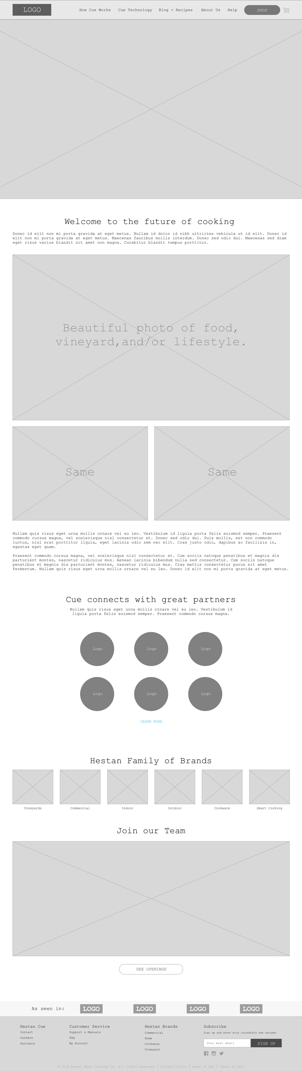
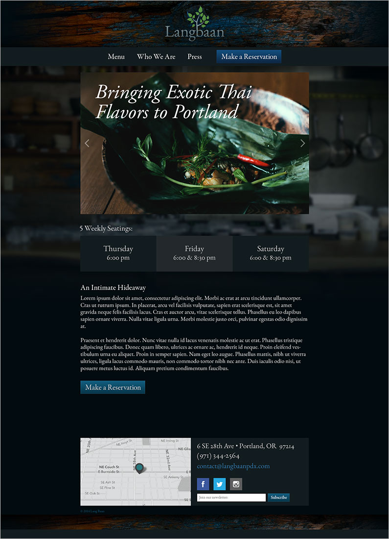
Home Page
The home page’s job is to introduce the product and accommodate the visitor’s subsequent intentions to learn more, be inspired, and ultimately purchase a new induction cooking system.

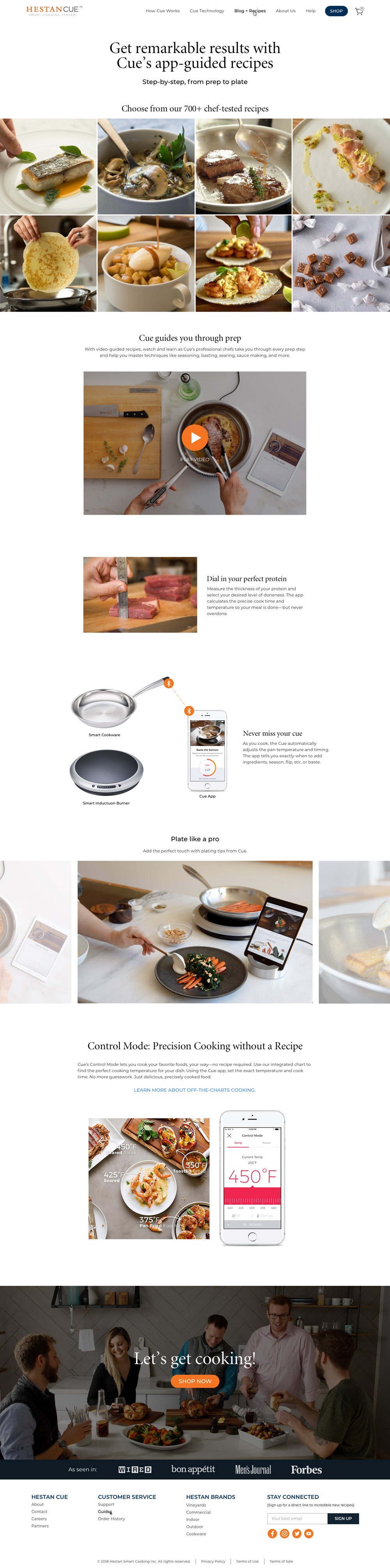
How it Works
The Hestan Cue product is more than a high-tech induction burner and pot or pan; it’s a rich and extensive library of recipes and education materials to improve one’s cooking skills. This page’s job is to present a complex amount of information in a concise and engaging way through written and visual story-telling.

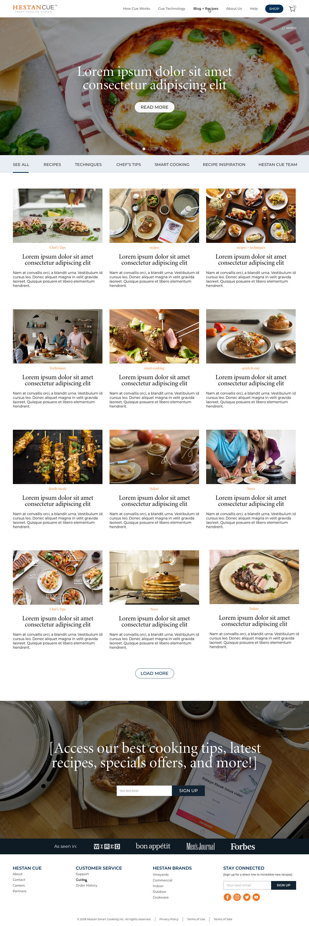
Blog Overview
A substantial part of the value Hestan Cue delivers to its customers is an extensive library of gourmet recipes created by some of the world’s best chefs. Their blog was designed to showcase beautiful photos of mouth-watering cuisine and enable hungry readers to easily find their next culinary adventure in a large collection of articles and recipes.

Blog Post Template
The Hestan Cue blog is an information resource for existing customers as well as a lead-generation tool for people who discover the company through their SEO marketing campaigns. The structure of the blog post template has been designed to facilitate these functions and an engaging journey through more of the website‘s offerings.

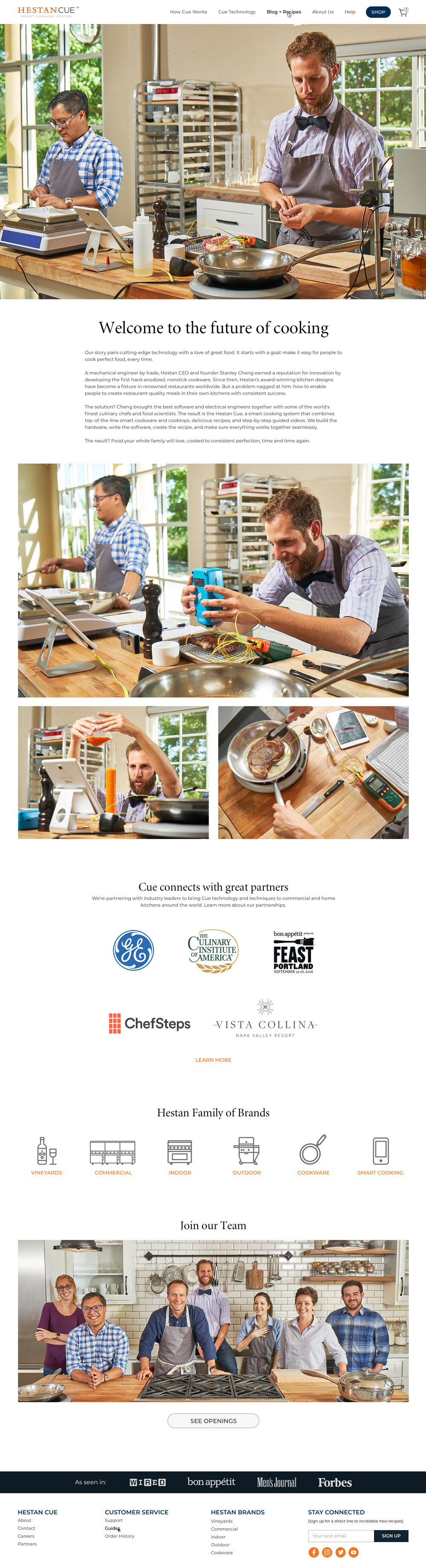
About Us
The purpose of the About page is to give specific information on the Hestan Cue team as well as a high-level overview of the extensive offerings of their parent company, Hestan Culinary. It’s also an invitation for interested parties to apply for positions that the company has open.
Final Designs
Home Page

How it Works
Blog Overview
Blog Post Template

About Us

Solmate Socks
UX/UI Design | ecommerce
YEAR: 2018
The Client: Solemate Socks is a delightful Portland-based manufacturer of high quality, durable, and sustainable socks.
My role on this project: UX/UI Design, Discovery Research, Visual Design
Project Objective: Solmate Socks makes genuinely wonderful socks, but their ecommerce website wasn’t providing a wonderful experience that matched. The project’s goal was to modernize the site’s functionality, polish their onsite brand presence, and increase the site’s appeal to a more tech-savvy demographic. All without disrupting the experience of their existing fanbase by introducing anything shockingly new.
Measuring the Impact


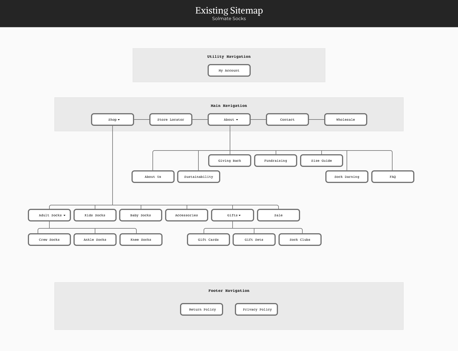
Streamlining the Site Map
The original site had a lot of great content, but it had come together in a way that didn’t provide an intentional path for visitors to follow through the site. It was likely that visitors wouldn’t be able to find what they were looking for or wouldn’t become aware of all the cool stuff Solmate Socks is up to. This was dramatically improved with the revised site map.

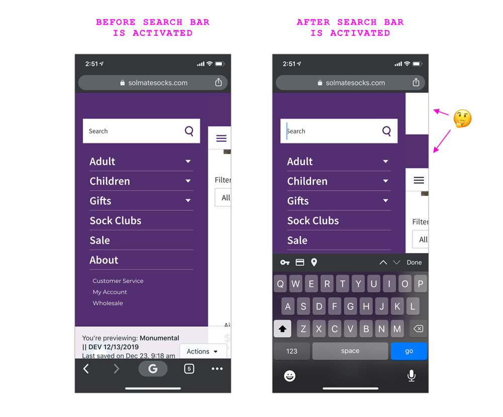
Improving the Website’s Responsiveness
Like most sites, the homepage hero area featured a photo, headline, and CTA (call-to-action) button. However, the mobile design was confusing. The photo — which looked big and beautiful on desktop — was shrunken on mobile. And the text — rather than being displayed on top of the photo — was put into a plain gray box just below it.
In the updated design, the image scales appropriately, the text and CTA button are included in the expected location, and everything meets the WCAG (Web Content Accessibility Guidelines) requirements.
Before: Original Design
Hero image wasn't responsive

After: Design Improvements
Proper responsive goodness

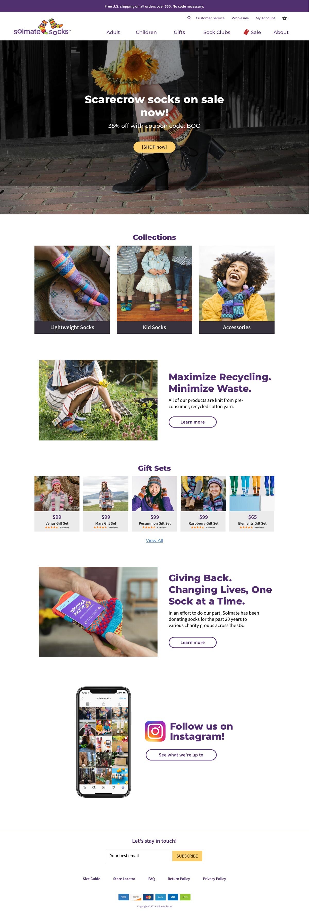
Helping the Products Stand Out
With the amount of content on the Solmates homepage and how it was structured, it was very easy to miss the products being highlighted. Additionally, only two products were displayed on the screen at the same time. The improved layout makes the difference in content-types clear and allows several products to be displayed at once.
Before: Original Design
There was a lot of content on the home page, but very few products being featured.

After: Design Improvements
We increased the number of products featured and introduced a new highly scannable visual convention.

Improving Legibility & WCAG Compliance
Website accessibility is as important as that of physical stores and locations. The previous convention of text being overlaid on top of images resulted in many instances where the category label was virtually invisible.
Before: Original Design
The existing website was using a convention of white text on top of images, which had several WCAG (Web Content Accessibility Guidelines) issues and also rendered some content virtually invisible.

After: Design Improvements
The updated design passes WCAG requirements and also increases the page's scanability.

Improving the Instagram CTA
Instagram is a key component of Solemate’s overall marketing strategy, and their presences there is lovely and engaging. But the existing CTA (call to action) design on their site was confusing and easy to miss.
Since the intention of this content block is to compel users to follow Solmate on Instagram, we wanted this to be immediately apparent to visitors.
Before: Original Design
The original Instagram feature was confusing and looked broken.

After: Design Improvements
A more eye-catching design and increased incentivization to click through to Instagram

Desktop
Before: Original Design

After: Design Improvements
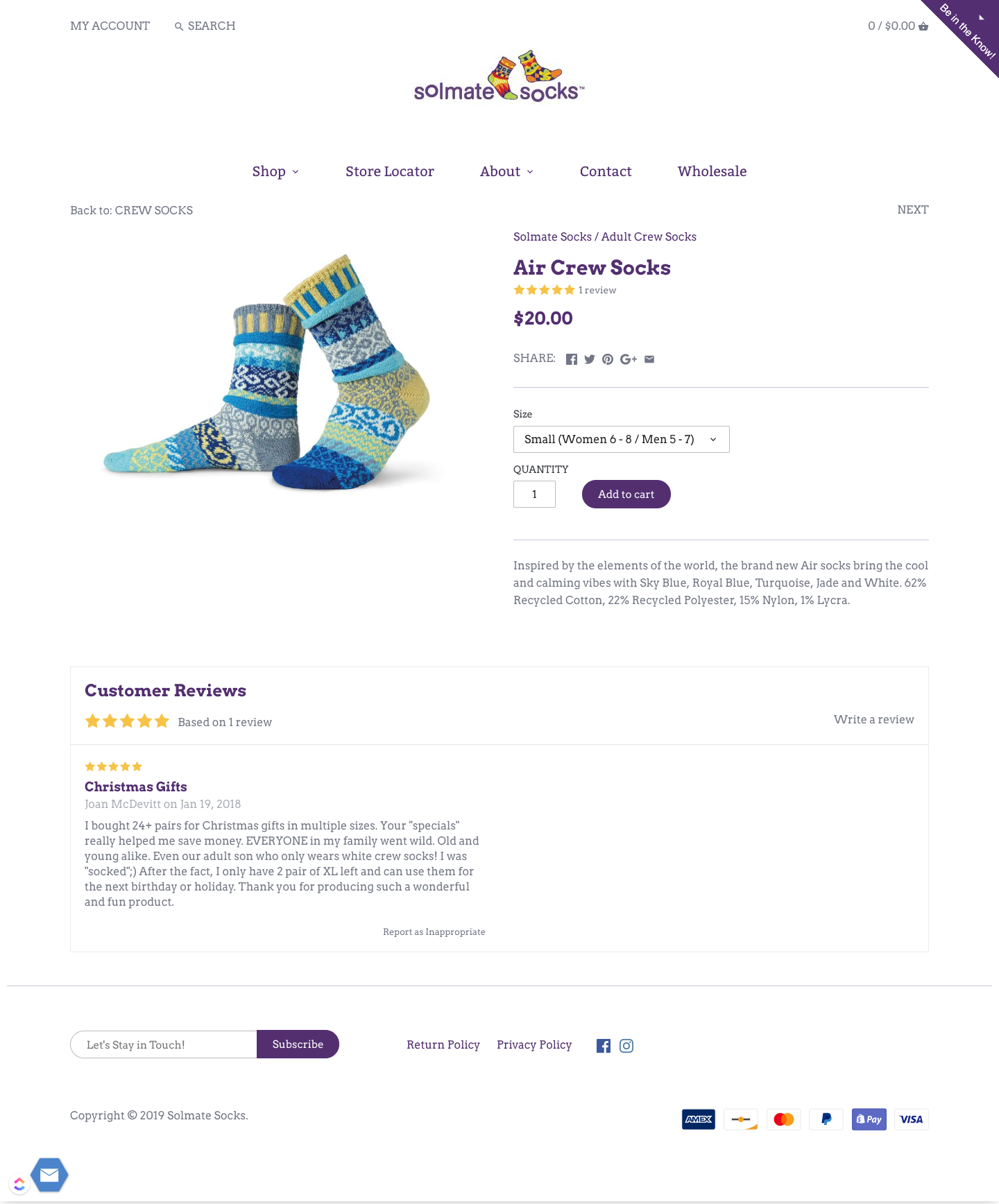
Product Detail Page
Before: Original Design
(Mobile)
(Mobile)

After: Design Improvements
(Mobile)
(Mobile)

Before: Original Design
(Desktop)
(Desktop)
After: Design Improvements
(Desktop)
(Desktop)

QA Feedback for Developers

Manifest Insights
UX/UI Design | Wireframing | Illustration
YEAR: 2014
The Client: Manifest Insights is a consulting firm and software development company that offers business intelligence solutions.
My role on this project: UX/UI Design, Discovery Research, Visual Design, Illustration
Project Objective: Manifest Insights needed a new website. Their primary SAAS offering had a complex feature-set that wasn't being effectively presented to their potential customers. The new website needed to highlight key features of the software, convey the company's personalized services that differentiated them from their competitors, and present it all in a friendly yet professional light.
I worked closely with their team to clarify their messaging, create new copy, and develop custom iconography. In the end, everything came together in a fresh and charming new website that hit all of our project's goals.
Preexisting Website
The client wanted to keep the same basic brochure-style structure they were currently working with, but ramp up its efficacy.

Website Wireframe
I got to work fleshing out the basic structure of the page. This communicated the new direction to the client, his developers, and gave the marketing strategist important direction to reference and work from in her efforts.

Mood Boards
Mood boards were created to convey the visual design direction for the new website.


Icon Design
I created a series of icons to showcase key features of the platform and lend a friendly and playful tone. Here are a few examples of original sketches and the final icons.


Final Design


Lang Baan Website
UX/UI Design | Wireframing
YEAR: 2015
The Client: Lang Baan is an award-winning Thai restaurant in Portland, Oregon.
My role on this project: UX/UI Design, Discovery Research, Visual Design
Project Objective: Lang Baan was voted the “2014 Restaurant of the Year” by Portland Monthly Magazine. It was experiencing a huge period of growth following this well-deserved bit of press, and owner Earl Ninsom needed a website that could keep up with the needs of his diners and restaurant staff.
The new website's job was to present the restaurant's uniqueness, make the menus easily accessible, streamline the process of booking reservations, and save time by simplifying his staff's workflow.
Wireframes
These are a couple of my hand drawn wireframes from the planning phase of this project.

Mood Boards
The mood boards consisted of photos I took of the restaurant's interior. The intention was to create an impression of how dining at Lang Baan feels, & these photos inspired the visual design.


(Photo of Earl Ninsom by Christine Dong)
Landing Page
And here is where it all came together in the final designs!
Who We Are Page

Menu Page

Responsive Layouts


The OMG Friends!
UX/UI Design | Illustration | Print Design | Photography
YEARS: 2011–2014
The OMG Friends are a family of pocket-sized adventure plushes that I created, mass-produced, and developed into a product line.
My role on this project: Creative Direction, Web Design, Print Design, Photography, Illustration, Branding, Character Design
Project Objective: To create a brand and eCommerce website that delighted, enticed, and introduced the world to a new and beautiful family of wonderful products.
This was a mammoth project that I worked on full-time with angel investors for two years. Strap in, because there's a lot of cuteness below.
omgfriends.com
Examples of the eCommerce site where the OMG Friends were marketed and sold.
Brand Identity
The OMG Friends logo was designed to embody the delight and excitement that people express when first seeing the critters. I created a custom typeface for the word "friends" to lend a friendly and handmade feel to the logo.

Sgt. Peepers the Adventure Owl
This is Sgt. Peepers the Adventure Owl. He is a seasoned world-traveler whose favorite means of transportation is riding in pockets.
Butterscotch the Adventure Bunny
This is Butterscotch the Adventure Bunny. He enjoys candlelit cabbages and long walks along produce departments. He can frequently be heard asking “what’s for dinner?” and “are you gonna eat that?”
Truffles the Adventure Pig
This is Truffles the Adventure Pig. She loves warm socks, pancakes, books about quantum mechanics, and going to the library. It's not uncommon to hear her say things like “Do you have a library card? Let’s go get some books! Oooh! and french fries!”
And in case you're wondering, that is a tiny glass of milk and miniature books that I made. :)
Shipping & Retail Display
The OMG Friends traveled to their new homes in stylish cardboard boxes, and congregated in retail shops in the beautiful wooden boxes you see below.
Plushes to Illustrations
Most of my work begins with sketches, but I designed the OMG Friends through a process of iterating hand-sewn plushes. I eventually had to work my way backwards and figure out how to draw 2D versions of what I'd only known as 3D critters.
Scout Books & Postcards
I love finding old journals and getting to review what my life was about back then. That was the inspiration for these OMG Friends Scout Books. Each Adventure Journal has 32 blank pages, that are perfect for recording bits of epic journeys and general life-bits, and they’re high-quality, meaning they’ll be around for years to come. :)
Doernbecher Children's Hospital Donations
I had the opportunity to donate a few hundred OMG Friends! to Doernbecher Children's Hospital on Christmas Eve. Stuffed animals weren't going to cure what was ailing any of those precious wee ones, but love and delight are excellent medicines, and the OMG Friends! had a lot of both to give.
Miscellaneous Cuteness


Related Project
Be sure to check out the OMG Friends' Halloween Mask Activity Sheet project for more cuteness and delight.