Jireh Industrial Services
Discovery
YEAR: 2025
The Client
Jireh Industrial Services (JIS) has an enviable position in the construction world where they operate. Through the excellent service they provide, they’ve established a reputation of respect and reliability for themselves, and they’re currently transitioning to a women-owned and women-led organization. Things are being passed to the next generation, and they needed their digital tools to more fully represent who they are, the quality of their work, and the direction they’re moving in.
Not only is the women-led nature of JIS impressive in such a male-dominated industry, it’s notable that their approach isn’t that of “female pirates” trying to conquer anything. They’re simply bringing community, inclusion, and heart to the strength and reliability their industry demands. These are not mutually exclusive traits, and JIS is proving that.
Project Objective
Evolve their web presence so it aligns with best practices and helps facilitate sales, and evolve their branding so it reaches the high standards of the services they provide.
My role on this project
UX/UI Design, industry & Audience Research, Wireframing, Visual Design, Website Development QC, Logo Design & Refinement.
Collaborator
Shea Ashdown (PMI-ACP, CSPO) for Content Strategy, Copywriting, and Project Management
Discovery & Research
The existing JIS website had done its job, but the company was evolving. They were expanding into a new industry, taking on new types of work, and needed a digital presence that reflected their capabilities and direction.
Discovery began with me and my creative partner, Shea Ashdown (PMI-ACP, CSPO), identifying the key members of the JIS team we needed to interview. Our goal was to understand the people they serve, the problems they solve, and the clarity the new site needed to deliver. The big questions we had to answer were:
• Who are we speaking to? • What must the website define and clarify? • What types of clients have the challenges that JIS is uniquely positioned to solve?
This started by identifying questions we’d cover in our interviews. Here are a few:
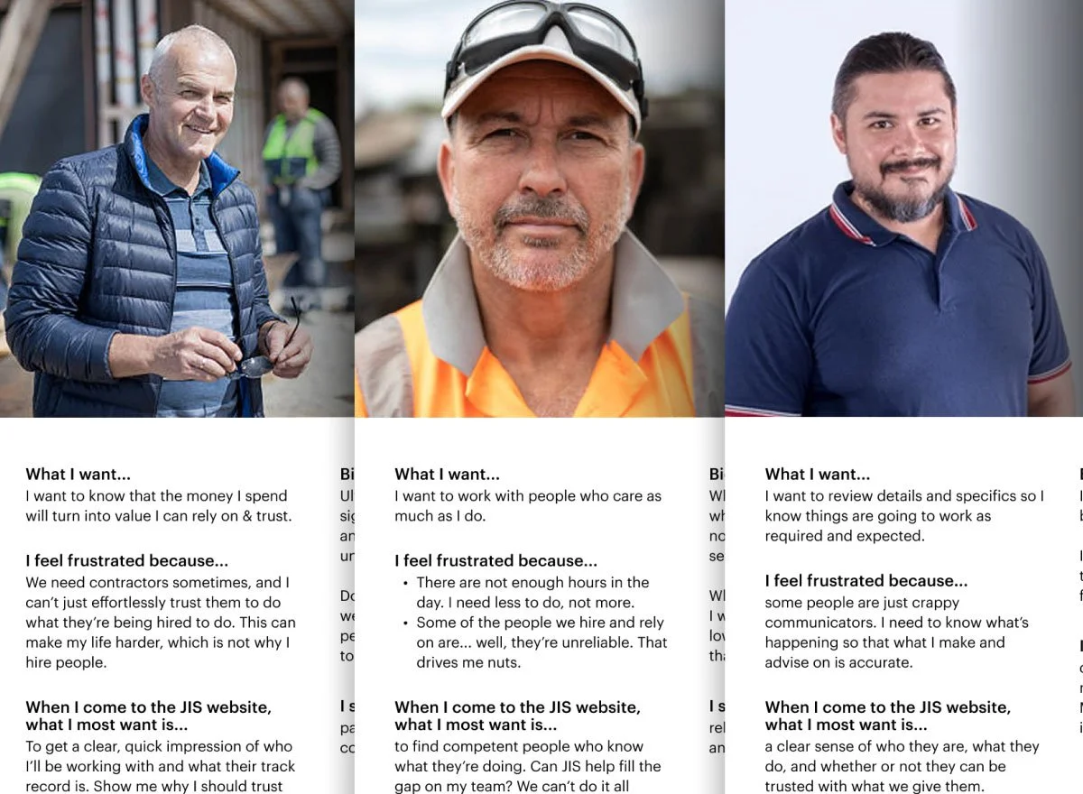
User Personas
All together, the goal of this project was to ease the sales process by giving researchers and hiring managers the information they needed and a clear path to booking an inspection by the JIS team.
What is most common for the organization structures of their clients is that a general tech-savvy engineer does the initial research, and then passes on solid findings to their superiors (who are the hiring managers). So they site needed to give the Engineer details and information to answer their technical curiosities, and then be straight-forward and easy to distill quickly for the hiring managers who needed to make good but quick decisions.
Final Project Personas
Tap Image to Enlarge
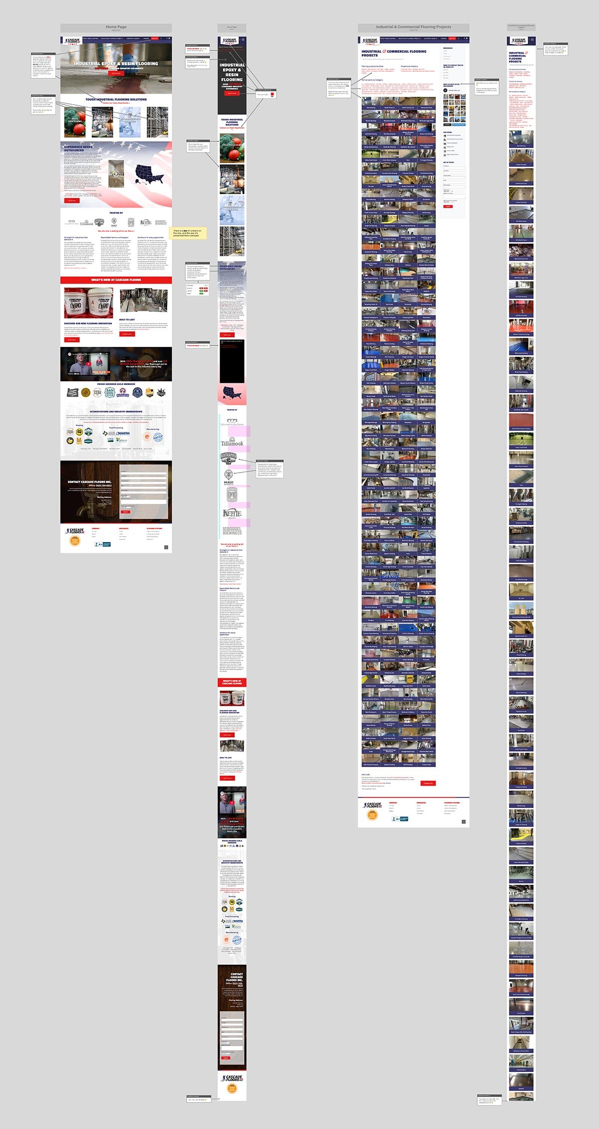
Competitive Analysis
One thing I noticed on their industry peers’ sites was heavy use of industrial caution colors as their branding colors. Emergency reds, warning oranges, and screaming yellows. It looked unsurprisingly like the signs and cones used for road work, and while that was understandable, it was a little too-on-the-nose. It also conflicted with website color conventions that most users have grown used to. Gray for inactive, red for alert, yellow for warning, and green for confirmation. Obviously that’s not the only way these colors are used in design, but it was very heavy-handed on these sites and felt directionless in most cases.
I looked at organizations who are successful but on the same level as JIS, and then some companies that JIS wanted to move closer to and play on their level. So it was a matter of differentiating from the other fish in their pond while also leveling up to demonstrate their aptitude and how fitting they were to trust by the bigger fish.
The Cons
There were several examples of companies that left a lot of room for improvements, so I highlighted both what I was seeing and alternatives I wanted to explore.
A few common elements I found were:
- A cold, uncanny valley quality where rendered images featuring high-tech scenes were leaned on rather heavily by some.
- Inconsistent color usage, which resulted in difficult way-finding and a heavy cognitive lift.
- Numerous WCAG violations that impaired usability, implied a carelessness to technologically savvy visitors, and risked ADA lawsuits.
Here’s a small sampling of what I uncovered.
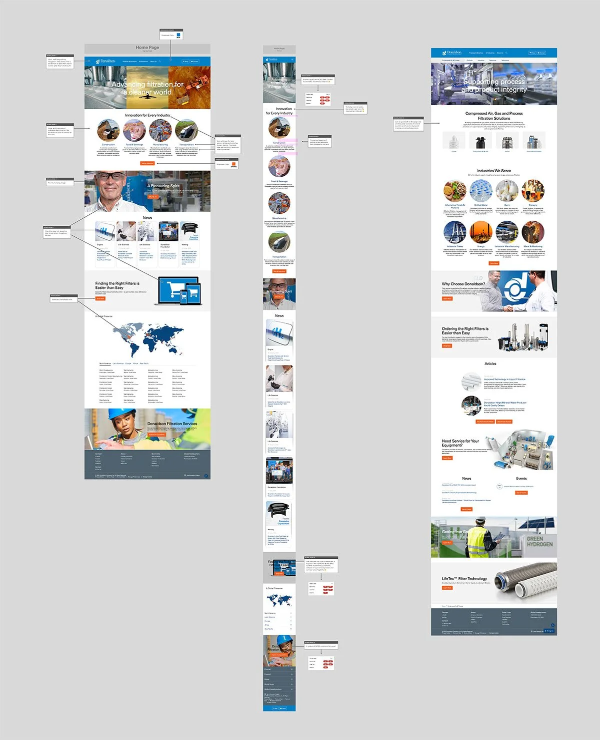
The Pros
There were also organizations that had very refined design systems that spoke volumes of the general quality of their operations. There was definitely an appreciation in the industry for companies who embraced these ideals, so it was more a matter of aligning with peers than simply forging out alone.
Here’s a small sampling of what I uncovered.
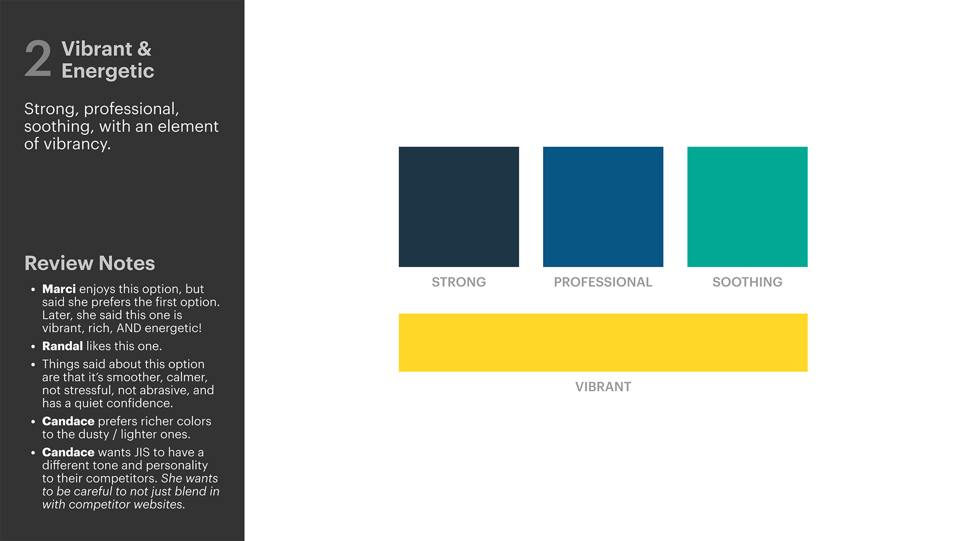
Color Palette
We needed colors that would be familiar to visitors who were familiar with construction conventions, but not so on-the-nose that it was forgettable. with a few colors that expanded the JIS identity and gave texture to what it’s like to work with them.
This were the distilled Color Options, Competitive Analysis, and typeface combinations I presented. This gave the needed context to understand what I was presenting and the “why” behind it.

The Chosen Palette
Read the “Review Notes” in the image below to see some of the meaningful comments the client made during our review.
Impact
Knowing who we were talking to allowed us to understand the human needs our work was addressing and brought the abstract into a more real form. Ultimately, it’s people who are visiting the JIS website, not analytics, graphs, or robots with one-dimensional needs & problems.
Now that we’d confirmed who we were talking to and what needed to be said, we could move on to the next phase, where this would be communicated visually and through the website’s functionality.
The next step: brand evolution.