
Jireh Industrial Services
2 of 4: Brand Evolution

The Client
Jireh Industrial Services (JIS) has an enviable position in the construction world where they operate. Through the excellent service they provide, they’ve established a reputation of respect and reliability for themselves, and they’re currently transitioning to a women-owned and women-led organization. Things are being passed to the next generation, and they needed their digital tools to more fully represent who they are, the quality of their work, and the direction they’re moving in.
Not only is the women-led nature of JIS impressive in such a male-dominated industry, it’s notable that their approach isn’t that of “female pirates” trying to conquer anything. They’re simply bringing community, inclusion, and heart to the strength and reliability their industry demands. These are not mutually exclusive traits, and JIS is proving that.
Project Objective
Evolve their web presence so it aligns with best practices and helps facilitate sales, and evolve their branding so it reaches the high standards of the services they provide.
My role on this project
UX/UI Design, industry & Audience Research, Wireframing, Visual Design, Website Development QC, Logo Design & Refinement.
Collaborator
Shea Ashdown (PMI-ACP, CSPO) for Content Strategy, Copywriting, and Project Management
Brand Evolution
As part of their website redesign project, JIS started the conversation thinking that a complete redesign of their logo was needed, but that didn’t feel right to me. JIS didn’t need a new logo; what they needed was for their existing mark to be expanded and raised up to the level of their new website, all without sacrificing the brand equity they'd built.
I thought the original mark that Bethany Duby (part of the family, and JIS's Environmental Services Manager) had created was rich with charm and humanity, and that there was a lot of value there. My recommendation was to treat the project as an evolution, not a replacement. Preserve the soul, strengthen its structure, and make it appropriate for every way that a logo is used in modern business. The team agreed.
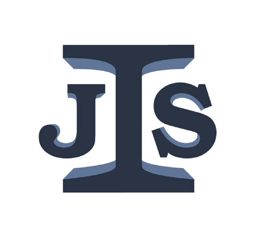
The Original Logo
The original lettermark had solid bones, but a few elements needed refinement to make it more distinctive and coherent. In the final version, I removed the beveling on the J and S so the bevel on the capital I could take center stage, strengthening the I-beam reference.
I also selected a more confident, professional typeface and customized the letterforms. Straightening the S and tightening the overall structure gave the mark a stronger presence and a more intentional visual rhythm.
The Original Logo
Refined Design
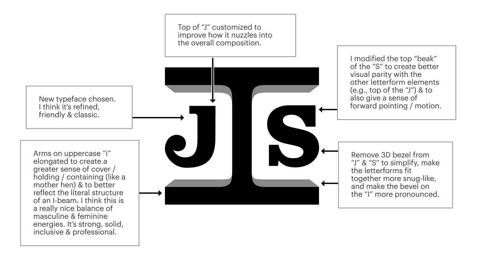
I refined the letterforms to create a cleaner, more intentional lockup. The most significant adjustments were trimming the right arm of the J so the letters nest more cohesively, and adjusting the “beaks” on the S for better visual flow. I also restricted the beveling to the capital I, sharpening the reference to an I-beam and giving the mark a single, clear focal point.
I selected a more professional typeface with similar proportions to the original, and customized its letterforms. The final color palette ties directly into the broader brand system I developed and reflects the materiality of steel, giving the logo a subtle connection to the work JIS does.”

The Redesigned Logo
Presenting the Updated Lettermark
Here are two slides from the lettermark presentation I walked the JIS team through, with notes explaining what was updated and the thinking behind each choice.
Creating the Final Lettermark
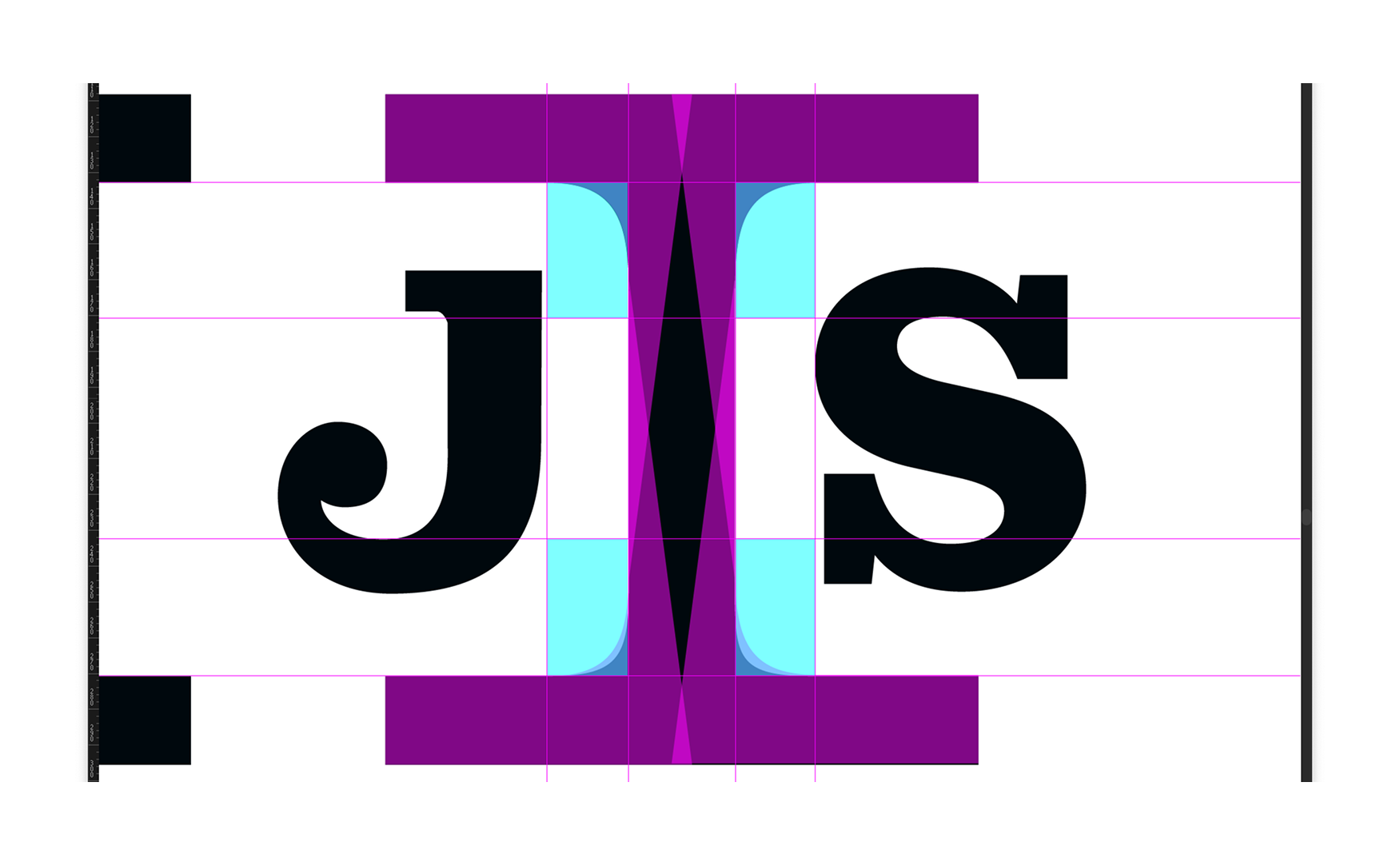
I constructed the capital I from the ground up to get the geometry perfect. This behind-the-scenes construction view isn’t something customers will ever see, but it’s part of the craft behind the final mark.
Comparing the Old & The New
This comparison shows how the refined lettermark preserves the original spirit while improving structure and visual impact.


Final Logo Design
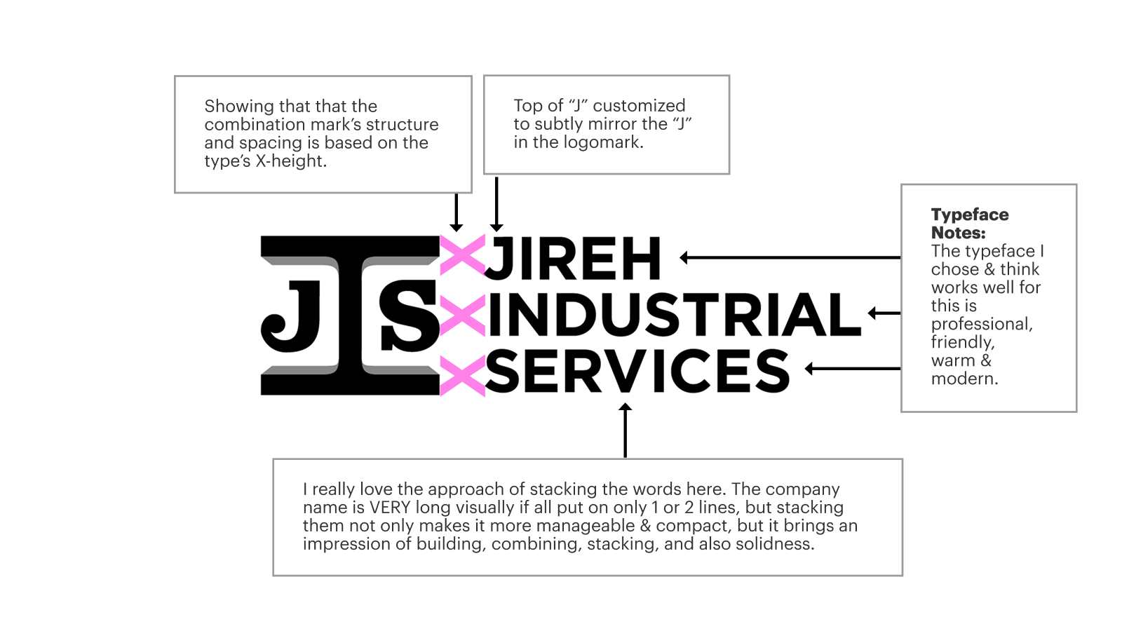
This is the final combination mark: the refined lettermark with the new wordmark.
Stacking the words was a deliberate decision. The full company name becomes unwieldy when set in a single line, but stacked, it becomes compact, balanced, and visually aligned with the ideas of building, strength, and structure. All central elements of JIS’s identity and work.
The lettermark has a timeless quality, so I chose a typeface that complements without feeling dated or too mechanical. It’s modern and approachable, giving the full mark a professional but warm presence.
Impact
The updated logo preserves what JIS had already built, while giving them a stronger, more versatile mark that works great across every application. Digital, print, signage, and future expansion, it’s scalable and aligned with who they are today.
The next step: website wireframes.
Client Testimonial
We were overwhelmed by the prospect of redesigning our website, but when Ryan and Shea got involved, they were a breath of fresh air. They carefully walked us through the process of our website overhaul and made every step along the way very clear.
They created customer profiles, custom color schemes, and our new web pages in phases that were easy to review and fun to participate in. When we saw their final website designs, we were so delighted! They are talented, wonderful to work with, and truly understand how to sift through the mayhem to create beauty.
Candace Duby
Operations Manager & Customer Relationship Manager
