Jireh Industrial Services
4 of 4: Visual Design
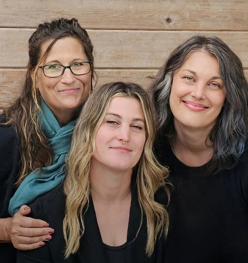
The Client
Jireh Industrial Services (JIS) has an enviable position in the construction world where they operate. Through the excellent service they provide, they’ve established a reputation of respect and reliability for themselves, and they’re currently transitioning to a women-owned and women-led organization. Things are being passed to the next generation, and they needed their digital tools to more fully represent who they are, the quality of their work, and the direction they’re moving in.
Not only is the women-led nature of JIS impressive in such a male-dominated industry, it’s notable that their approach isn’t that of “female pirates” trying to conquer anything. They’re simply bringing community, inclusion, and heart to the strength and reliability their industry demands. These are not mutually exclusive traits, and JIS is proving that.
Project Objective
Evolve their web presence so it aligns with best practices and helps facilitate sales, and evolve their branding so it reaches the high standards of the services they provide.
My role on this project
UX/UI Design, industry & Audience Research, Wireframing, Visual Design, Website Development QC, Logo Design & Refinement.
Collaborator
Shea Ashdown (PMI-ACP, CSPO) for Content Strategy, Copywriting, and Project Management
Visual Design
The strategy, research, and interviews completed earlier in the project made the visual design phase straightforward. By the time I reached this stage, the aesthetic direction was clear: professional, reliable, trustworthy, and strong, while also remaining inclusive, relational, and human.
In the final designs, you can see how every decision converged. The refreshed color palette and type system are featured across the layout, imagery was chosen to reinforce the narrative, and each page was structured to guide visitors through a clean, intuitive, and intentional experience.
Their website functions as both a marketing tool and an information hub, and to deliver those experiences well, it has to move users forward without friction. So, every design choice reduces confusion, removes barriers, and eases the user’s progress.
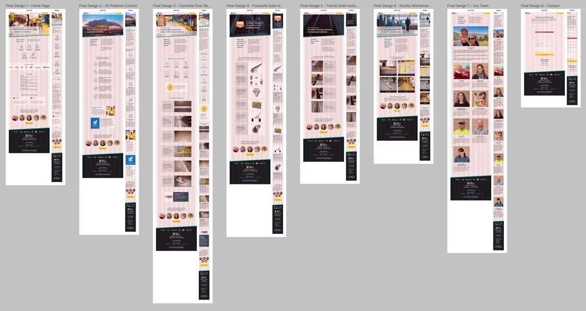
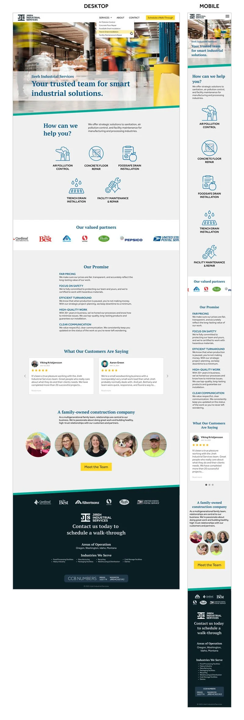
Home Page
One of the strengths of partnering with Shea Ashdown is the clarity and precision she brings to messaging. Her copy strategy and my visual system were developed in tandem, which is why this home page feels cohesive. The hierarchy, tone, and layout all echo the same story: a company that is strong, reliable, and deeply human.
You can see in this design how her language and my visual framing reinforce each other. The words set the narrative direction, and the visual structure amplifies it. It’s a true collaboration. She designs with language, and I design with form, and this page is the result of both disciplines working in sync.
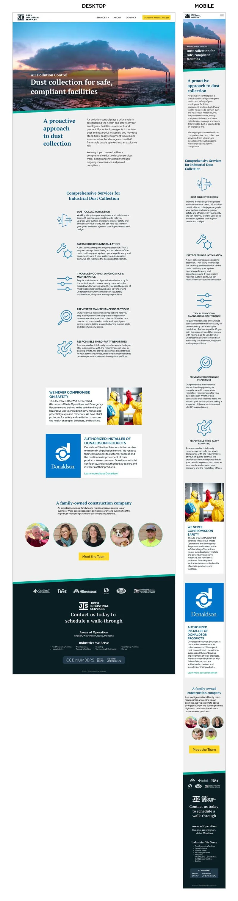
Air Pollution Control
This service was recently added to JIS’s offerings by the acquisition of an environmental-services company. Now, they needed a clear and credible way to present it. “Comprehensive Services for Industrial Dust Collection” captures the scope, but the design had to build trust, not just inform.
This page organizes a highly technical offering into a clean, approachable structure that helps potential clients understand what’s being offered, why it matters, and what qualifies JIS to deliver it. Their HAZWOPER certification, authorized dealer status, and safety protocols are presented as credibility anchors, supported by clear descriptions of each service.
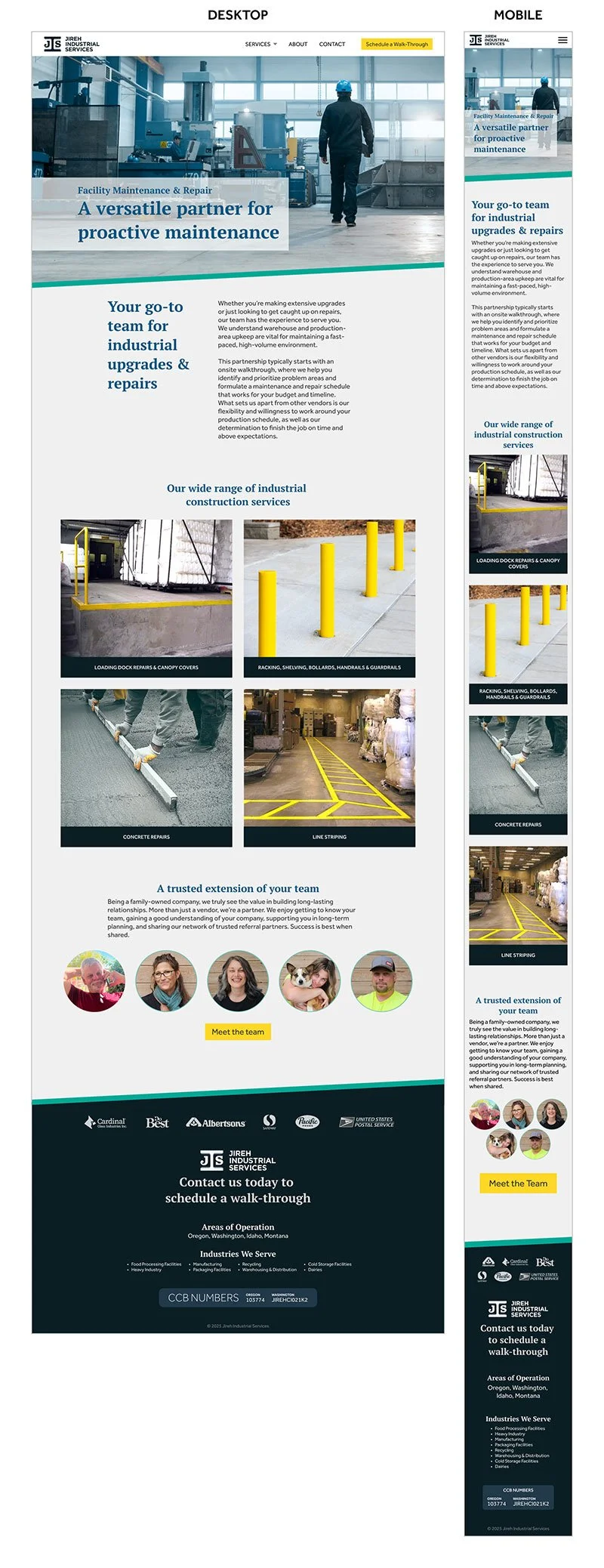
Facility Maintenance & Repair
This page showcases the core of JIS’s ongoing work: facility maintenance and repair. These services are wide-ranging, practical, and essential for keeping industrial environments safe and operational. The design had to communicate versatility without overwhelming the user.
The page opens with a clear value statement and transitions into messaging that positions JIS as a reliable, long-term partner rather than a one-off contractor. The hero introduces the big promise, the next section explains the relational aspect of their work, and the service grid breaks down their capabilities into digestible, visual categories.
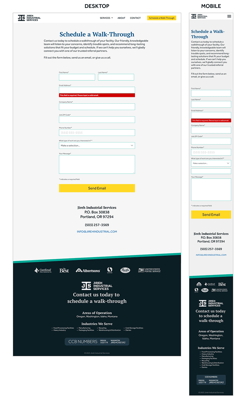
Contact Form
This page may appear simple, but it’s the point where the visitor’s interest turns into action, so clarity, accessibility, and trust are built into its structure.
The form layout follows WCAG standards and clean eye-flow patterns to reduce friction and support easy completion. Required fields, validation states, and error messaging were designed with intention so users always know what to do, what went wrong, and how to fix it without frustration.
The result is a simple page, but one that’s executed with care and thoughtfulness.
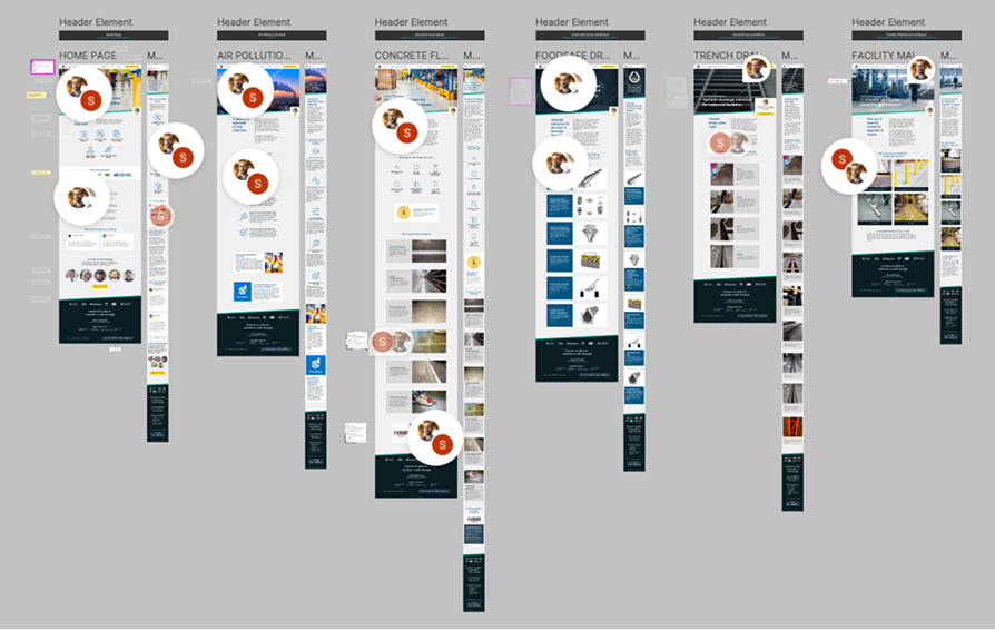
Design to Development
With the final designs complete, I prepared a Figma file for handoff to the development team. This screenshot shows part of that file. We used it to review the layouts, clarify functionality, and work through any questions during a few rounds of Q&A.
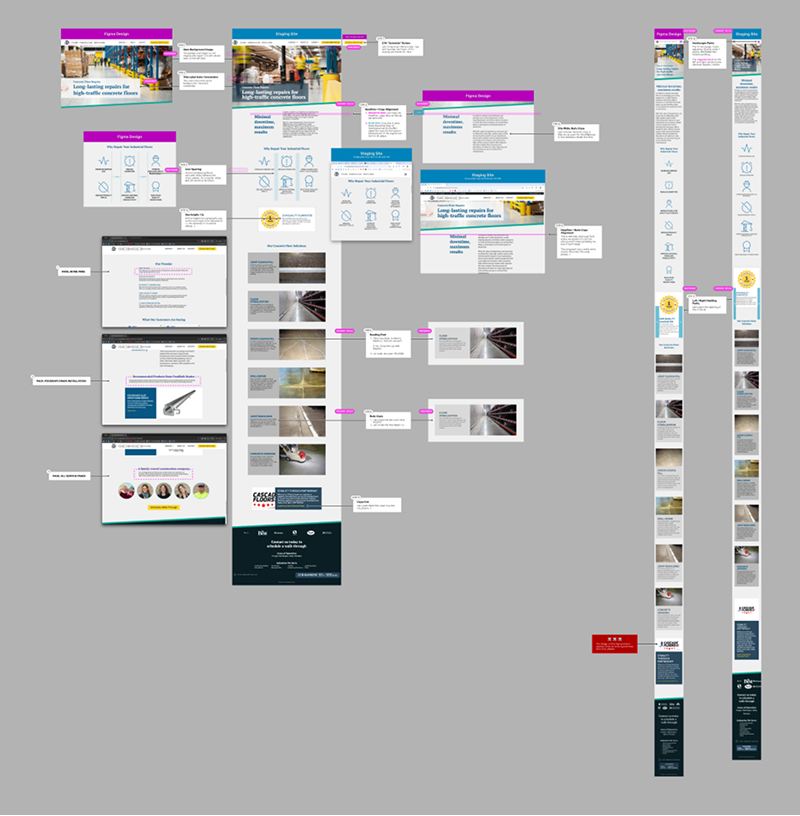
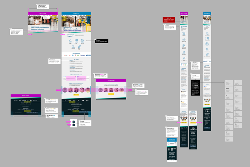
Comparing Figma Designs to the Dev Build
After the first dev build, I brought page screenshots into Figma and annotated the differences between the original Figma designs and the browser output. This step tightens the details and ensures the build matches the intended design.
Impact
The handoff process was very smooth. Our communication was clear and efficient, and our work produced an excellent translation from Figma to the browser.
Client Testimonial
We were overwhelmed by the prospect of redesigning our website, but when Ryan and Shea got involved, they were a breath of fresh air. They carefully walked us through the process of our website overhaul and made every step along the way very clear.
They created customer profiles, custom color schemes, and our new web pages in phases that were easy to review and fun to participate in. When we saw their final website designs, we were so delighted! They are talented, wonderful to work with, and truly understand how to sift through the mayhem to create beauty.
Candace Duby
Operations Manager & Customer Relationship Manager
