Sleep Metrics
case study
The Client: Sleep Metrics is an industry leader in providing CPAP (Continuous Positive Airway Pressure) tests and equipment for people experiencing sleep apnea.
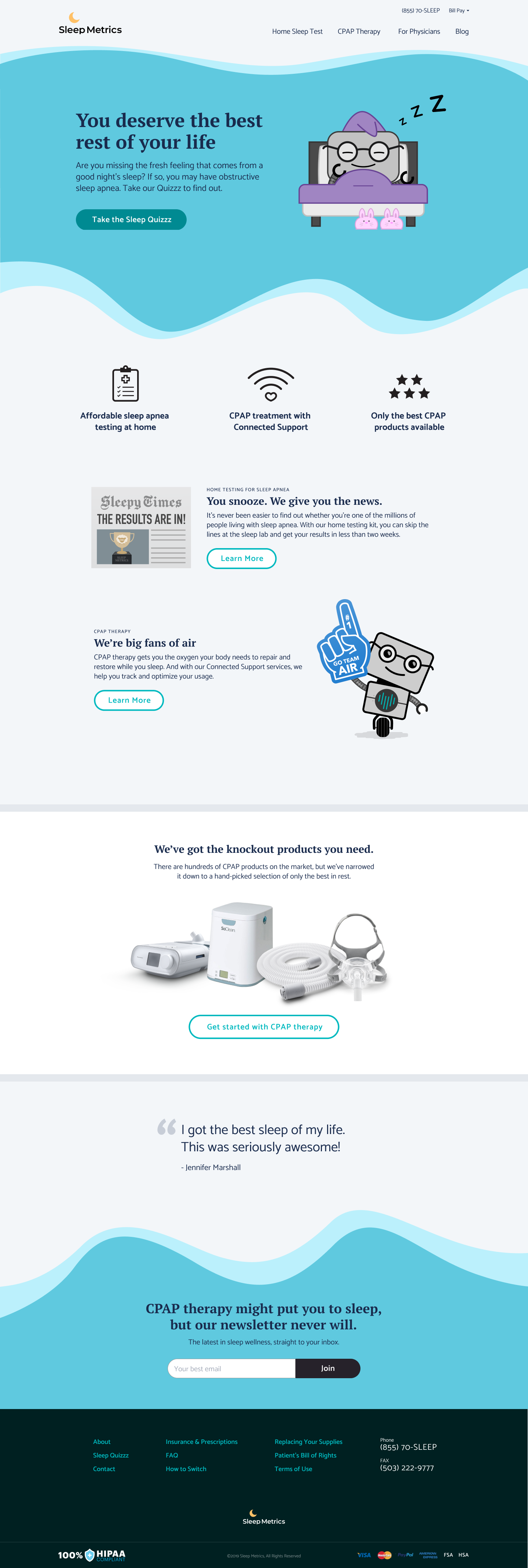
Project Objective: Sleep Metrics needed a more humanized and welcoming brand experience to stand out in a field of competitors whose offerings were cold and even off-putting. They were also expanding their business model to include a mail-order service. We accomplished all of this while also navigating the complexities introduced by requirements of various manufacturers and the medical industry (e.g., HIPAA compliance).
My role on this project: UX/UI Design, Discovery Research, Visual Design, Illustration
User Personas
“As little as possible, as much as necessary” is my battle cry for all things design, and we took that approach in creating Sleep Metrics’ user personas. The user base for sleep apnea therapies is very extensive (as health doesn’t choose humans based on demographics or psychographics), but we were able to whittle it down to 5 customer personas and one doctor persona.
Dissatisfied Dennis
Shoppin’ Sharon
Proactive Patricia
Health-Conscious Hank
Happy Harold
Delightful Doctor Dimitri
Mapping Customer Needs
This diagram shows the desires and needs that are unique to each persona as well as where there is overlap between different patients.
User Flows
Site Map
Based on information uncovered in the Research phase for this project, I created user flows based on our various User Personas. This culminated in an updated and streamlined new site map for their website.
Wireframes
Now, it was time to collaborate with the Creative Director. She has a background in writing + editing and worked with a team of copywriters on the brand’s voice and website content. I was brought up to speed with the content strategy and copywriting and determined how the UI could best support it.
Home Page

At Home Sleep Test

Product Detail Page

Physician FAQ Page

Visual Design Keywords
A key piece that came from our discovery interviews and research was the keywords we developed to guide the voice in our copywriting and the personality and tone of our visual designs. These keywords captured what the client was eager to convey and what could set Sleep Metrics apart from their competitors.
An Unfortunate Industry Standard
One of the particularly off-putting, and even kind of disturbing, elements that many of Sleep Metrics’ competitors use are photos of people wearing CPAP equipment. Sure, that’s what it looks like, but there are better ways to humanize the experience for sleep apnea patients.

Competitor Photo

Competitor Photo

Competitor Photo

Competitor Photo
So my recommendation was to create a friendly character to be the Sleep Metrics ambassador. The character could be used to convey and address topics that look silly or deeply unpleasant when showing people in those situations, and it could add a level of warmth and playfulness to an understandably heavy topic.
Ambasador Sketches

Digital Explorations

Final Character Designs
Final Visual Design
Home Page (Multiple Breakpoints)

Contact Page
Starting Point

Partial Form-Completion + Dropdown Menu

Further into the process

Message sent!

Client Testimonial

While on the surface Ryan's superpower is the ability to ‘break’ website and app user flows and interactions, his true superpower is what happens next. His perspective on customer experience goes beyond what looks right into what is the best holistic solution, and his mindfulness of the customer on the other end of the transaction is second to no other UXer I've known.
Rob Alan
Founder of Monumental Design Co.